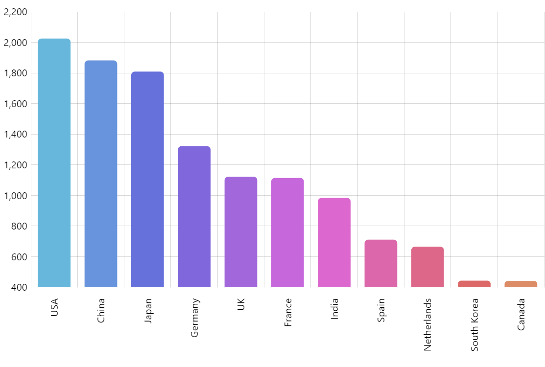
Column with Rotated Labels
In this demo, we create a simple column chart.
We adjust its panning features and mouse wheel behavior right there while creating the object. Then we enable a cursor (that vertical line you see when hovering over the chart) and hide its horizontal (Y) line.
Then we rotate the labels on the X axis and add a country name tooltip shown alongside it when moving a mouse over the chart.
Next, we add our series – the columns themselves. We associate respective axes, set value fields, and configure the tooltip text (the value tooltip shown on top of the column). We also round the top corners of our columns.
A finishing touch is adjusting column colors based on their order number.
Related tutorials
- XY series (the main component of an XY chart)
- Cursor
- Axes
- Adapters (used to adjust individual column colors)
Demo source