Sometimes all it takes to convey a message is a pie chart. It's a great way to show distribution without going into much detail using words.
It's also great, because it can be crammed into relatively small containers. amCharts' implementation of a pie chart will do the job for you of auto-fitting the actual pie into container, taking into account and accommodating free space for pulled out slices and it's labels.
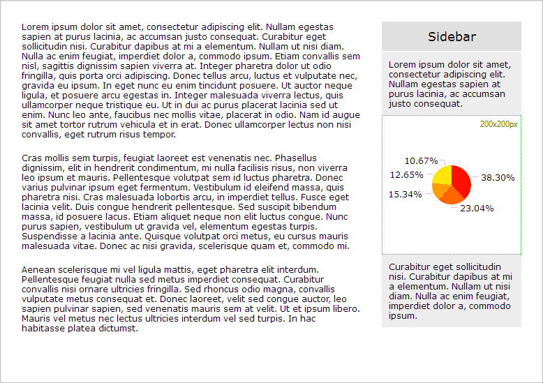
But what if you are confined to a really really small space? Even with a 200x200px container, your pie chart might look a bit on an ugly-small side when auto-sized.
Consider this typical scenario: a pie chart in a 200px wide sidebar:
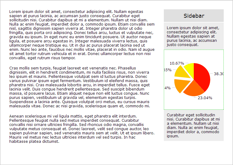
Sure, we can set the radius property to make our chart bigger. The pie looks about the right size now, but the labels do not fit into container anymore so they are cut off:
There's some padding around sidebar that we could easily reuse. Probably no-one would get mad at us if we let some of the chart elements, especially when the slice is pulled out to bleed out of the sidebar.
To do that, we're going to do a very simple trick:
- Make the chart container bigger;
- Wrap it around some other div to confine the chart to the same space.
Here's a schema to demonstrate what I mean:
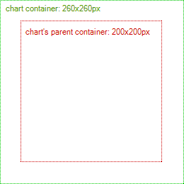
Yes, bigger container is included in a smaller one.
To make this work we will need to CSS-position chart container globally at negative top/left coordinates:
#chartwrapper {
  position: relative;
  width: 200px;
  height: 200px;
}
#chartdiv {
  position: absolute;
  top: -30px;
  left: -30px;
  width : 260px;
  height : 260px;
}
The end result is that some of the chart's elements are going outside sidebar confinement, but it's OK since it has some padding anyway:
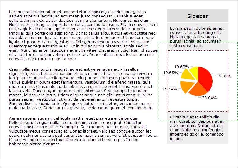
Here's how it looks without explanatory borders:

An here's a working demo if you want to play around with it.