As you may know each amCharts chart can be created using two approaches:
- Object-based;
- JSON-based.
For JSON-based setup refer to these introductory articles:
This article focuses on building the charts using object based setup.
Object-based approach, while not as straightforward as JSON, has its advantages, like complete flexibility over created objects, ability to dynamically manipulate complex chart setups, etc.
Creating a chart
We can use window.onLoad method to start building chart, but as this is not a good practice, amCharts has it’s own method for this – AmCharts.ready. So all the chart code should be placed within this method:
AmCharts.ready( function() {
 // chart code will go here
} );
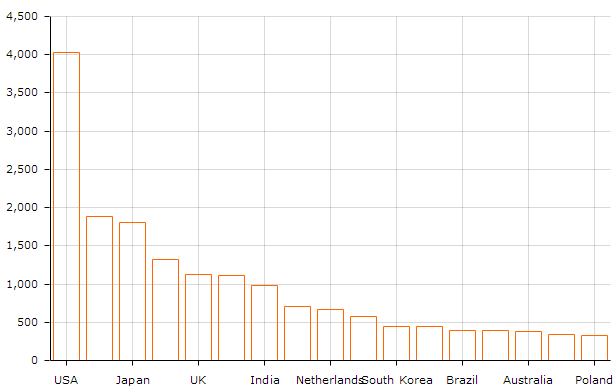
First we will need to create an AmCharts.AmSerialChart object for our chart, set it’s dataProvider and categoryField properties. As you may have guessed from the names, dataProvider is used to specify a data source for the chart and categoryField denotes a field in data objects holding values for the category axis (usually X-axis).
var chart = new AmCharts.AmSerialChart();
chart.dataProvider = chartData;
chart.categoryField = "country";
Next we will need to add a graph to our chart. A chart can have multiple graphs, but we will settle for one in this part. Graphs are represented by AmCharts.AmGraph class. We will need to specify valueField (the name of the field in data provider holding graph item values) and set type field to "column" since we are looking to create a column chart (the default is "line"). Then we just add the graph to the chart.
var graph = new AmCharts.AmGraph();
graph.valueField = "visits";
graph.type = "column";
chart.addGraph( graph );
Finally we ask our chart to render itself into our chartdiv by calling it’s write() method:
chart.write( "chartdiv" );
Here’s what you should see when you open this page in a browser:
Category Axis Customizations
When we have some sequential data on category axis we don’t want to display every one of the data points on it and overcrowd it. However in this particular case we need to display the labels for all category axis points.
We can achieve that by adjusting gridCount property on categoryAxis like this:
var categoryAxis = chart.categoryAxis;
categoryAxis.autoGridCount  = false;
categoryAxis.gridCount = chartData.length;
categoryAxis.gridPosition = "start";
We also had to set autoGridCount to false, as otherwise gridCount property is ignored. We also set gridPosition to "start" so that grid lines wouldn't cross columns but would go between them. So now we get this:
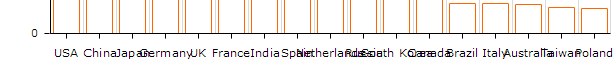
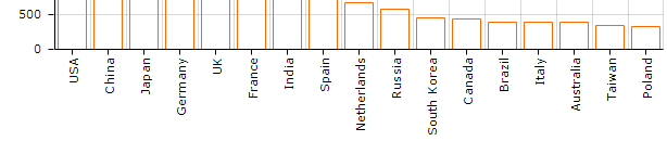
Ouch. Not very nice. However categoryAxis has a labelRotation property. We set it to 90 (degrees) like this:
categoryAxis.labelRotation = 90;
And here we go:
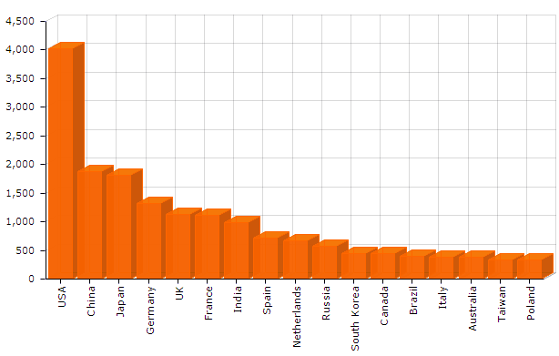
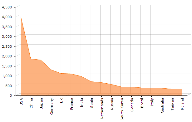
Fill & 3D
Let’s fill our columns with color and make them 3D.
First let’s fill the columns. This is controlled by setting graph’s fillAlphas property.
graph.fillAlphas = 0.8;
Opacity value range from 0 (transparent) to 1 (fully opaque).
Let’s also make the chart faux 3D. To do that we set chart’s depth3D property which controls the depth of columns (third dimension) and angle – controlling 3D direction.
chart.angle = 30;
chart.depth3D = 15;
Here’s what we've got so far:
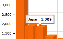
Rollover balloons
By default rollover balloon will display column's value.
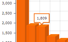
Let’s make it a bit more useful by adding country names to it. We can use graph’s balloonText property for that. Use built-in tags like [[category]], [[value]], etc. (the list of all available tags can be found in AmGraph class reference) by surrounding them in double square brackets like this. Or you can refer to any field in data, i.e. [[myCustomField]]
graph.balloonText = "[[category]]: <b>[[value]]</b>";
Better, isn't it?
Here’s a CodePen example for you to play with it.
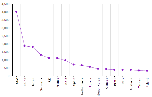
Changing graph's settings
Let’s say you don’t want column, but area chart instead. All you need to do is set:
graph.type = "line";
And adjust opacity of a fill, if you want:
graph.fillAlphas = 0.5;
Result:
Setting other line graph properties like bullets and color
Want a regular line chart with some different color and bullets? Remove 3D properties (angle and depth3D) and set:
graph.fillAlphas = 0; // or delete this line, as 0 is default
graph.bullet = "round";
graph.lineColor = "#8d1cc6";
Here you go:
As you see, it’s really easy! Happy charting!