UPDATE: Since the launch of our super-powerful LIVE EDITOR we recommend starting building the chart using it. No more coding, no mistypes. WYSIWYG charts are available now!
Although we think that the most easy way of starting learning amCharts or any other similar library is study the examples (there are lots of them in samples folder), in this tutorial we will go through a process of building your first chart from the very beginning. Don’t worry, this won’t take long. Let’s start by implementing a simple column chart and add some nice touches to it.
Setting up
First you should download amCharts from the download page. Extract the contents of the archive to a directory of your choice. Copy "amcharts" directory from downloaded zip file into your working folder. Then create a simple HTML file using your editor of choice. I’ve called the file columnchart.html.
Now let’s open the file and start coding.
Adding a container
The only HTML element needed on the page is a container for the chart. Let's add a DIV like this:
<body>
 <div id="chartdiv" style="width: 640px; height: 400px;"></div>
</body>
This is an object JavaScript chart will use as a container for the drawing surface. Notice that we've set its id property to "chartdiv". We will need that name/id later.
Referencing JavaScript Libraries
In the HEAD section of our page we will need to reference amCharts JavaScript library. Since V3 amCharts library is split into several files, in order to save some kilobytes – you need to include main amcharts.js file and one or several chart files, depending on what chart you need. Column chart is a serial chart, so we include these two js files:
<script src="amcharts/amcharts.js"></script>
<script src="amcharts/serial.js"></script>
Note - the order is important - amcharts.js should always go first.
We will need some sample data to work with. So let’s just add a simple JavaScript array of objects:
<script>
  var chartData = [ {
    "country": "USA",
    "visits": 4252
  }, {
    "country": "China",
    "visits": 1882
  }, {
    "country": "Japan",
    "visits": 1809
  }, {
    "country": "Germany",
    "visits": 1322
  }, {
    "country": "UK",
    "visits": 1122
  }, {
    "country": "France",
    "visits": 1114
  }, {
    "country": "India",
    "visits": 984
  }, {
    "country": "Spain",
    "visits": 711
  }, {
    "country": "Netherlands",
    "visits": 665
  }, {
    "country": "Russia",
    "visits": 580
  }, {
    "country": "South Korea",
    "visits": 443
  }, {
    "country": "Canada",
    "visits": 441
  }, {
    "country": "Brazil",
    "visits": 395
  }, {
    "country": "Italy",
    "visits": 386
  }, {
    "country": "Australia",
    "visits": 384
  }, {
    "country": "Taiwan",
    "visits": 338
  }, {
    "country": "Poland",
    "visits": 328
} ];
</script>
If you are familiar with JSON, you might notice that the data is perfectly valid JSON object.
Creating a chart
There are two ways you can create a chart with amCharts
1) using JavaScript API (all elements on the charts are created as objects in JavaScript);
2) passing all the chart config as JSON object.
We recommend using the first approach for more complex setups with dynamically built charts and their configs.
The second approach is much simpler to understand and easier to get started, so we're going to focus on it in this article.
The chart is created using AmCharts.makeChart() function. It accepts two parameters:
- An id of the the HTML container to create chart in;
- JSON object of the chart config
Would rather use JavaScript API object-based setup? Switch over to this article.
Chart type
A typical call to create the chart looks like this:
AmCharts.makeChart( "chartdiv", {
  "type": "serial",
  // ... other config parameters
} );
Notice the type setting. It determines what kind of chart is this. It's important because it will determine what code will be used to build the chart. It also relates to the type-specific include you need to have on your page. I.e. if type is set to "serial", you will need to ensure "serial.js" is loaded. For "pie", you will need "pie.js", etc.
NOTE: the makeChart() function is document state-safe. You may invoke it at any point, even if the page is not fully loaded. It will wait until the document is ready and will build the chart then.
Chart data
Another important and necessary parameter in every chart is dataProvider. It holds data for the chart.
We already have our data array defined earlier in this article. We just need to assign it to a key in chart config:
AmCharts.makeChart( "chartdiv", {
  "type": "serial",
  "dataProvider: chartData,
  // ... other chart parameters
} );
The rest of the config
OK, our chart config is slowly coming together. Let's put together a minimal config for our serial line chart.
We will also need to tell chart which field in data holds category name: categoryField. A category is a label or iteration in data series, that is displayed (usually) on the X axis.
Also, define a list of graphs. graphs is an array of separate objects. Each defines a separate graph on the chart. At the very minimum each graph needs its valueField set so that the chart knows where to take its values from. Another important graph parameter is type which tells the chart what type of graph it is. Default being "line", it also supports following: "line", "column", "step", "smoothedLine", "candlestick", "ohlc".
Let's go with "column":
AmCharts.makeChart( "chartdiv", {
  "type": "serial",
  "dataProvider": chartData,
  "categoryField": "country",
  "graphs": [ {
    "valueField": "visits",
    "type": "column"
  } ]
} );
Here’s what you should see when you open this page in a browser:
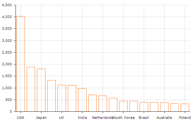
Category Axis Customizations
When we have some sequential data on category axis we don’t want to display every one of the data points on it and overcrowd it. However in this particular case we need to display the labels for all category axis points.
We can achieve that by adjusting gridCount property on cateoryAxis like this:
"categoryAxis": {
  "autoGridCount": false,
  "gridCount": chartData.length,
  "gridPosition": "start"
}
We also had to set autoGridCount to false, as otherwise gridCount property would be ignored. We also set gridPosition to "start" so that grid lines wouldn't cross columns but would go between them. So now we get this:
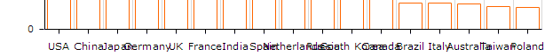
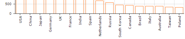
Ouch. Not very nice. To fix this, let's use categoryAxis' property labelRotation. We set it to 90 (degrees) like this:
"categoryAxis": {
  // ... other category axis settings
  "labelRotation": 90
}
And here we go:
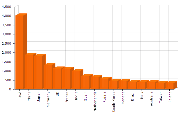
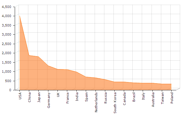
Fill & 3D
Let’s fill our columns with color and make them 3D.
First let’s fill the columns. This is controlled by setting graph’s fillAlphas property.
"graphs": [ {
  "valueField": "visits",
  "type": "column",
  "fillAlphas: 0.8
} ]
Opacity value range from 0 (transparent) to 1 (fully opaque).
Let’s also make the chart faux 3D. To do that we set chart’s depth3D property which controls the depth of columns (third dimension) and angle – controlling 3D direction.
"graphs": [ {
  "valueField": "visits",
  "type": "column",
  "fillAlphas": 0.8,
  "angle": 30,
  "depth3D": 15
} ]
Here’s what we've got so far:
Balloons
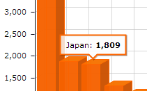
Currently when users hover over the columns they can see the value of the underlying data point.
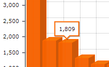
Let’s spice it up a little by including a country name (category axis value). This is done by setting graph’s balloonText property. You can use predefined tags like [[category]], [[value]], etc. (the list of all available tags can be found in AmGraph class reference) by surrounding them in double square brackets like this:
"graphs": [ {
 // ... other graph's settings
 "balloonText": "[[category]]: <b>[[value]]</b>"
} ],
NOTE: You can also use HTML & CSS tags.
Now when we hover over the column we see a nicer, more informative balloon:
In this part we've learned how to implement a simple interactive JavaScript column chart on a web page. Here’s an editable CodePen demo or you to play with.
Want an area chart instead?
Let’s say you don’t want column, but area chart instead. All you need to do is set type to "line" and adjust fillAlphas
"graphs": [ {
  "valueField": "visits",
  "type": "line",
  "fillAlphas: 0.5
} ]
And here is the result:
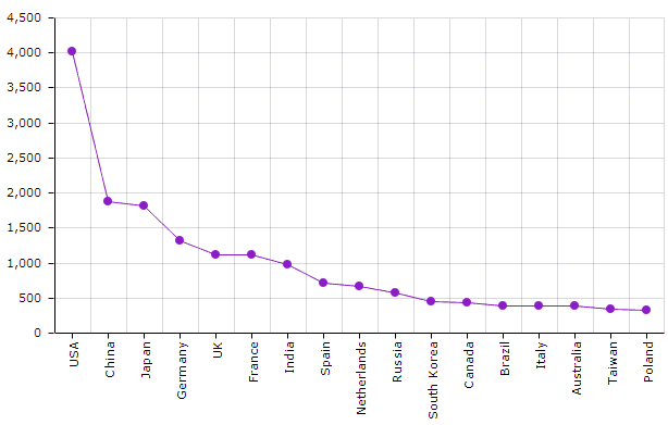
Line chart with bullets?
Want a regular line chart with some different color and bullets? Remove 3D properties (angle and depth3D) and set bullet property.
We can change line color while we're at it using lineColor:
"graphs": [ {
  "valueField": "visits",
  "type": "line",
  "fillAlphas: 0, // this line is redundant since the default is 0 (no fill) anyway
  "bullet": "round",
  "lineColor": "#8d1cc6"
} ]
Here you go:
As you see, it’s really easy! Happy charting!