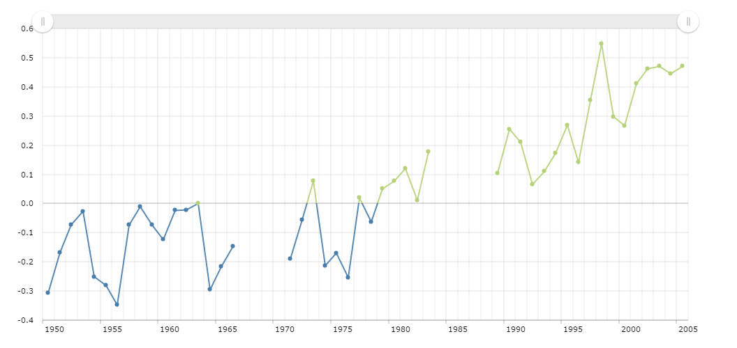
Chart With Gaps In Data
Our charts can handle gaps in data in different ways – display real gaps in the graphs, like in this sample, or, if you prefer not to have these gaps, the graph might connect data points. And even more – catergory axis can simply omit the dates with no data. In this case all the spaces between data points will be equal, no matter if the dates go one by another or not.
Hand-drawn style
If you select the “chalk” theme at the top of the chart, you will notice that all the grid lines, axes, and even the graph itself is distorted, creating a hand-drawn effect. This is a very special feature we are very proud of. We are sure we are the first who implemented such feature in a charting library. Now you can have hand-made dynamic charts with a single property, handDrawn set to true.
Demo source