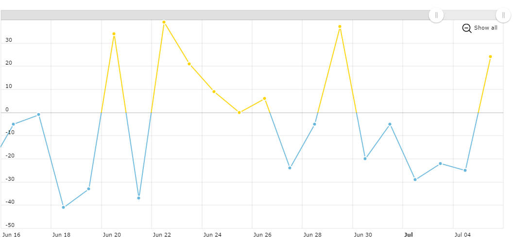
Line with different negative color
As you see, the line graph can use different color for it’s positive and negative part. And even more – line color can change at user defined value – you can set any negativeBase you want. If you set fillAlphas for the graph to a greater than 0 value, this line chart will became area chart, and it will also use different fill colors for positive and negative part of the graph.
Date based category axis
If you zoom-out and zoom0in the chart, you will notice that date format and the number of grid lines changes, depending on the length of selected period. Grid lines are placed ad logical intervals – beginning of the week, month or year. And dates on category axis also use different date format.
Position of the axis
You can easily change position of value and category axis. Click EDIT button and add position: "right" to the value axis object. Run the script ad the axis will be displayed on the right. In case you don’t like axis labels to be displayed inside the plot area, simply set inside: false. If you’d like your category axis to be on top, add position: "top" to category axis object, also, as in this particular example we disabled automatic margins, you should increase topMargin value in order axis labels to fit, or simply set autoMargins to true.
Demo source