Simple Pie Chart
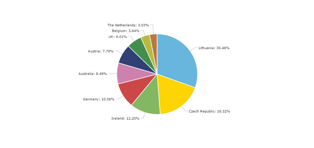
Our pie chart uses intelligent way to arrange its labels so that they would not overlap. The chart will apply intelligent fuzzy logic to assure no two slice labels overlap. While there is a theoretical limit of how many labels can be accommodated that way – a large amount of labels can dramatically distort the chart and make it look cluttered – the chart will do its best to accommodate anything you throw at it.
Grouping small slices together
To avoid a lot of supersmall slices, the chart can group them all into a single “Others” slice. To enable this feature, add groupPercent setting to chart config. Set it to a number of percent. Smaller slices than the set percent value will be automatically grouped into “Others” slice.
This will allow cutting down on a clutter of barely visible tiny slices and their respective labels.
Demo source