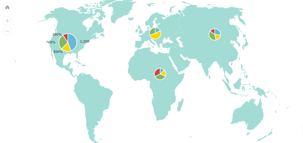
Map with dynamic Pie charts
Since any amCharts instance, bet it map or chart of any type, can be shown on the same page without any conflicts, we can use all of them to create a nice infographics.
This demo shows, how we can place various Pie charts on a map.
First of all, we’re going to “disguise” pie charts as map images. A map image is any image that can be placed at specific latitude/longitude coordinate. A regular circle image would go into images array in dataProvider and would look something like this:
"images": [ {
  "title": "North America",
  "latitude": 39.563353,
  "longitude": -99.316406,
  "width": 150,
  "height": 150,
  "type": "circle"
} ]
Since we’re not aiming for simple circles, but would rather display a nice interactive pie chart, we’re going to replace the type part with a proprietary pie block, which as you probably already guessed, will contain Pie chart’s config:
"images": [ {
  "title": "North America",
  "latitude": 39.563353,
  "longitude": -99.316406,
  "width": 150,
  "height": 150,
  "pie": {
    "type": "pie",
    "pullOutRadius": 0,
    "labelRadius": 0,
    "dataProvider": [ {
      "category": "Category #1",
      "value": 1200
    }, {
      "category": "Category #2",
      "value": 500
    }, {
      "category": "Category #3",
      "value": 765
    } ],
    "labelText": "[[value]]%",
    "valueField": "value",
    "titleField": "category"
  }
} ]
Since JavaScript Maps does not support this kind of config out-of-the-box, we’re going to use an event handler positionChanged to:
- Create custom HTML container for each image in
dataProvider; - Position those containers over the map, right where the map image would be;
- Use the Pie chart config container in image data to create an actual live chart;
- Update position of the chart containers when the map is zoomed or moved.
Demo source