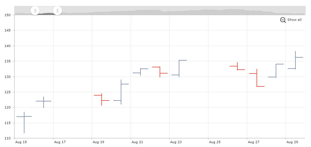
OHLC chart
OHLC or open-high-low-close chart is a type of chart used to illustrate how the price of a stock or bond changed over time. Vertical line on the chart shows the price range (the highest and lowest prices). Tick marks project from each side of the line indicating the opening price on the left, and the closing price on the right. Usually the bars are shown in different colors depending on whether prices rose or fell in that period.
Making OHLC with amCharts
Our serial chart has a special graph type – ohlc. To have such a graph you only need to set openField, closeField, highField and lowField for the graph and have these values in your data. OHLC graph is quite similar to Candlestick graph type, which is also supported by our library.
OHLC chart for long time periods
If you zoom-out this chart, you will notice that the bars are getting more and more narrow. At some point, if you’d have even more data, they would become quite unreadable. To solve this, you could write a zoom-event handler which would change the graph type to a simple line chart if the number of data points exceeds some number X. As an alternative for this we recommend checking our Stock chart which accumulate data into longer periods – for example, if you have daily data but the selected time span is very long, our stock chart can accumulate daily data into weekly or monthly or even yearly data.
Demo source