Candlestick chart
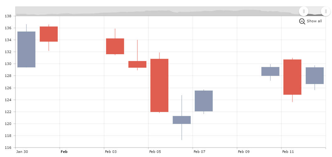
A candlestick chart is used to describe price movements of a security or currency for a designated span of time. Candlesticks are usually composed of the body, and an upper and a lower shadow (wick). The wick illustrates the highest and lowest prices during the time interval represented. The body illustrates the opening and closing prices. If the close price is higher than it open, the body is light or unfilled, otherwise – dark or filled.
Making Candlestick with amCharts
Our serial chart has a special graph type – candlestick. To have such a graph you only need to set openField, closeField, highField and lowField for the graph and have these values in your data. Candlestick graph is quite similar to OHLC graph type, which is also supported by our library.
Candlesticks for long time periods
If you zoom-out this chart, you will notice that candlesticks are getting more and more narrow. At some point, if you’d have even more data, they would become quite unreadable. To solve this, you could write a zoom-event handler which would change the graph type to a simple line chart if the number of data points exceeds some number X. As an alternative for this we recommend checking our Stock chart which accumulate data into longer periods – for example, if you have daily data but the selected time span is very long, our stock chart can accumulate daily data into weekly or monthly or even yearly data.
Demo source