Complex Venn Diagram
A Venn diagram is a visual representation that uses overlapping circles or ellipses to illustrate the relationships and commonalities between different sets or groups of items. Each circle represents a set, and the overlapping regions depict the intersections or shared elements between the sets. The size of each circle is typically proportional to the number of elements or the significance of the set it represents. Venn diagrams are widely used in various fields, including mathematics, logic, statistics, and data analysis, to visually depict and analyze the relationships, similarities, and differences between different categories or entities. They provide a clear and intuitive way to understand set relationships and aid in identifying commonalities and distinctions among the items being compared.
Related tutorials
Build this chart with AI
The prompt below can be used to build this chart with AI. For best coding results, use the most advanced AI models, like Claude Opus 4.6 and GPT-5.3-Codex. For more info and tips, check out amCharts AI docs.
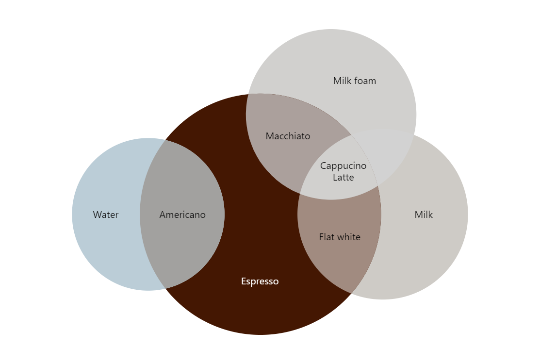
Create a Venn diagram illustrating coffee beverage compositions. Define four primary ingredient sets (Milk, Milk foam, Espresso, Water) and five intersection items representing drinks (Flat white, Macchiato, Cappuccino, Latte, Americano), each mapped to the appropriate ingredient intersections. Use distinct fill colors for each set and intersection in beige, brown, gray, and blue tones. Display text labels at circle centers identifying each beverage and ingredient. Show tooltips with category names on hover. Apply a hover effect with white dashed borders. Use custom colors per section. Add responsive padding and automatic layout adjustment. Use amCharts 5 library.
Demo source