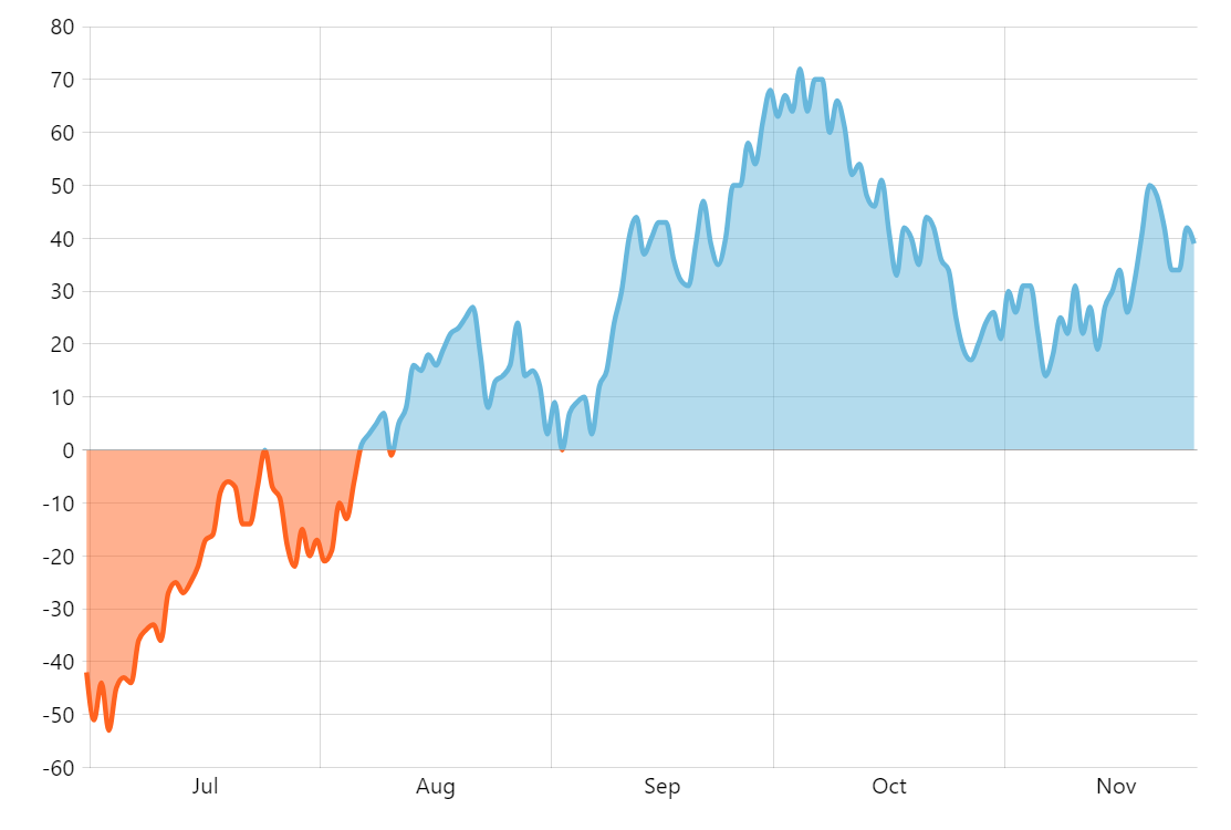
Line with Different Negative Color
Axis ranges
Axis ranges allow defining a scope of values, or a stretch between categories, or dates. Any property of the segment of the series that falls into that range can be overridden.
This demo shows how we can color any segment of the line below the zero line with an alternative color.
More about using axis ranges with series
Build this chart with AI
The prompt below can be used to build this chart with AI. For best coding results, use the most advanced AI models, like Claude Opus 4.6 and GPT-5.3-Codex. For more info and tips, check out amCharts AI docs.
Create a smoothed line chart with 150 daily data points oscillating above and below zero. Color the line orange for negative values and use the default color for positive values. Apply a slightly thicker stroke and semi-transparent area fill. Add an XY cursor with zoom-select behavior, axis tooltips on both axes, and animate on load. Use amCharts 5 library.
Demo source