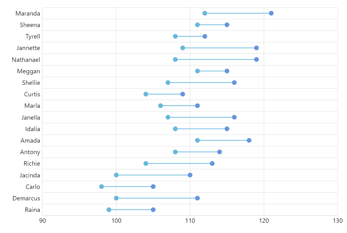
Horizontal Dumbbell Plot
Dumbbell plot (also known as Dumbbell chart, Connected dot plot) is great for displaying changes between two points in time, two conditions or differences between two groups.
Key implementation details
We set baseAxis of ColumnSeries to our Y-axis to make columns horizontal. Then we utilize the “floating columns” feature to make columns start off-axis by setting openValueXField to one of our fields in the data set. Finally, we set column’s height (since it’s horizontal) to 0.5 pixels to make them look like lines. And then we just add circles as bullets on the ends of the column.
Related tutorials
Also see Vertical dumbbell plot demo.
Demo source