Line Chart with Horizontal Target
It is very common to have a target value line on a chart and it is also common to display the parts of the chart that fall below and above that target line differently. Achieving this effect is very easy with amCharts.
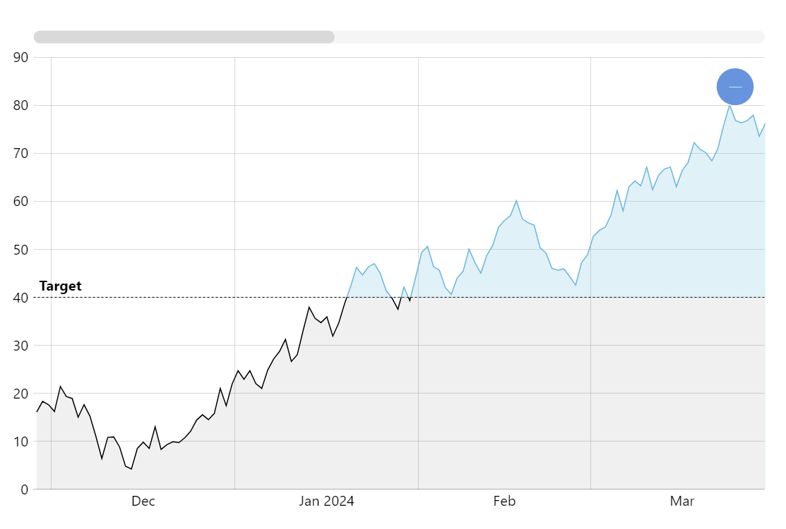
Key implementation details
To get the effect we use the axis range feature but we do it with a twist. Commonly axis ranges are created on axes (hence the name) but we can also create a range on the series. In this setup the range settings affect the look of parts of the series where values fall into our range.
Related tutorials
Build this chart with AI
The prompt below can be used to build this chart with AI. For best coding results, use the most advanced AI models, like Claude Opus 4.6 and GPT-5.3-Codex. For more info and tips, check out amCharts AI docs.
Create a line chart with 300 daily data points (values 0-100) featuring a dashed horizontal target reference line at value 40 with a 'Target' label. Shade the area below the target with a dark fill. Include a semi-transparent fill under the series line, XY cursor, tooltips, horizontal scrollbar, pan/zoom, and entrance animation. Use amCharts 5 library.
Demo source