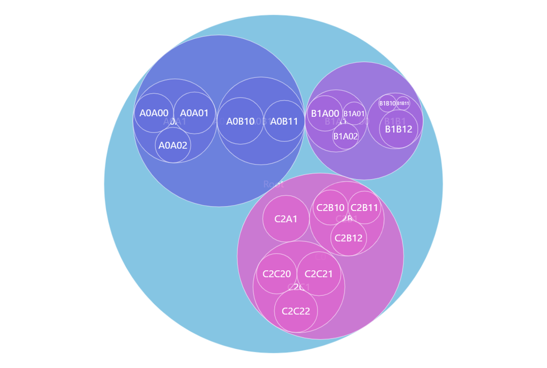
Packed Circle Chart
Packed Circle Chart is great for visualizing hierarchical data. Circles on the bottom (leaf) level represent the values on that level and then they are packed (hence the name) into parent circles and determine their size. This way you can see a birds-eye view of the values in your data and also drill down for the details. Try clicking on the circles in the demo.
Key implementation details
Packed Circle Chart along with other hierarchical charts is covered by the hierarchy module of amCharts Charts. To add a Packed Circle chart we just create a Container and add a Pack child into it. Then we just need to add hierarchical data and configure the appropriate value fields.
Related tutorials
Build this chart with AI
The prompt below can be used to build this chart with AI. For best coding results, use the most advanced AI models, like Claude Opus 4.6 and GPT-5.3-Codex. For more info and tips, check out amCharts AI docs.
Create a packed circle chart (circle packing visualization) that displays hierarchical data where parent circles contain and are sized based on their child circles. Use randomly generated hierarchical data with a root node, up to 2 levels of nesting, and up to 3 nodes per level with values from 0 to 100. Leaf-level circles represent individual values, while parent circles pack their children. Enable click-to-drill-down on circles. The root data item should be pre-selected on load. Apply the Animated theme. Animate the series appearance with a smooth staggered animation. Use amCharts 5 library.
Demo source