Radar Timeline
In this demo we use a Radar chart to display data changing over time.
Key implementation details
We use a Slider element (a specialized version of a scrollbar) at the bottom of the chart to trigger changes in the radar’s underlying data. The value (position) on the slider is animated when start button is clicked. Alternatively, the user can manipulate the position manually.
Related tutorials
Build this chart with AI
The prompt below can be used to build this chart with AI. For best coding results, use the most advanced AI models, like Claude Opus 4.6 and GPT-5.3-Codex. For more info and tips, check out amCharts AI docs.
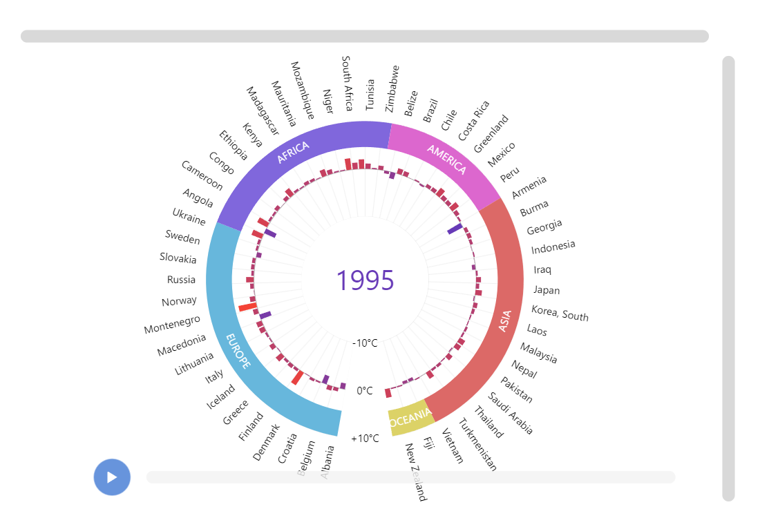
Create a radar timeline chart displaying temperature anomaly data across 110+ countries organized by six continental regions (Europe, Africa, America, Asia, Oceania). Use a circular categorical axis for country names and a radial value axis ranging from -3 to +6 degrees C. Set a donut hole in the center. Color columns based on their value, ranging from purple for cold anomalies to red for warm anomalies. Add clickable colored continental grouping labels around the perimeter -- clicking a continent zooms into that region, clicking again resets. Show a large central year label. Add a timeline slider at the bottom spanning 1973-2016 with a play button that animates through all years. On year change, animate column values smoothly. Load nested array data with country name, baseline temperature, and annual anomaly values for each year. Use amCharts 5 library.
Demo source