Bar Chart Race
Bar Chart Race is a great and highly visual way to display data changing over time in the form of an animated bar chart. It’s a very comprehensible representation of time-based changes in data.
Key implementation details
In this demo we have year-based data, and we interpolate the values in a linear fashion inside the year to show smooth continuous growth. We [re]sort series on the category (Y) axis from high to low and then we calculate the necessary zoom level to zoom-in to a point where only the non-zero items are visible.
Finally, on each step we calculate the series position delta and set an animation on the data-item, so when its position changes it doesn’t jump into its new place immediately but goes there in a smooth animation.
Related tutorials
Build this chart with AI
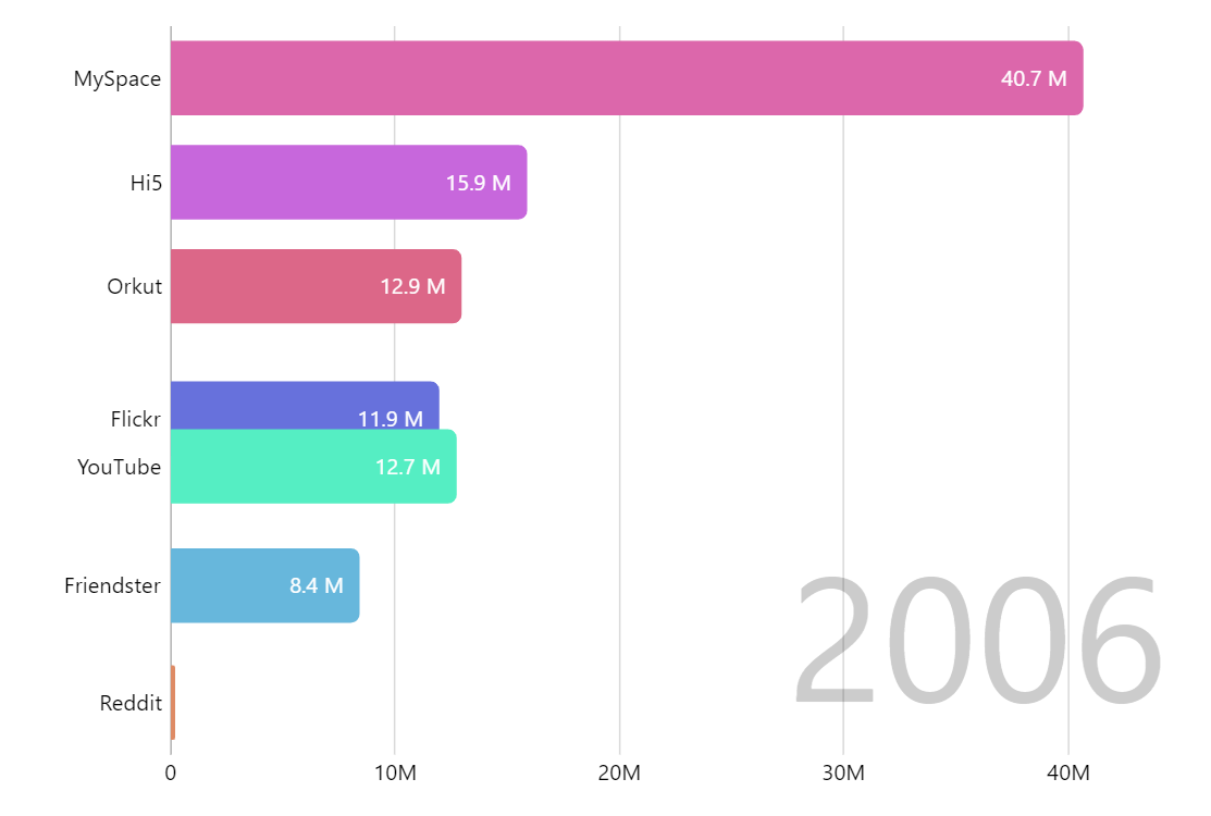
The prompt below can be used to build this chart with AI. For best coding results, use the most advanced AI models, like Claude Opus 4.6 and GPT-5.3-Codex. For more info and tips, check out amCharts AI docs.
Create an animated bar chart race showing social media platform user counts from 2002 to 2018 across 19 platforms (Facebook, Instagram, YouTube, Twitter, TikTok, WeChat, WhatsApp, etc.). Bars should automatically sort from highest to lowest with smooth transitions as values update every 2 seconds. Instead of big numbers, use letters K, M, B, etc. Use amCharts 5 library.
Demo source