Date Based Data
The most common type of chart is some column or line chart where the Y axis represents numeric values and the X axis is some sequence of discreet values (often referred to as “categories”). The categories can also be some string representations of dates but they are actually just plain strings as far as the chart’s smarts are concerned. A proper way to display date-based data is using a date-aware X axis which can handle displaying different labels (days, months, years) based on the amount of data, zoom level, etc., as well as handle different data granularity (eg. no data on some days). All of this is handled automatically by amCharts XY chart.
Key implementation details
All you need to do for proper date handling in the XY chart is create a DateAxis as your X axis. You can adjust its behavior by setting axis’ baseInterval and other options. Depending on the data types on your data you may need to pre-process it so the dates are handled as expected.
Related tutorials
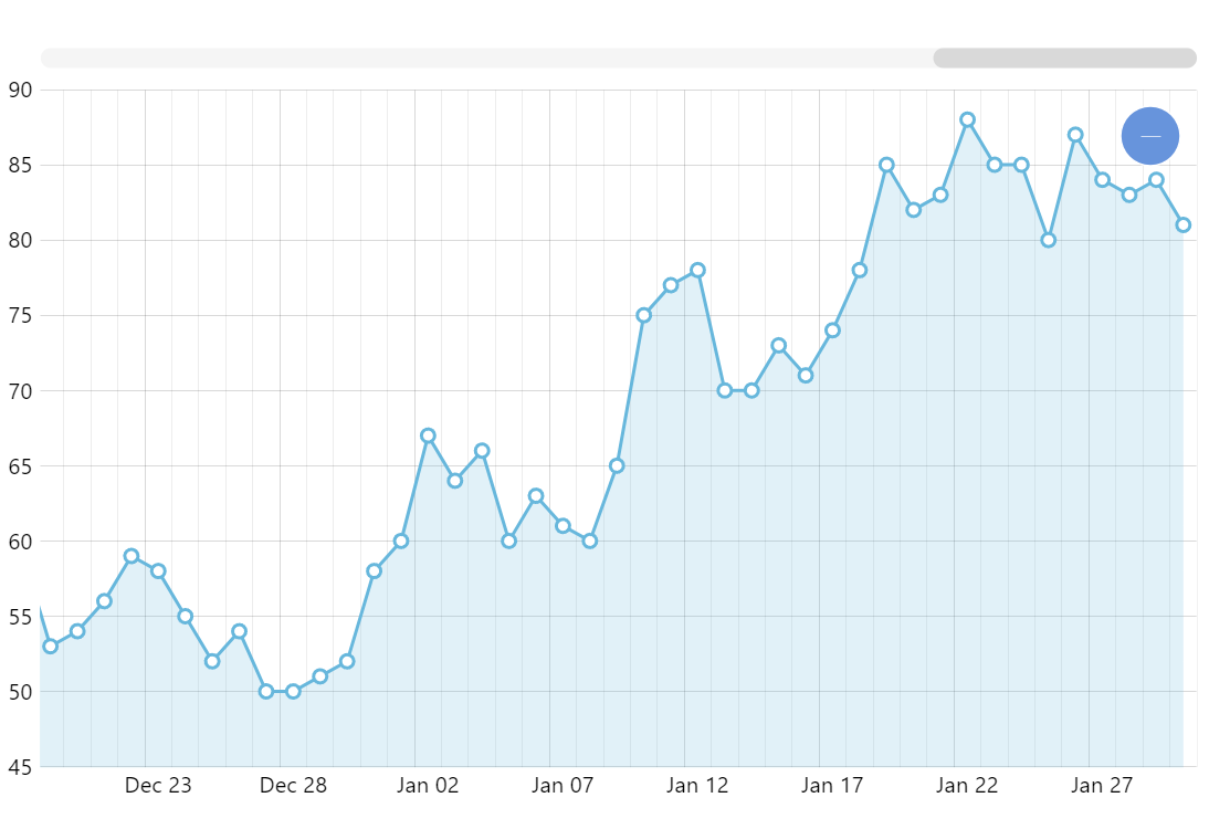
Build this chart with AI
The prompt below can be used to build this chart with AI. For best coding results, use the most advanced AI models, like Claude Opus 4.6 and GPT-5.3-Codex. For more info and tips, check out amCharts AI docs.
Create a line chart with 188 daily data points on a date axis (Jul 2012-Jan 2013) with automatic date string parsing. Show a subtle filled area beneath the line and small circular markers matching the series color. Include minor grid lines, pan/zoom on both axes, XY cursor with horizontal tooltips, horizontal scrollbar, and entrance animation. Use amCharts 5 library.
Demo source