Date axis is used to display date-based data with a natural time scale.
Data order
IMPORTANTDate axis expects series data to be sorted in ascending order. Otherwise, chart will be prone to all kinds of plotting anomalies.
Data granularity
The single most important setting for a date axis is baseInterval which describes granularity of data used in the chart.
The value of baseInterval is an object of type ITimeInterval which has two keys:
timeUnit- what time unit is used in data.count- number of time units.
For example, if we have daily data (one data item per day), we'd set up axis like this:
let xAxis = chart.xAxes.push(
  am5xy.DateAxis.new(root, {
    baseInterval: { timeUnit: "day", count: 1 },
    renderer: am5xy.AxisRendererX.new(root, {})
  })
);
var xAxis = chart.xAxes.push(
  am5xy.DateAxis.new(root, {
    baseInterval: { timeUnit: "day", count: 1 },
    renderer: am5xy.AxisRendererX.new(root, {})
  })
);
The timeUnit can be one of the following: "millisecond", "second", "minute", "hour", "day", "week", "month", "year".
NOTE A lot of of other aspects and functionality of a date axis depends on a value of baseInterval as we will see throughout this tutorial.
IMPORTANT For month-based date axes, the value of count for baseInterval must be a divider of 12, i.e. 1, 2, 3, 4, 6, 12, 24, etc.
Grid granularity
How it functions?
Date axis' will choose where and how to display its grid based on available space.
The axis renderer's setting minGridDistance controls how close together grid (and related ticks/labels) elements can be.
This determines theoretical number of grid lines a grid can display.
When axis calculates that number it will check how far those grid lines are in terms of time.
This will determine the granularity of the time units that grid uses.
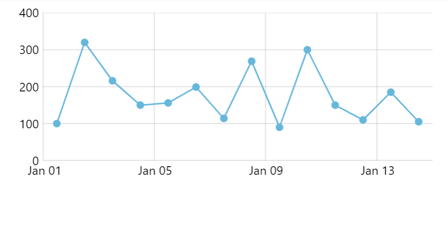
For example, let's say our chart displays 30 days worth of daily data.
If our chart is wide enough to comfortably display all 30 grid lines, it will display a grid line for each day.
However, if the chart does not fit all 30 of days, it will revert to some bigger time intervals, like displaying a grid line every two days.
If that still not enough to display grids spaced out enough, it will revert to displaying grid every three, four, or five days, then weeks, months, etc.
The granularity depends on current date range of the axis, meaning that it will update dynamically when zooming the chart in and out:
Customizing grid granularity
We can control to what time intervals we want grid of the date axis to switch by setting its gridIntervals setting.
It's an array of ITimeInterval objects, each specifying an allowed option for grid lines.
Date axis will use the most granular interval that satisfies grid density restrictions.
For example, let's restrict grid to just days and months:
let xAxis = chart.xAxes.push(
  am5xy.DateAxis.new(root, {
    baseInterval: { timeUnit: "day", count: 1 },
    gridIntervals: [
      { timeUnit: "day", count: 1 },
      { timeUnit: "month", count: 1 }
    ],
    renderer: am5xy.AxisRendererX.new(root, {})
  })
);
var xAxis = chart.xAxes.push(
  am5xy.DateAxis.new(root, {
    baseInterval: { timeUnit: "day", count: 1 },
    gridIntervals: [
      { timeUnit: "day", count: 1 },
      { timeUnit: "month", count: 1 }
    ],
    renderer: am5xy.AxisRendererX.new(root, {})
  })
);
Default grid intervals
The default value for gridIntervals is:
[
  { timeUnit: "millisecond", count: 1 },
  { timeUnit: "millisecond", count: 5 },
  { timeUnit: "millisecond", count: 10 },
  { timeUnit: "millisecond", count: 50 },
  { timeUnit: "millisecond", count: 100 },
  { timeUnit: "millisecond", count: 500 },
  { timeUnit: "second", count: 1 },
  { timeUnit: "second", count: 5 },
  { timeUnit: "second", count: 10 },
  { timeUnit: "second", count: 30 },
  { timeUnit: "minute", count: 1 },
  { timeUnit: "minute", count: 5 },
  { timeUnit: "minute", count: 10 },
  { timeUnit: "minute", count: 15 },
  { timeUnit: "minute", count: 30 },
  { timeUnit: "hour", count: 1 },
  { timeUnit: "hour", count: 3 },
  { timeUnit: "hour", count: 6 },
  { timeUnit: "hour", count: 12 },
  { timeUnit: "day", count: 1 },
  { timeUnit: "day", count: 2 },
  { timeUnit: "day", count: 3 },
  { timeUnit: "day", count: 4 },
  { timeUnit: "day", count: 5 },
  { timeUnit: "week", count: 1 },
  { timeUnit: "month", count: 1 },
  { timeUnit: "month", count: 2 },
  { timeUnit: "month", count: 3 },
  { timeUnit: "month", count: 6 },
  { timeUnit: "year", count: 1 },
  { timeUnit: "year", count: 2 },
  { timeUnit: "year", count: 5 },
  { timeUnit: "year", count: 10 },
  { timeUnit: "year", count: 50 },
  { timeUnit: "year", count: 100 },
  { timeUnit: "year", count: 200 },
  { timeUnit: "year", count: 500 },
  { timeUnit: "year", count: 1000 },
  { timeUnit: "year", count: 2000 },
  { timeUnit: "year", count: 5000 },
  { timeUnit: "year", count: 10000 },
  { timeUnit: "year", count: 100000 }
]
Labels and ticks
The granularity of grid also may affect how related labels and ticks are placed.
For more information about how to position labels/ticks with their location and multiLocation settings, visit "XY chart axes: Location of axis elements" tutorial.
Date formats
Labels
The current grid granularity determines the date/time format of the labels, too.
Instead of using date format as set in a global date formatter, date axis defines own list of formats, suitable for each time unit a grid interval its grid can have.
Label date formats
The formats used for each time unit are set in date axis' dateFormats setting.
It's an object with a key corresponding to each time unit ( "millisecond", "second", "minute", "hour", "day", "week", "month", "year") with a value corresponding to its format.
Here's how it looks like by default, with International English locale:
{
  "millisecond": "mm:ss SSS",
  "second": "HH:mm:ss",
  "minute": "HH:mm",
  "hour": "HH:mm",
  "day": "MMM dd",
  "week": "MMM dd",
  "month": "MMM",
  "year": "yyyy"
}
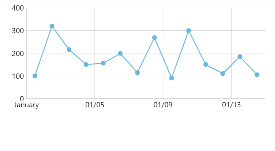
We can easily change the formats as needed:
xAxis.get("dateFormats")["day"] = "MM/dd";
xAxis.get("dateFormats")["day"] = "MM/dd";


dateFormats modifiedPeriod change date formats
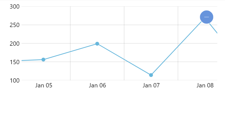
A label representing start of a period, e.g. start of the month when grid uses daily time unit, will be formatted according to different format, by default.
We can turn this behavior off by setting markUnitChange setting to false on a date axis.
let xAxis = chart.xAxes.push(
  am5xy.DateAxis.new(root, {
    baseInterval: { timeUnit: "day", count: 1 },
    markUnitChange: false,
    renderer: am5xy.AxisRendererX.new(root, {})
  })
);
var xAxis = chart.xAxes.push(
  am5xy.DateAxis.new(root, {
    baseInterval: { timeUnit: "day", count: 1 },
    markUnitChange: false,
    renderer: am5xy.AxisRendererX.new(root, {})
  })
);
We can also override the date format for such labels.
Similarly to dateFormats there's another setting: periodChangeDateFormats.
Formats from periodChangeDateFormats will be used only for the period beginning labels, like for January 1st in the following example.
xAxis.get("periodChangeDateFormats")["day"] = "MMM";
xAxis.get("periodChangeDateFormats")["day"] = "MMM";
See the Pen Formatting date axis labels by amCharts team (@amcharts) on CodePen.
Minor grid formats
If you have "minor grid" enabled, its labels (if enabled) will be formatted using the same date formats as the regular axis labels.
Should we nee to, we can specify different formats using axis' setting minorDateFormats.
Contrary to other date format lists (e.g. dateFormats), this setting is not pre-set to anything, so we need to set it to an object:
xAxis.set("minorDateFormats") = {
  millisecond: "ff",
  second: "ss",
  minute: "mm",
  hour: "hh",
  day: "dd",
  week: "dd",
  month: "MM",
  year: "yyyy"
};
xAxis.set("minorDateFormats") = {
  millisecond: "ff",
  second: "ss",
  minute: "mm",
  hour: "hh",
  day: "dd",
  week: "dd",
  month: "MM",
  year: "yyyy"
};
Axis tooltip
There are a few aspects and settings that will affect date format shown in a date axis tooltip. This section will examine those.
Base interval based format
Axis will use the date format suitable for the granularity of the data (as set via baseInterval) for its tooltip (when used with cursor).
There are defaults set for each available baseInterval that provides the best experience.
For example, by default, with daily data granularity, we may have axis labels showing "Jan 1", "Jan 2", etc.
Tooltip would show a more descriptive information for those, i.e. "Jan 1, 2022", "Jan 2, 2022".
These can be overridden using date axis' tooltipDateFormats setting.
It works exactly the same way as label formats, i.e. by setting appropriate base interval key:
xAxis.get("tooltipDateFormats")["day"] = "MM/dd";
xAxis.get("tooltipDateFormats")["day"] = "MM/dd";
Here's how defaults look like in International English locale:
{
  "millisecond": "mm:ss SSS MMM dd, yyyy",
  "second": "HH:mm:ss MMM dd, yyyy",
  "minute": "HH:mm MMM dd, yyyy",
  "hour": "HH:mm MMM dd, yyyy",
  "day": "MMM dd, yyyy",
  "week": "MMM dd, yyyy",
  "month": "MMM yyyy",
  "year": "yyyy"
}
Fixed tooltip format
If we do not want to define different format for each base interval, we can also override it with a single setting: tooltipDateFormat.
let xAxis = chart.xAxes.push(
  am5xy.DateAxis.new(root, {
    tooltipDateFormat: "MMM d, yyyy",
    renderer: am5xy.AxisRendererX.new(root, {})
  })
);
var xAxis = chart.xAxes.push(
  am5xy.DateAxis.new(root, {
    tooltipDateFormat: "MMM d, yyyy",
    renderer: am5xy.AxisRendererX.new(root, {})
  })
);
Time offset
A date axis is divided into cells by grid in certain increments. For example there might be a grid line every hour.
Normally, an axis tooltip will display timestamp representing cell's beginning - same as corresponding axis tooltip, even if it does not correspond with the actual position of the cursor line.
This is controlled by axis' tooltipIntervalOffset setting.
It's a numeric value denoting how timestamp used for the tooltip should be offset relatively to the length of the cell.
The default of -0.5 ensures that the tooltip uses a cell's beginning timestamp.
Resetting it to 0 (zero) would make it display timestamp from the actual position of the cursor's line.
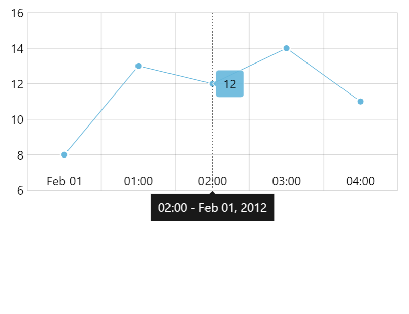
tooltipIntervalOffset: -0.5 (default)
tooltipIntervalOffset: 0
tooltipIntervalOffset: 0.5Axis date scope
Date axis will automatically calculate its scope (start and end date/time) from the data of actual series that are using it.
There are a few ways to override those start and end timestamps.
Custom scope
We can set start date using min setting of the axis. Similarly, end date can be overridden using max.
Those are numeric values of timestamps:
let xAxis = chart.xAxes.push(
  am5xy.DateAxis.new(root, {
    min: new Date(2021, 0, 1).getTime(),
    max: new Date(2021, 1, 1).getTime(),
    renderer: am5xy.AxisRendererX.new(root, {})
  })
);
var xAxis = chart.xAxes.push(
  am5xy.DateAxis.new(root, {
    min: new Date(2021, 0, 1).getTime(),
    max: new Date(2021, 1, 1).getTime(),
    renderer: am5xy.AxisRendererX.new(root, {})
  })
);
The above will make date axis display scale from Jan 1st to Feb 1st, 2021.
We can specify both min and max, or just one of them. If either min or max is not set, the axis will use automatically-calculated value for it.
Relative scope extension
We can also make date axis expand its scope relatively to automatically-calculated range, using its extraMin and extraMax settings.
Those are relative values indicating how much of the automatically-calculated value range to add to either min or max.
For example, extraMax: 0.1 will make axis expand its scope by 10 past last data item.
let xAxis = chart.xAxes.push(
  am5xy.DateAxis.new(root, {
    extraMax: 0.1,
    renderer: am5xy.AxisRendererX.new(root, {})
  })
);
var xAxis = chart.xAxes.push(
  am5xy.DateAxis.new(root, {
    extraMax: 0.1,
    renderer: am5xy.AxisRendererX.new(root, {})
  })
);
Dynamic data item grouping
Date axis can also orchestrate dynamic grouping of series data items.
It works like this: when there are more data items in currently selected time scope, it aggregates data items into larger representative data items.
For example, if we have a year worth of data - 365 days - it can aggregate those into weeks, or 52 data items.
Using grouping, a chart can handle hundreds of thousands of data items, without sacrificing performance and readability of the chart.
Data grouping is also dynamic. If user zooms in, and time scope changes, chart may revert to showing more granular data.
Here's a very basic chart with data grouping and 50K data points:
See the Pen Date axis grid granularity by amCharts team (@amcharts) on CodePen.
Enabling grouping
To enable grouping simply set axis' groupData setting to true:
let xAxis = chart.xAxes.push(
  am5xy.DateAxis.new(root, {
    groupData: true,
    renderer: am5xy.AxisRendererX.new(root, {})
  })
);
var xAxis = chart.xAxes.push(
  am5xy.DateAxis.new(root, {
    groupData: true,
    renderer: am5xy.AxisRendererX.new(root, {})
  })
);
Grouping threshold
Grouping occurs when there's a number of intervals in current scope is bigger than threshold value, which is 500 by default.
Please note that this is number of intervals, not actual data items.
For example, let's say we have a daily data (baseInterval: { timeUnit: "day" }) which spans 10 years.
That means ~3650 base intervals, which is way more than 500.
Grouping kicks in.
The chart now tries to group into weeks, resulting in ~520 weeks, which is still more than 500.
The chart now goes on to months, which gives us just 120 aggregate data items. Threshold is bigger, so that's how the chart will be shown: in monthly increments.
If zoom changes, the chart will re-evaluate the current range and number of intervals in it, and will adjust granularity of displayed data items as necessary.
The threshold can be change using groupCount setting:
let xAxis = chart.xAxes.push(
  am5xy.DateAxis.new(root, {
    groupData: true,
    groupCount: 300,
    renderer: am5xy.AxisRendererX.new(root, {})
  })
);
var xAxis = chart.xAxes.push(
  am5xy.DateAxis.new(root, {
    groupData: true,
    groupCount: 300,
    renderer: am5xy.AxisRendererX.new(root, {})
  })
);
Grouping intervals
The groups into which the chart will try to group data items is set via groupIntervals setting, with the default being this:
groupIntervals: [
  { timeUnit: "millisecond", count: 1 },
  { timeUnit: "millisecond", count: 10 },
  { timeUnit: "millisecond", count: 100 },
  { timeUnit: "second", count: 1 },
  { timeUnit: "second", count: 10 },
  { timeUnit: "minute", count: 1 },
  { timeUnit: "minute", count: 10 },
  { timeUnit: "hour", count: 1 },
  { timeUnit: "day", count: 1 },
  { timeUnit: "week", count: 1 },
  { timeUnit: "month", count: 1 },
  { timeUnit: "year", count: 1 }
]
Let's say we don't want to group data items into weeks, or anything smaller than day, we can do this:
let xAxis = chart.xAxes.push(
  am5xy.DateAxis.new(root, {
    groupData: true,
    groupIntervals: [

      { timeUnit: "day", count: 1 },
      { timeUnit: "month", count: 1 },
      { timeUnit: "year", count: 1 }
    ],
    renderer: am5xy.AxisRendererX.new(root, {})
  })
);
var xAxis = chart.xAxes.push(
  am5xy.DateAxis.new(root, {
    groupData: true,
    groupIntervals: [

      { timeUnit: "day", count: 1 },
      { timeUnit: "month", count: 1 },
      { timeUnit: "year", count: 1 }
    ],
    renderer: am5xy.AxisRendererX.new(root, {})
  })
);
Forcing group interval
We can also force the chart to group data items into specific interval, regardless if the threshold (groupCount) hasn't been passed.
The setting groupInterval is for that:
let xAxis = chart.xAxes.push(
  am5xy.DateAxis.new(root, {
    groupData: true,
    groupInterval: { timeUnit: "month", count: 1 },
    renderer: am5xy.AxisRendererX.new(root, {})
  })
);
var xAxis = chart.xAxes.push(
  am5xy.DateAxis.new(root, {
    groupData: true,
    groupInterval: { timeUnit: "month", count: 1 },
    renderer: am5xy.AxisRendererX.new(root, {})
  })
);
The above will force grouping into months.
IMPORTANTFor groupInterval to work, the equivalent interval dfinition must be present in groupIntervals array.
Aggregation function
When several data items are grouped, a date axis calculates aggregate values to represent the joint data item.
By default, it will use value from the last data item in group for aggregate data item value, and open value from the first data item for aggregate open value.
Let's examine specific case. Here's a data for data items that go into a single group:
{ date: 1638451170000, value: 120 },
{ date: 1638451190000, value: 90 },
{ date: 1638451190000, value: 145 }
For data like that, we probably have the following data fields set up for our series:
let series = chart.series.push(
  am5xy.LineSeries.new(root, {
    valueXField: "date",
    valueYField: "value"
  })
);
var series = chart.series.push(
  am5xy.LineSeries.new(root, {
    valueXField: "date",
    valueYField: "value"
  })
);
When the three data items are grouped into a single one, the value for it will be 145 (last data item's value), and the open value 120 (first data point's value).
There's a number of functions that can be used to change aggregation mechanism, each represented by a setting like like valueYGrouped and openValueYGrouped.
Basically each *Field setting has a counterpart *Grouped setting.
For example, if we want to calculate aggregate values for valueYField as averages from all data items in group, we'd set valueYGrouped to "average".
Possible values for any of the aggregate-function settings are: "open", "close", "low", "high", "average", "sum", "extreme".
The following will make series sum up all values from a group, rather than use the last value:
let series = chart.series.push(
  am5xy.ColumnSeries.new(root, {
    valueXField: "date",
    valueYField: "value",
    valueYGrouped: "sum"
  })
);
var series = chart.series.push(
  am5xy.ColumnSeries.new(root, {
    valueXField: "date",
    valueYField: "value",
    valueYGrouped: "sum"
  })
);
For series, that use more than one value, several *Grouped settings can be used as well:
let series = chart.series.push(
  am5xy.ColumnSeries.new(root, {
    valueXField: "date",

    valueYField: "value",
    valueYGrouped: "high",

    openValueYField: "open",
    openValueYGrouped: "low"
  })
);
var series = chart.series.push(
  am5xy.ColumnSeries.new(root, {
    valueXField: "date",

    valueYField: "value",
    valueYGrouped: "high",

    openValueYField: "open",
    openValueYGrouped: "low"
  })
);
The above will make columns float starting with the lowest open value and ending with the highest close value.
Custom aggregation functions
If the built-in aggregation functions are not enough, we can define out own that applies custom logic when calculating aggregate values for grouped data items.
XYSeries does have a setting for that: groupDataCallback.
We can set it to a function, which will receive group data item as well as the time interval items are grouped into.
The custom function can then do whatever it needs to do to analyze source data items, and modify the end values of the aggregate data item.
let series = chart.series.push(
  am5xy.LineSeries.new(root, {
    xAxis: xAxis,
    yAxis: yAxis,
    valueYField: "value",
    valueXField: "date",
    groupDataWithOriginals: true,
    groupDataCallback: function(dataItem, interval) {
      dataItem.set("valueY", dataItem.get("originals").length)
      dataItem.set("valueYWorking", dataItem.get("originals").length)
    }
  })
);
var series = chart.series.push(
  am5xy.LineSeries.new(root, {
    xAxis: xAxis,
    yAxis: yAxis,
    valueYField: "value",
    valueXField: "date",
    groupDataWithOriginals: true,
    groupDataCallback: function(dataItem, interval) {
      dataItem.set("valueY", dataItem.get("originals").length)
      dataItem.set("valueYWorking", dataItem.get("originals").length)
    }
  })
);
The above example replaces actual group value with the number of source data items that comprise the group.
The data item received by custom grouping function contains originals setting, which holds a list of all source data items.
If we need to calculate our custom value based on original values, we can iterate through that list to do our calculations.
let series = chart.series.push(
  am5xy.LineSeries.new(root, {
    xAxis: xAxis,
    yAxis: yAxis,
    valueYField: "value",
    valueXField: "date",
    groupDataWithOriginals: true,
    groupDataCallback: function(dataItem, interval) {
      let originals = dataItem.get("originals");
      let high = -10000;
      for (var i = 0; i < originals.length; i++) {
        if (dataItem.get("valueY") > high) {
          high = dataItem.get("valueY");
        }
      }
      dataItem.set("valueY", high)
      dataItem.set("valueYWorking", high)
    }
  })
);
var series = chart.series.push(
  am5xy.LineSeries.new(root, {
    xAxis: xAxis,
    yAxis: yAxis,
    valueYField: "value",
    valueXField: "date",
    groupDataWithOriginals: true,
    groupDataCallback: function(dataItem, interval) {
      var originals = dataItem.get("originals");
      var high = -10000;
      for (var i = 0; i < originals.length; i++) {
        if (dataItem.get("valueY") > high) {
          high = dataItem.get("valueY");
        }
      }
      dataItem.set("valueY", high)
      dataItem.set("valueYWorking", high)
    }
  })
);
The above will iterate through "originals" to determine highest value, then use it as a group value.
IMPORTANTFor originals to be included in the related data items, series needs its groupWithOriginals: true set.
See the Pen Custom data grouping function by amCharts team (@amcharts) on CodePen.
Selectively disabling grouping
Setting groupData: true on a date axis will automatically enable grouping for all series attached to it.
We can selectively disable grouping for individual series by setting its groupDataDisabled.
// Grouping enabled
let series1 = chart.series.push(
  am5xy.ColumnSeries.new(root, {
    valueXField: "date",
    valueYField: "value"
  })
);

// Grouping disabled
let series2 = chart.series.push(
  am5xy.ColumnSeries.new(root, {
    valueXField: "date",
    valueYField: "value",
    groupDataDisabled: true
  })
);
// Grouping enabled
var series1 = chart.series.push(
  am5xy.ColumnSeries.new(root, {
    valueXField: "date",
    valueYField: "value"
  })
);

// Grouping disabled
var series2 = chart.series.push(
  am5xy.ColumnSeries.new(root, {
    valueXField: "date",
    valueYField: "value",
    groupDataDisabled: true
  })
);
Performance implications
While being powerful tool, data grouping introduces it's own layer of calculations, that can reduce performance of the charts.
In chart setups with a lot of series, or dashboards with a lot of charts that use data grouping, data pre-processing might take significant strain on the CPU.
To optimize the performance, we can follow these guidelines:
1) Use correct data granularity
Make sure that the baseInterval setting is set to an absolute highest setting that suits the actual data.
2) Tweak group intervals
Normally, series will calculate its aggregate values for all available grouping intervals.
For some data sets some of the intervals might not be applicable and needed.
We can tweak groupIntervals list to include only those intervals we absolutely need data grouped to, and save on unnecessary calculations.
For example, if we have a few days worth of minute-based data, it could be enough to let the the series group its data to maximum of an hour:
let xAxis = chart.xAxes.push(
  am5xy.DateAxis.new(root, {
    groupData: true,
    groupIntervals: [
      { timeUnit: "hour", count: 1 }
    ],
    renderer: am5xy.AxisRendererX.new(root, {})
  })
);
var xAxis = chart.xAxes.push(
  am5xy.DateAxis.new(root, {
    groupData: true,
    groupIntervals: [
      { timeUnit: "hour", count: 1 }
    ],
    renderer: am5xy.AxisRendererX.new(root, {})
  })
);
Zooming
Zooming to date range
We can use date axis' method zoomToDates() to zoom the axis to specific date range:
xAxis.zoomToDates(new Date(2021, 0, 1), new Date(2022, 0, 1));
xAxis.zoomToDates(new Date(2021, 0, 1), new Date(2022, 0, 1));
Pre-zooming
Once data is loaded on some series the date axis gets its scope of dates from, we can use zoomToDates to pre-zoom it to some date range:
series.events.once("datavalidated", function(ev) {
  ev.target.get("xAxis").zoomToDates(new Date(2021, 0, 1), new Date(2022, 0, 1));
});
series.events.once("datavalidated", function(ev) {
  ev.target.get("xAxis").zoomToDates(new Date(2021, 0, 1), new Date(2022, 0, 1));
});
Read more about pre-zooming using series events in "Zoom and pan: Pre-zooming axes".
Events
Date axis does not have specific events that are triggered when it is zoomed.
Instead, we can use private setting change events on selectionMin and selectionMax private settings:
xAxis.onPrivate("selectionMin", function(value, target) {
  var start = new Date(value);
  console.log("Start date changed:", start);
});

xAxis.onPrivate("selectionMax", function(value, target) {
  var end = new Date(value);
  console.log("End date changed:", end);
});
xAxis.onPrivate("selectionMin", function(value, target) {
  var start = new Date(value);
  console.log("Start date changed:", start);
});

xAxis.onPrivate("selectionMax", function(value, target) {
  var end = new Date(value);
  console.log("End date changed:", end);
});
See the Pen amCharts 5: Line chart with scroll and zoom by amCharts team (@amcharts) on CodePen.
Gapless date axis
There's a special version of the category axis, called "gapless date axis", or GaplessDateAxis.
In a nutshell it's a DateAxis that removes time periods that there is no data for.
It can be used to display irregularly-spaced date-based data, where maintaining natural time scale is not important, e.g. removing weekends from the axis, because there is not data for those days.
For more information, please refer to "Gapless date axis" tutorial.
Related tutorials
- Additional axis tooltip to display totals
- Location of items on date axis and date-based series
- Different bullet styling of grouped data items
- Axis zoom end event
- Dual date axis with both month and year labels
- Show a range of dates in a tooltip of a DateAxis when grouping data