This tutorial will walk through available options of configuring a sunburst series.
Slices
Configuration of a slice is done via its template, which is accessible via series template list: series.slices.template.
We can set any setting via template:
series.slices.template.setAll({
  fillOpacity: 0.5,
  stroke: am5.color(0xffffff),
  strokeWidth: 2
});
series.slices.template.setAll({
  fillOpacity: 0.5,
  stroke: am5.color(0xffffff),
  strokeWidth: 2
});
NOTE Setting a value on a template will also update existing slices created using it.
Radius
Outer radius
Sunburst's outer radius can be set using its radius setting.
It can be either percent value (relative to available space) or fixed pixel value.
Pie chart's radius is set to 100% by default.
We can change that by specifying different value for radius:
let series = root.container.children.push(
  am5hierarchy.Sunburst.new(root, {
    valueField: "value",
    categoryField: "name",
    childDataField: "children",
    radius: am5.percent(90)
  })
);
var series = root.container.children.push(
  am5hierarchy.Sunburst.new(root, {
    valueField: "value",
    categoryField: "name",
    childDataField: "children",
    radius: am5.percent(90)
  })
);
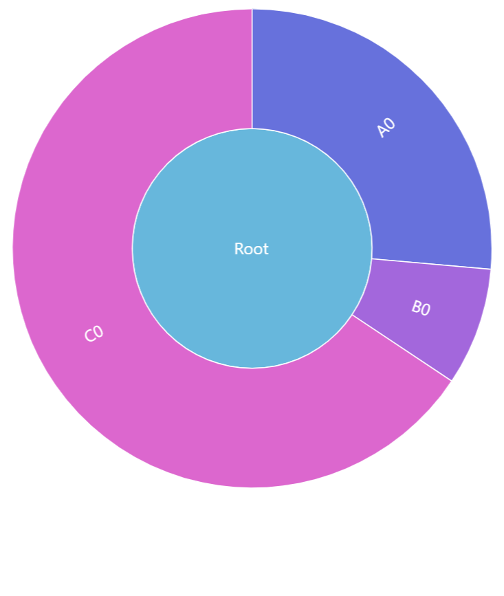
radius: am5.percent(100) (default)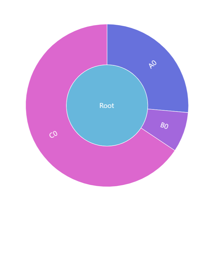
radius: am5.percent(80)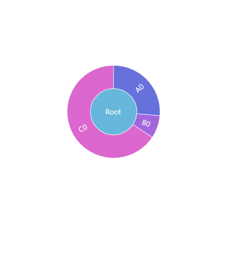
radius: 100Inner radius
Series's innerRadius settings controls the "hole" inside the sunburst's pie.
As with radius it can be either a percent value or fixed pixel value.
The difference is that innerRadius percent value is relative to the series radius, rather than available space.
We can also use negative values in innerRadius. Those will mean pixel distance from the outer radius. This allows creating fixed-width donut circles.
let series = root.container.children.push(
  am5hierarchy.Sunburst.new(root, {
    valueField: "value",
    categoryField: "name",
    childDataField: "children",
    radius: am5.percent(95),
    innerRadius: am5.percent(50)
  })
);
var series = root.container.children.push(
  am5hierarchy.Sunburst.new(root, {
    valueField: "value",
    categoryField: "name",
    childDataField: "children",
    radius: am5.percent(95),
    innerRadius: am5.percent(50)
  })
);
innerRadius: 0 (default)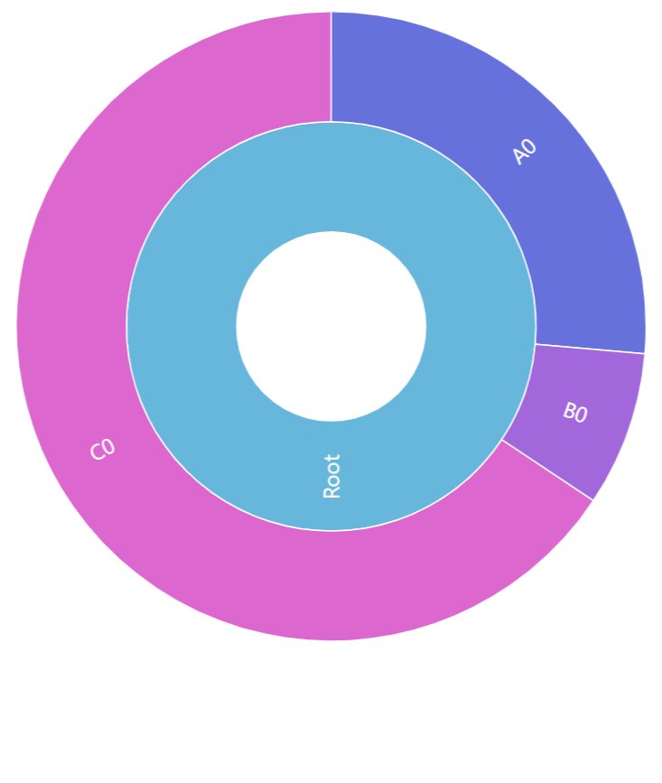
innerRadius: am5.percent(30)See the Pen Sunburst chart by amCharts team (@amcharts) on CodePen.
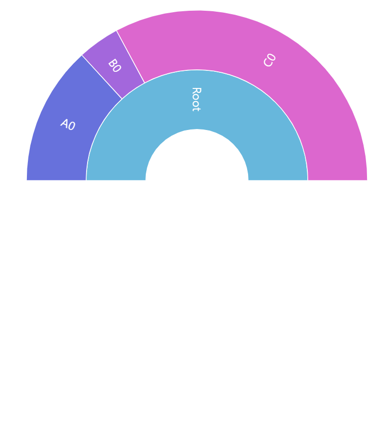
Start/end angles
A sunburst series is not limited to a full circle. It can start and end at any angle.
For that we have to set series' settings: startAngle and endAngle.
These are numeric values denoting degrees.
A zero angle is one that goes from the center of the chart directly to right.
Defaults are -90 (startAngle) and 270 (endAngle) forming full circle starting at vertical line up.
We can change that any way we want.
let series = chart.series.push(
  am5percent.PieSeries.new(root, {
    valueField: "value",
    categoryField: "name",
    childDataField: "children",
    startAngle: -180,
    endAngle: 0
  })
);
var series = chart.series.push(
  am5percent.PieSeries.new(root, {
    valueField: "value",
    categoryField: "name",
    childDataField: "children",
    startAngle: -180,
    endAngle: 0
  })
);
The above will result in a horizontal semi-circle:
{ startAngle: -180, endAngle: 0 }See the Pen Sunburst chart with inner radius by amCharts team (@amcharts) on CodePen.
Labels
Sunburst series will display a label inside its slices by default.
Configuring labels
Series label configuration is done via its template, accessible via series property labels.template.
series.labels.template.setAll({
  fontSize: 20,
  fill: am5.color(0x888888)
});
series.labels.template.setAll({
  fontSize: 20,
  fill: am5.color(0x888888)
});
Refer to RadialLabel class reference for a full list of available settings.
Label content
To change label content, we only need to set text property of the label template:
series.labels.template.setAll({
  text: "[bold]{category}[/] ({sum})"
});
series.labels.template.setAll({
  text: "[bold]{category}[/] ({sum})"
});
Contents of the label can include data placeholders (codes in curly brackets that will be replaced by actual data) and in-line formatting blocks (formatting instructions enclosed in square brackets).
For available data placeholder fields refer to ISunburstDataItem.
Disabling labels
To disable labels, we can simply set their forceHidden to true:
series.labels.template.set("forceHidden", true);
series.labels.template.set("forceHidden", true);
Tooltips
Nodes are pre-set to display a tooltip on hover containing name of the category and its value.
We can modify contents of the tooltips using tooltipText on rectangle's template:
series.nodes.template.set("tooltipText", "{category}: [bold]{sum}[/]");
series.nodes.template.set("tooltipText", "{category}: [bold]{sum}[/]");
Contents of the tooltip can include data placeholders (codes in curly brackets that will be replaced by actual data) and in-line formatting blocks (formatting instructions enclosed in square brackets).
Refer to ISunburstDataItem for available keys for the data placeholders.
Example
See the Pen Pack chart by amCharts team (@amcharts) on CodePen.