Value axis is used for plotting numeric values.
Axis value scope
Custom scope
Value axis will automatically calculate its scope (min and max values) based on range of values of visible data items from series.
We can override those values by specifying min and max settings manually:
let yAxis = chart.yAxes.push(
  am5xy.ValueAxis.new(root, {
    min: 0,
    max: 100,
    renderer: am5xy.AxisRendererY.new(root, {})
  })
);
var yAxis = chart.yAxes.push(
  am5xy.ValueAxis.new(root, {
    min: 0,
    max: 100,
    renderer: am5xy.AxisRendererY.new(root, {})
  })
);
We can specify both min and max, or just one of them. If either min or max is not set, the axis will use automatically-calculated value for it.
Strict min/max
Restricting to exact min and max values
If we specify min and max, value axis will take it into consideration, but might still modify them in order to make scale look neater, based on available space and grid density, so that axis scale starts and ends at "nice" numbers.
If we absolutely need axis to start and/or end and precise values set in min and/or max, we can set axis setting strictMinMax to true:
let yAxis = chart.yAxes.push(
  am5xy.ValueAxis.new(root, {
    min: 20,
    max: 80,
    strictMinMax: true,
    renderer: am5xy.AxisRendererY.new(root, {})
  })
);
var yAxis = chart.yAxes.push(
  am5xy.ValueAxis.new(root, {
    min: 20,
    max: 80,
    strictMinMax: true,
    renderer: am5xy.AxisRendererY.new(root, {})
  })
);
Strict min and max based on data values
We can also use strictMinMax without setting actual min and/or max.
In such case, axis scale will be automatically capped at lowest and highest values from all data items in series attached to the axis.
let yAxis = chart.yAxes.push(
  am5xy.ValueAxis.new(root, {
    strictMinMax: true,
    renderer: am5xy.AxisRendererY.new(root, {})
  })
);
var yAxis = chart.yAxes.push(
  am5xy.ValueAxis.new(root, {
    strictMinMax: true,
    renderer: am5xy.AxisRendererY.new(root, {})
  })
);
strictMinMax will fix the scale at value extremes based out of all data items. This means that zooming the chart on X axis (e.g. date axis), will not affect the zoom on its Y axis (value axis).
If we would like to limit scale to the values of only currently visible data items, we should use strictMinMaxSelection instead.
let yAxis = chart.yAxes.push(
  am5xy.ValueAxis.new(root, {
    strictMinMaxSelection: true,
    renderer: am5xy.AxisRendererY.new(root, {})
  })
);
var yAxis = chart.yAxes.push(
  am5xy.ValueAxis.new(root, {
    strictMinMaxSelection: true,
    renderer: am5xy.AxisRendererY.new(root, {})
  })
);
NOTEStrict scale means that data items with highest and lowest values will be plotted right on the edge of the plot area. If we would like to add some relative spacing before then, we should use extraMin and extraMax settings, as explained in "Relative scope extension" of this tutorial.
Dynamic min/max
Normally, a value axis would auto-zoom to accommodate range of values within current visible scope.
If we would like to to disable it, we can set min and max as we saw in previous section. However, we might not know specific values for those settings in advance.
Setting autoZoom: false on the axis will automatically fix itself on the actual range of values, without us needing to provide specific values:
let yAxis = chart.yAxes.push(
  am5xy.ValueAxis.new(root, {
    autoZoom: false,
    renderer: am5xy.AxisRendererY.new(root, {})
  })
);
var yAxis = chart.yAxes.push(
  am5xy.ValueAxis.new(root, {
    autoZoom: false,
    renderer: am5xy.AxisRendererY.new(root, {})
  })
);
Relative scope extension
We can also make value axis expand its scope relatively to automatically-calculated range, using its extraMin and extraMax settings.
Those are relative values indicating how much of the automatically-calculated value range to add to either min or max.
For example, extraMax: 0.1 will mean 10% of the current value range. If our axis scope is from 0 to 100, the new max will be 110.
let yAxis = chart.yAxes.push(
  am5xy.ValueAxis.new(root, {
    extraMax: 0.1,
    renderer: am5xy.AxisRendererY.new(root, {})
  })
);
var yAxis = chart.yAxes.push(
  am5xy.ValueAxis.new(root, {
    extraMax: 0.1,
    renderer: am5xy.AxisRendererY.new(root, {})
  })
);
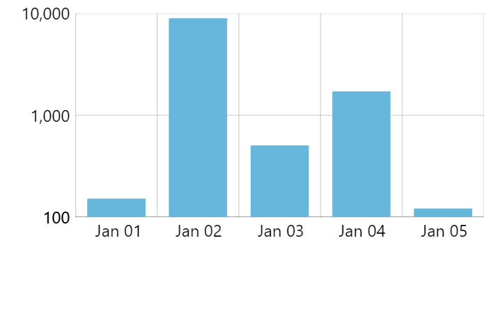
Logarithmic scale
Enabling
To enable logarithmic scale on a value axis, we can simply set its logarithmic setting to true:
let yAxis = chart.yAxes.push(
  am5xy.ValueAxis.new(root, {
    logarithmic: true,
    renderer: am5xy.AxisRendererY.new(root, {})
  })
);
var yAxis = chart.yAxes.push(
  am5xy.ValueAxis.new(root, {
    logarithmic: true,
    renderer: am5xy.AxisRendererY.new(root, {})
  })
);

Avoiding zero values
If our data contains zero values, logarithmic scale might be problematic, since logarithm of a zero is an invalid mathematical operation.
To work around such cases, value axis adds a setting treatZeroAs.
We can set it to a small number, so when axis encounters a zero, it will consider the alternative number instead, preventing critical failure.
let yAxis = chart.yAxes.push(
  am5xy.ValueAxis.new(root, {
    logarithmic: true,
    treatZeroAs: 0.001,
    renderer: am5xy.AxisRendererY.new(root, {})
  })
);
var yAxis = chart.yAxes.push(
  am5xy.ValueAxis.new(root, {
    logarithmic: true,
    treatZeroAs: 0.001,
    renderer: am5xy.AxisRendererY.new(root, {})
  })
);
Base value
A base value (or a zero value) is a number which separates positive and negative numbers.
It can affect how actual series are plotted.
For example, column series plots columns upwards for positive numbers, and downwards for negative ones.
By default, base value is 0 (zero).
Should we need to, we can change it using value axis' baseValue setting:
let yAxis = chart.yAxes.push(
  am5xy.ValueAxis.new(root, {
    baseValue: 100,
    renderer: am5xy.AxisRendererY.new(root, {})
  })
);
var yAxis = chart.yAxes.push(
  am5xy.ValueAxis.new(root, {
    baseValue: 100,
    renderer: am5xy.AxisRendererY.new(root, {})
  })
);
baseValue: 0 (default)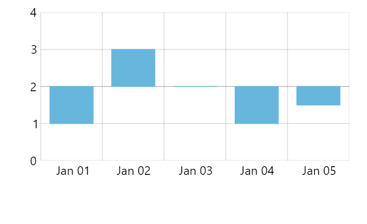
baseValue: 2Calculated values
If our chart setup requires some derivative values, e.g. sums, changes, etc., to be used either for plotting of series, or displaying in tooltips/legend, we need to enable such calculation on a related value axis.
For that we have calculateTotals setting, which needs to be set to true.
The process is described in great detail in "XY chart series: Display data fields".
Label format
Automatic formatting
Value axis will use global number formatter and format settings set on it to format numbers in its labels, with one exception: Value axis will control number of decimals so that it represents grid steps best.
For example, even if our global number format is set to "#.###" (which means up to 3 decimals), a value axis with very fine steps, may increase decimal number to be able to effectively show grid values, e.g. : 0.0001, 0.0002, etc.
Enforcing number precision
We can use value axis' maxPrecision setting to restrict maximum number of decimals.
For example, setting it to 0 (zero) will force an all-integer scale.
Please note that forcing maxPrecision will not just affect label formatting, but will also how and where grid lines are placed, as well as their density.
let yAxis = chart.yAxes.push(
  am5xy.ValueAxis.new(root, {
    maxPrecision: 0,
    renderer: am5xy.AxisRendererY.new(root, {})
  })
);
var yAxis = chart.yAxes.push(
  am5xy.ValueAxis.new(root, {
    maxPrecision: 0,
    renderer: am5xy.AxisRendererY.new(root, {})
  })
);
maxPrecision: 0Fixed number format
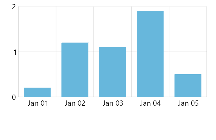
We can specify a totally custom number format for the axis labels, too.
For that we use numberFormat setting:
let yAxis = chart.yAxes.push(
  am5xy.ValueAxis.new(root, {
    numberFormat: "#.00'%'",
    renderer: am5xy.AxisRendererY.new(root, {})
  })
);
var yAxis = chart.yAxes.push(
  am5xy.ValueAxis.new(root, {
    numberFormat: "#.00'%'",
    renderer: am5xy.AxisRendererY.new(root, {})
  })
);
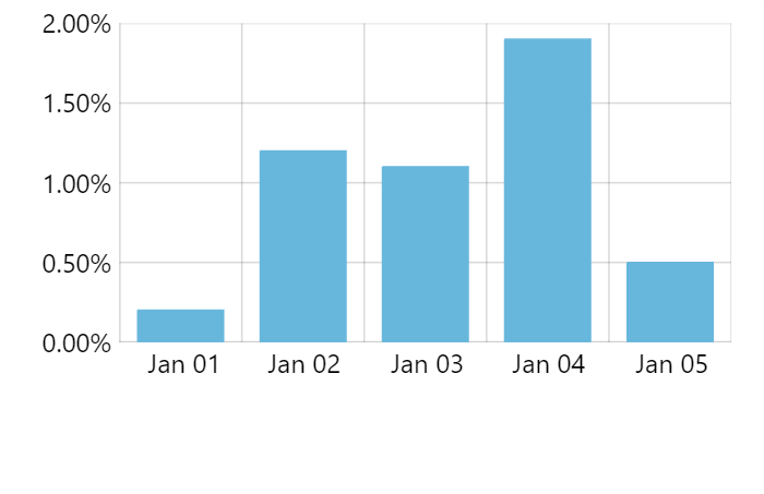
numberFormat: "#.000'%'"Tooltip number format
If our chart setup has a cursor as well as tooltips enabled for the value axis, tooltips will be shown indicating value at precise position of the cursor.
Normally, axis will use the same number format for the tooltip as for its labels.
There are a couple of ways to modify it.
Extra precision
We can increase precision of the numbers displayed in the tooltip using extraTooltipPrecision setting.
It basically means: "use X more decimals in tooltip than we use for axis labels".
It is useful in situations where we have grid lines with increments in 1, 0.1, etc.
let yAxis = chart.yAxes.push(
  am5xy.ValueAxis.new(root, {
    extraTooltipPrecision: 1,
    renderer: am5xy.AxisRendererY.new(root, {})
  })
);
var yAxis = chart.yAxes.push(
  am5xy.ValueAxis.new(root, {
    extraTooltipPrecision: 1,
    renderer: am5xy.AxisRendererY.new(root, {})
  })
);
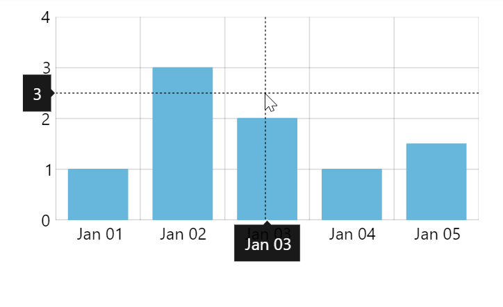
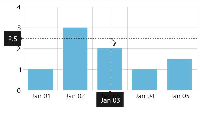
extraTooltipPrecision: 1Overriding format
Similarly to how we can override format for axis labels using numberFormat setting, we can force specific format for tooltips using tooltipNumberFormat as well:
let yAxis = chart.yAxes.push(
  am5xy.ValueAxis.new(root, {
    numberFormat: "#.00'%'",
    tooltipNumberFormat: "#.00'%'",
    renderer: am5xy.AxisRendererY.new(root, {})
  })
);
var yAxis = chart.yAxes.push(
  am5xy.ValueAxis.new(root, {
    numberFormat: "#.00'%'",
    tooltipNumberFormat: "#.00'%'",
    renderer: am5xy.AxisRendererY.new(root, {})
  })
);
Zooming
Zooming to value range
We can use value axis' method zoomToValues() to zoom the axis to specific value range:
yAxis.zoomToValues(100, 200);
yAxis.zoomToValues(100, 200);
Pre-zooming
Once data is loaded on some series the axis gets its scope of values from, we can use zoomToValues to pre-zoom it to some valuerange:
series.events.once("datavalidated", function(ev) {
  ev.target.get("xAxis").zoomToValues(100, 200);
});
series.events.once("datavalidated", function(ev) {
  ev.target.get("xAxis").zoomToValues(100, 200);
});
Read more about pre-zooming using series events in "XY chart axes: Pre-zooming axes".
Syncing grid
If the chart has multiple value axes, it will each have own value scale and thus will calculate position of its grid using own logic. This might result in a chart with a relatively messy grid.
For that there's a value axis' setting: syncWithAxis.
It needs to be set to an instance of another value axis that we want grid to be synced with.
let yAxis1 = chart.yAxes.push(am5xy.ValueAxis.new(root, {
  renderer: am5xy.AxisRendererY.new(root, {})
}));


let yAxis2 = chart.yAxes.push(am5xy.ValueAxis.new(root, {
  syncWithAxis: yAxis1,
  renderer: am5xy.AxisRendererY.new(root, {
    opposite: true
  })
}));
var yAxis1 = chart.yAxes.push(am5xy.ValueAxis.new(root, {
  renderer: am5xy.AxisRendererY.new(root, {})
}));


var yAxis2 = chart.yAxes.push(am5xy.ValueAxis.new(root, {
  syncWithAxis: yAxis1,
  renderer: am5xy.AxisRendererY.new(root, {
    opposite: true
  })
}));
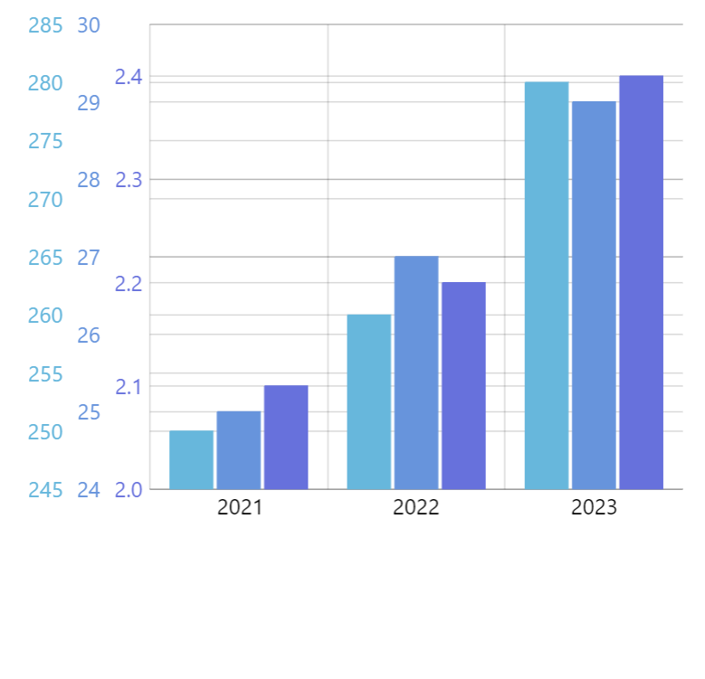
NOTEsyncWithAxis setting is experimental and is not guaranteed to work perfectly in 100% of scenarios.
See the Pen amCharts 5: Clustered columns by amCharts team (@amcharts) on CodePen.
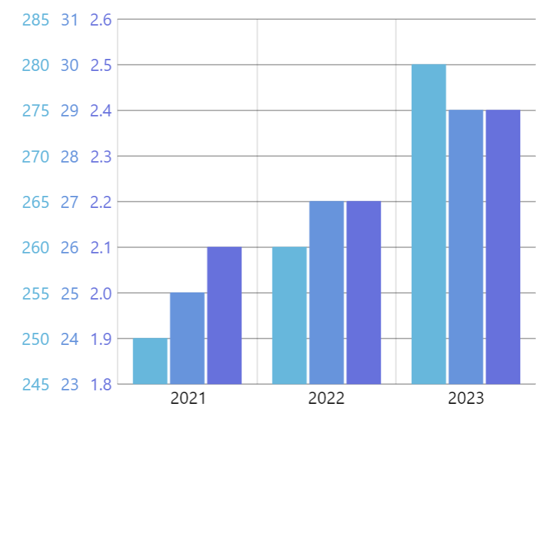
Syncing zero lines
Sometimes, it makes sense to not just sync grid but also the zero-value line.
To enable it, set syncZeros to true in axis' settings. Please note, that syncWithAxis still needs to be set for it to work properly.
It will only work if both synced axes include zero in their range.
let yAxis1 = chart.yAxes.push(am5xy.ValueAxis.new(root, {
  renderer: am5xy.AxisRendererY.new(root, {})
}));


let yAxis2 = chart.yAxes.push(am5xy.ValueAxis.new(root, {
  syncWithAxis: yAxis1,
  syncZeros: true,
  renderer: am5xy.AxisRendererY.new(root, {
    opposite: true
  })
}));
var yAxis1 = chart.yAxes.push(am5xy.ValueAxis.new(root, {
  renderer: am5xy.AxisRendererY.new(root, {})
}));


var yAxis2 = chart.yAxes.push(am5xy.ValueAxis.new(root, {
  syncWithAxis: yAxis1,
  syncZeros: true,
  renderer: am5xy.AxisRendererY.new(root, {
    opposite: true
  })
}));
Events
Value axis does not have specific events that are triggered when it is zoomed.
Instead, we can use private setting change events on selectionMin and selectionMax private settings:
xAxis.onPrivate("selectionMin", function(start, target) {
  console.log("Start value changed:", start);
});

xAxis.onPrivate("selectionMax", function(end, target) {
  console.log("End value changed:", end);
});
xAxis.onPrivate("selectionMin", function(start, target) {
  console.log("Start value changed:", start);
});

xAxis.onPrivate("selectionMax", function(end, target) {
  console.log("End value changed:", end);
});
Ghost label
Each value axis contains a "ghost" label, accessible via its ghostLabel property.
It's an axis label that is not visible and does not represent any actual value, but is there to ensure constant width of the axis.
The width of the ghost label has width of the longest possible label in the range of values available in the chart.
When chart is zoomed, range of displayed values might change. Consequently, all labels in displayed range might be narrower than when the labels when the chart is fully zoomed out. If axis width would depend on the width of the currently displayed labels, the width of the axis, and in turn width of the plot area might change dynamically, resulting in unpleasant jumping.
This is why there's a ghost label, holding axis width constant, regardless of the rest of the labels.
If we'd like to disable this behavior, we can disable the ghost label:
yAxis.ghostLabel.set("forceHidden", true);
yAxis.ghostLabel.set("forceHidden", true);
Or, we can set specific width for it:
yAxis.ghostLabel.set("minWidth", 200);
yAxis.ghostLabel.set("minWidth", 200);
The following demo uses ghost label to sync width between two charts:
See the Pen Syncing axis widths across multiple charts by amCharts team (@amcharts) on CodePen.