This tutorial will look at how to configure treemap series.
Nodes
Layout algorithm
Treemap can use different ways to layout algorithms.
It's controlled by the setting layoutAlgorithm:
let series = root.container.children.push(
  am5hierarchy.Treemap.new(root, {
    valueField: "value",
    categoryField: "name",
    childDataField: "children",
    layoutAlgorithm: "sliceDice"
  })
);
var series = root.container.children.push(
  am5hierarchy.Treemap.new(root, {
    valueField: "value",
    categoryField: "name",
    childDataField: "children",
    layoutAlgorithm: "sliceDice"
  })
);
Available settings are as follows:
| Setting value | Example |
|---|---|
"binary" | 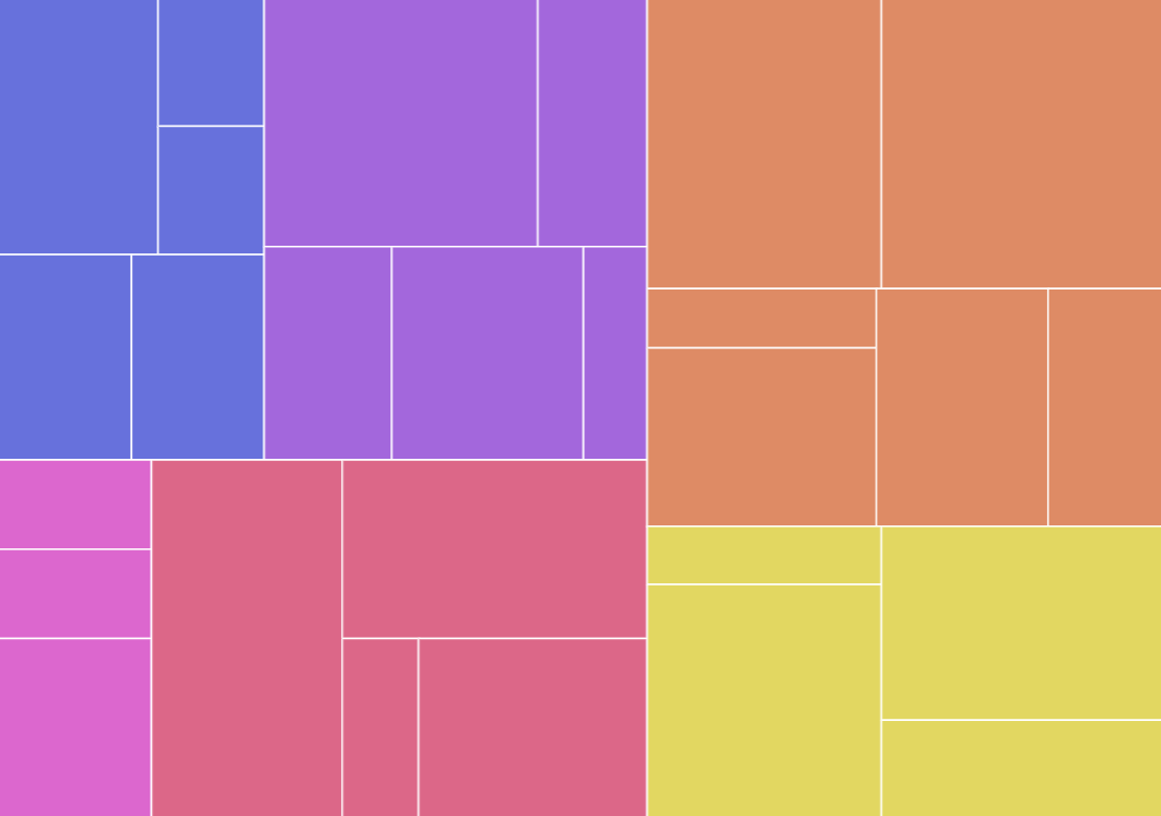 |
"squarify" | 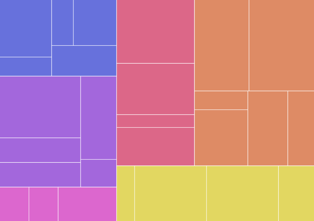 |
"slice" | 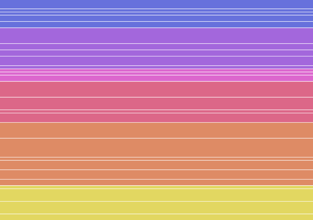 |
"dice" | 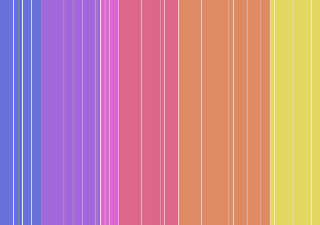 |
"sliceDice" | 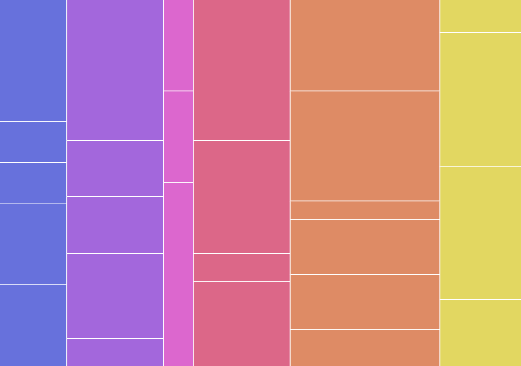 |
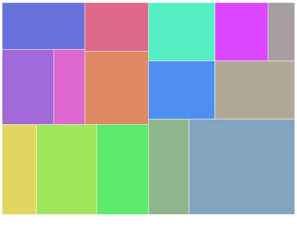
Margins
By default, the rectangles of the nodes are plotted without any gaps between them.
We do have a few settings at our disposal that we can use to control the gaps. All accept numeric value in pixels.
| Setting | Comment |
|---|---|
nodePaddingInner | Gap between nodes. |
nodePaddingOuter | Gap between nodes and outer edge of the chart. |
nodePaddingTop | Gap between nodes and top edge. Will be ignored if nodePaddingOuter is set. |
nodePaddingBottom | Gap between nodes and bottomedge. Will be ignored if nodePaddingOuter is set. |
nodePaddingLeft | Gap between nodes and left edge. Will be ignored if nodePaddingOuter is set. |
nodePaddingRight | Gap between nodes and bottom edge. Will be ignored if nodePaddingOuter is set. |
let series = root.container.children.push(
  am5hierarchy.Treemap.new(root, {
    valueField: "value",
    categoryField: "name",
    childDataField: "children",
    nodePaddingOuter: 20,
    nodePaddingInner: 10
  })
);
var series = root.container.children.push(
  am5hierarchy.Treemap.new(root, {
    valueField: "value",
    categoryField: "name",
    childDataField: "children",
    nodePaddingOuter: 20,
    nodePaddingInner: 10
  })
);
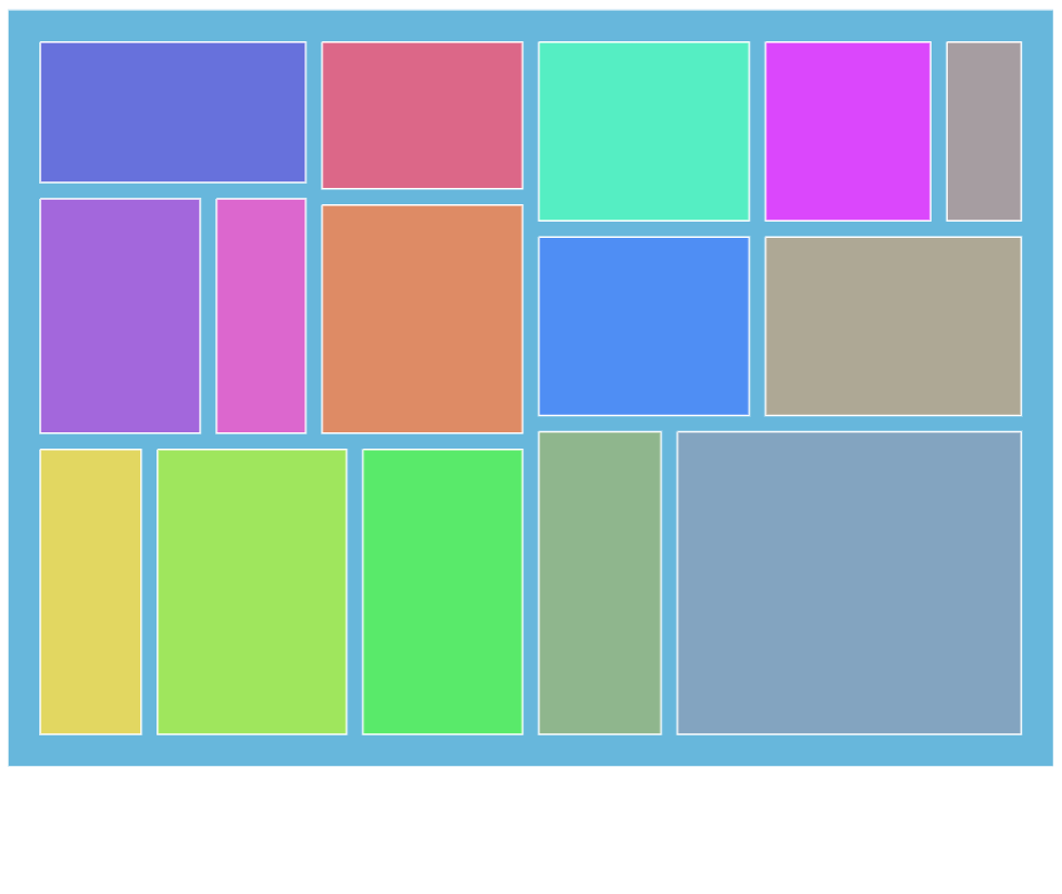
nodePaddingOuter: 20nodePaddingInner: 10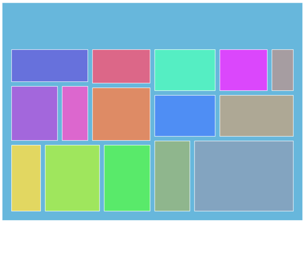
nodePaddingInner: 10nodePaddingTop: 100nodePaddingBottom: 20nodePaddingLeft: 20nodePaddingRight: 20Node appearance
The appearance of node rectangles can be configured using their template, accessible on series property: rectangles.template.
The template can have contain any RoundedRectangle setting.
series.rectangles.template.setAll({
  fillOpacity: 0.7,
  cornerRadiusTL: 4,
  cornerRadiusTR: 4,
  cornerRadiusBL: 4,
  cornerRadiusBR: 4
});
series.rectangles.template.setAll({
  fillOpacity: 0.7,
  cornerRadiusTL: 4,
  cornerRadiusTR: 4,
  cornerRadiusBL: 4,
  cornerRadiusBR: 4
});
Hover behavior
We can set setting values to apply to a rectangle when it is hovered by creating a "hover" state for it.
series.rectangles.template.states.create("hover", {
  fill: am5.color(0x677935),
  fillOpacity: 1
});
series.rectangles.template.states.create("hover", {
  fill: am5.color(0x677935),
  fillOpacity: 1
});
Labels
Configuring labels
Series label configuration is done via its template, accessible via series property labels.template.
series.labels.template.setAll({
  fontSize: 20,
  fill: am5.color(0x550000),
  text: "{category}"
});
series.labels.template.setAll({
  fontSize: 20,
  fill: am5.color(0x550000),
  text: "{category}"
});
Partition series uses Label for its labels. Check out its class reference for all the possible settings.
Label content
Node labels are pre-set to display name of the category and its percent value.
We can modify contents of the tooltips using text setting on a series label template:
series.labels.template.setAll({
  text: "{category}: [bold]{sum}[/]",
  fontSize: 14
});
series.labels.template.setAll({
  text: "{category}: [bold]{sum}[/]",
  fontSize: 14
});
Contents of the tooltip can include data placeholders (codes in curly brackets that will be replaced by actual data) and in-line formatting blocks (formatting instructions enclosed in square brackets).
Disabling labels
To disable series labels, we can set forceHidden setting to true in their template:
series.labels.template.set("forceHidden", true);
series.labels.template.set("forceHidden", true);
Tooltips
Rectangles series are pre-set to display a tooltip on hover containing name of the category and its value.
We can modify contents of the tooltips using tooltipText on node's template:
series.nodes.template.set("tooltipText", "{category}: [bold]{sum}[/]");
series.nodes.template.set("tooltipText", "{category}: [bold]{sum}[/]");
Contents of the tooltip can include data placeholders (codes in curly brackets that will be replaced by actual data) and in-line formatting blocks (formatting instructions enclosed in square brackets).
Example
See the Pen Partition chart by amCharts team (@amcharts) on CodePen.
Related tutorials
- Adaptive label colors on a Treemap
- Treemap with partial fills in nodes (demo)
- Treemap with auto-colored labels (demo)
- Treemap with highlight of parent node on hover (demo)