This tutorial is about configuring various aspects of a pie series appearance.
Slices
Slice colors
Slice colors are important. They identify a slice and connect it to its legend item visually.
There are a few ways to control how colors are assigned to slices.
Auto-assigned colors
A series will automatically assign a unique color to each slice from its own color set.
Should we want to, we can override the whole list of colors by either setting it directly on series color set, creating a quick theme, or a reusable full theme, e.g.:
series.get("colors").set("colors", [
  am5.color(0x095256),
  am5.color(0x087f8c),
  am5.color(0x5aaa95),
  am5.color(0x86a873),
  am5.color(0xbb9f06)
]);
series.get("colors").set("colors", [
  am5.color(0x095256),
  am5.color(0x087f8c),
  am5.color(0x5aaa95),
  am5.color(0x86a873),
  am5.color(0xbb9f06)
]);
MORE INFO A "Color sets" section of our color tutorial has more details and code samples.
Manual slice colors
We can also specify color for each slice through data and template fields.
For more information on how to do it, refer to "Template fields" tutorial.
Configuring slices
Configuration of a slice is done via its template, which is accessible via series template list: series.slices.template.
We can set any setting via template:
series.slices.template.setAll({
  fillOpacity: 0.5,
  stroke: am5.color(0xffffff),
  strokeWidth: 2
});
series.slices.template.setAll({
  fillOpacity: 0.5,
  stroke: am5.color(0xffffff),
  strokeWidth: 2
});
NOTE Setting a value on a template will also update existing slices created using it.
Modifying hover state
Slice will grow a bit when hovered, by default.
We can modify hover state to modify that look. The below code will make a donut slice grow inwards, as opposed to outwards when hovered:
series.slices.template.states.create("hover", {
  scale: 1,
  innerRadius: 80
});
series.slices.template.states.create("hover", {
  scale: 1,
  innerRadius: 80
});
Slice pull-out
If we click on a slice in a pie series it will pull out of the place. It's the default behavior.
What happens here is that slice has its togglable setting set to true by default, so that when it is clicked active state is applied to it. Subsequent click removes resets it back to default state. And so on.
Disabling pull-out
To disable pull-out, we can simply set toggleKey setting on slice template to "none":
series.slices.template.set("toggleKey", "none");
series.slices.template.set("toggleKey", "none");
Modifying active state
We can also modify active state to change how a slice behaves or looks when clicked.
The default active state defines single setting: shiftRadius: 20. We can set our own stuff there:
series.slices.template.states.create("active", {
  shiftRadius: 0,
  stroke: am5.color(0x995522),
  strokeWidth: 5
});
series.slices.template.states.create("active", {
  shiftRadius: 0,
  stroke: am5.color(0x995522),
  strokeWidth: 5
});
See the Pen Modifying active state on pie slices by amCharts team (@amcharts) on CodePen.
Labels
Configuring labels
Series label configuration is done via its template, accessible via series property labels.template.
series.labels.template.setAll({
  fontSize: 20,
  fill: am5.color(0x550000),
  text: "{category}"
});
series.labels.template.setAll({
  fontSize: 20,
  fill: am5.color(0x550000),
  text: "{category}"
});
Pie series uses RadialLabel for its labels. Check out its class reference for all the possible settings.
Label content
Slice labels are pre-set to display name of the category and its percent value.
We can modify contents of the tooltips using text setting on a series label template:
series.labels.template.set("text", "{category}: [bold]{valuePercentTotal.formatNumber('0.00')}%[/] ({value})");
series.labels.template.set("text", "{category}: [bold]{valuePercentTotal.formatNumber('0.00')}%[/] ({value})");
Contents of the label can include data placeholders (codes in curly brackets that will be replaced by actual data) and in-line formatting blocks (formatting instructions enclosed in square brackets).
Disabling labels
To disable series labels, we can set forceHidden setting to true in their template:
series.labels.template.set("forceHidden", true);
series.labels.template.set("forceHidden", true);
Alignment
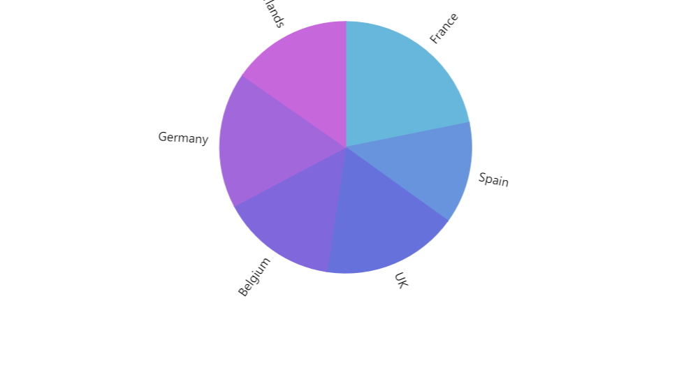
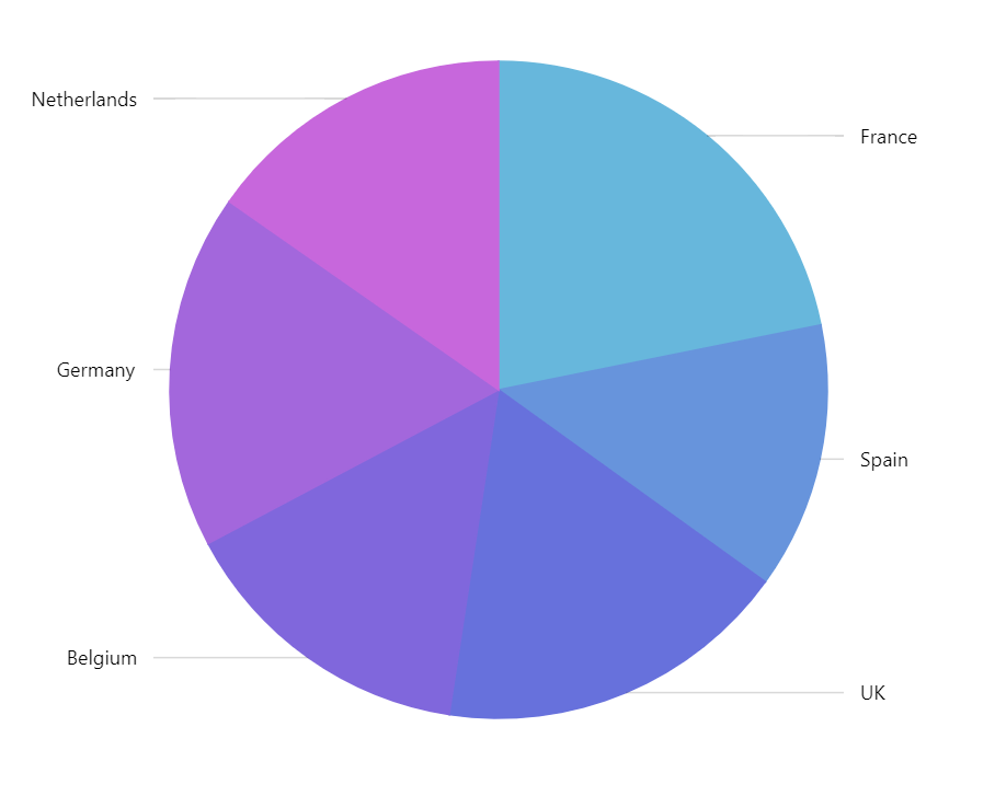
Pie series labels can either be aligned into two columns (default) or position themselves equal distance from the related slices.
This can be disabled using series setting alignLabels.
let series = chart.series.push(
  am5percent.PieSeries.new(root, {
    name: "Series",
    categoryField: "country",
    valueField: "sales",
    alignLabels: false
  })
);
var series = chart.series.push(
  am5percent.PieSeries.new(root, {
    name: "Series",
    categoryField: "country",
    valueField: "sales",
    alignLabels: false
  })
);
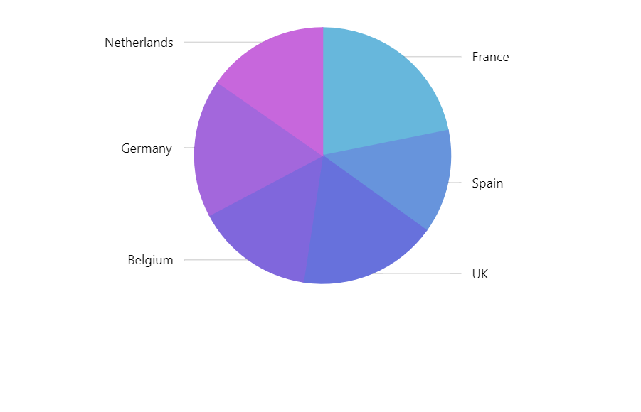
alignLabels: true (default)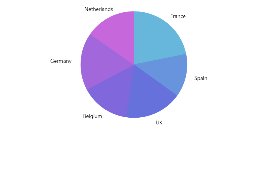
alignLabels: falseSee the Pen Radial labels by amCharts team (@amcharts) on CodePen.
Radius
Label setting radius that can be set via its template controls distance from the slice's outer edge.
It's a number in pixels. The higher the radius, the further from the slice edge the label will be:
series.labels.template.setAll({
  radius: 10
});
series.labels.template.setAll({
  radius: 10
});
Labels inside the slice
We can set inside setting to true on the label template, if we want the labels to appear inside the slice.
If we do so, the radius setting will revert: it will mean radius in pixels inwards, rather than outwards from the slice's outer edge.
series.labels.template.setAll({
  radius: 10,
  inside: true
});
series.labels.template.setAll({
  radius: 10,
  inside: true
});
Circular labels
We can also arrange labels to curve along the outer edge of the slice by setting textType: "circular" on the label template.
series.labels.template.setAll({
  text: "{category}",
  textType: "circular",
  inside: true,
  radius: 10
});
series.labels.template.setAll({
  text: "{category}",
  textType: "circular",
  inside: true,
  radius: 10
});
IMPORTANT Pie series' alignLabels (default: true) takes precedence over the textType setting. Make sure you set alignLabels: false on series, too.
let series = chart.series.push(
  am5percent.PieSeries.new(root, {
    // ...
    alignLabels: false
  })
);
var series = chart.series.push(
  am5percent.PieSeries.new(root, {
    // ...
    alignLabels: false
  })
);
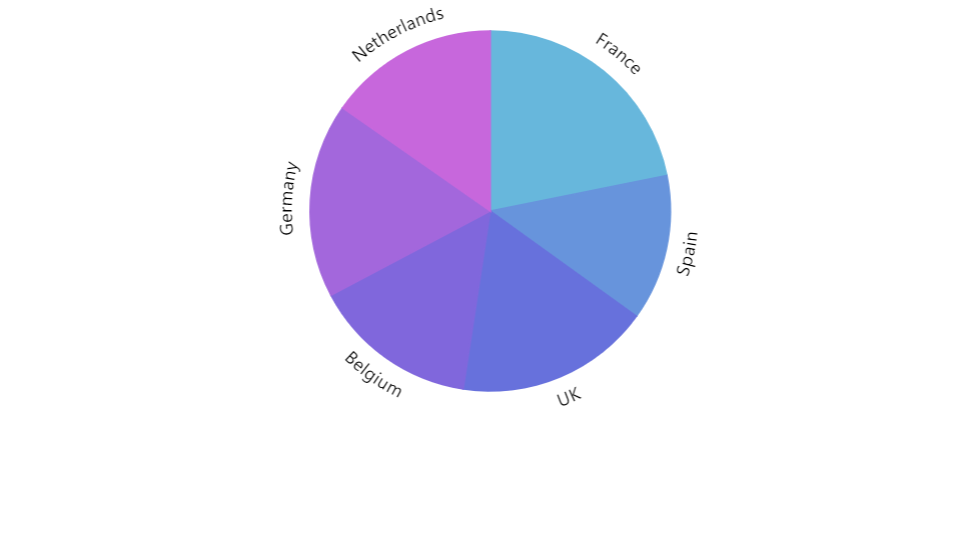
{ textType: "circular", inside: false }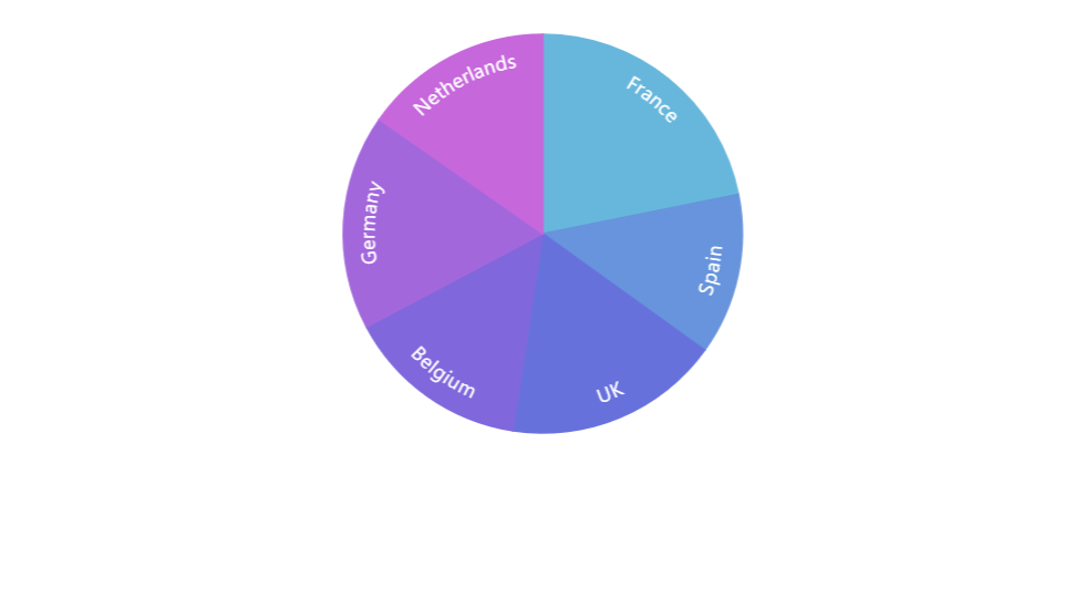
{ textType: "circular", inside: true }See the Pen Modifying active state on pie slices by amCharts team (@amcharts) on CodePen.
Radial labels
We can also make labels radiate outwards from the center of the pie, like rays.
To do so we need to set textType to radial.
We'll also need to use centerX setting to control anchor point of the label. A value of 0 (zero) will mean that anchor point is beginning of the label, so the labels will radiate outwards starting from slice edge + whatever radius we have set.
A value of 100 means end of the label, which means that labels will end at the slice outer edge, effectively putting them inside the slice.
series.labels.template.setAll({
  text: "{category}",
  textType: "radial",
  centerX: am5.percent(100)
});
series.labels.template.setAll({
  text: "{category}",
  textType: "radial",
  centerX: am5.percent(100)
});
IMPORTANT Pie series' alignLabels (default: true) takes precedence over the textType setting. Make sure you set alignLabels: false on series, too.
let series = chart.series.push(
  am5percent.PieSeries.new(root, {
    // ...
    alignLabels: false
  })
);
var series = chart.series.push(
  am5percent.PieSeries.new(root, {
    // ...
    alignLabels: false
  })
);
{ textType: "radial", centerX: am5.percent(0) }
{ textType: "radial", centerX: am5.percent(100) } See the Pen Circular labels by amCharts team (@amcharts) on CodePen.
Labels that don't fit
Check out the "Handling pie chart labels that don't fit" tutorial for many useful techniques.
Ticks
Configuring ticks
Series tick configuration is done via its template, accessible via series property ticks.template.
series.ticks.template.setAll({
  stroke: am5.color(0x550000),
  strokeWidth: 2
});
series.ticks.template.setAll({
  stroke: am5.color(0x550000),
  strokeWidth: 2
});
Series uses Tick for its labels. Check out its class reference for all the possible settings.
Disabling ticks
To disable series ticks, we can set visible setting to true in their template:
series.ticks.template.set("visible", false);
series.ticks.template.set("visible", false);
Tick location
The tick will point to the outer edge of the slice by default.
That can be changed using tick template setting location.
It's a numeric value from 0 (zero) to 1 (one) indicating relative position within the slice.
series.ticks.template.setAll({
  location: 0.5
});
series.ticks.template.setAll({
  location: 0.5
});
The above will make tick point to the middle of the slice.
location: 1 (default)
location: 0.8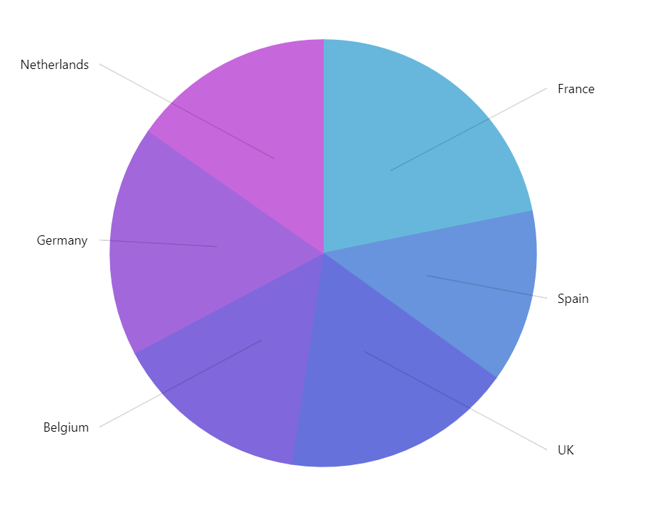
location: 0.5Tooltips
Slices in a pie series are pre-set to display a tooltip on hover containing name of the category and its percent value.
We can modify contents of the tooltips using tooltipText on slice's template:
series.slices.template.set("tooltipText", "{category}: [bold]{valuePercentTotal.formatNumber('0.00')}%[/] ({value})");
series.slices.template.set("tooltipText", "{category}: [bold]{valuePercentTotal.formatNumber('0.00')}%[/] ({value})");
Contents of the tooltip can include data placeholders (codes in curly brackets that will be replaced by actual data) and in-line formatting blocks (formatting instructions enclosed in square brackets).
To disable tooltips, set tooltipText to an empty string:
series.slices.template.set("tooltipText", "");
series.slices.template.set("tooltipText", "");
Binding settings to data
It's possible to bind settings of a series slice, label, and tick templates to values in data.
For more information on how to do it, refer to "Template fields" tutorial.
Related tutorials
- One pulled slice per pie series
- Sum label inside a donut chart
- Pre-hiding pie chart slices
- Hiding labels and ticks for small pie slices
- Selectively displaying pie chart labels inside or outside slices
- Using slice color for PieChart label backgrounds
- Coloring pie labels and ticks by slice