This tutorial will look at various ways how we can enable, configure, and trigger tooltips in amCharts 5.
Enabling
Common elements
The easiest way to enable rollover tooltips is to set element's tooltipText setting.
It can be set directly on an element, or a template.
For example, we can set a tooltip to be shown when XY chart's zoom out button is hovered:
zoomOutButton.set("tooltipText", "Click to zoom out");
zoomOutButton.set("tooltipText", "Click to zoom out");
The following code will set a rollover tooltip on all columns in a column series using its template:
series.columns.template.setAll({
  tooltipText: "{name}, {categoryX}: {valueY}"
});
series.columns.template.setAll({
  tooltipText: "{name}, {categoryX}: {valueY}"
});
tooltipText supports data placeholders, which means that we can use curly bracket references to related data item and element itself. For more information, please refer to "Data placeholders" tutorial.
Shared tooltip
When root element is created, it does create a single shared Tooltip instance which is reused for most elements.
Whenever tooltip needs to be shown, that shared tooltip instance is populated with data and colors of the target element, as well as positioned according to settings.
Individual tooltip
If we would like to configure tooltip for some element (or its children) we will need to set up a dedicated instance of a Tooltip for that element.
We can do that by assigning a new instance of the Tooltip to element's tooltip setting.
The following will create a dedicated tooltip for a scrollbar, as well as enable rollover tooltips on its grips:
let scrollbar = am5.Scrollbar.new(root, {
  orientation: "horizontal"
});

let tooltip = am5.Tooltip.new(root, {});

tooltip.get("background").setAll({
  fill: am5.color(0xeeeeee)
});

scrollbar.set("tooltip", tooltip);

scrollbar.startGrip.set("tooltipText", "Drag to zoom");
scrollbar.endGrip.set("tooltipText", "Drag to zoom");

chart.set("scrollbarX", scrollbar);
var scrollbar = am5.Scrollbar.new(root, {
  orientation: "horizontal"
});

var tooltip = am5.Tooltip.new(root, {});

tooltip.get("background").setAll({
  fill: am5.color(0xeeeeee)
});

scrollbar.set("tooltip", tooltip);

scrollbar.startGrip.set("tooltipText", "Drag to zoom");
scrollbar.endGrip.set("tooltipText", "Drag to zoom");

chart.set("scrollbarX", scrollbar);
See the Pen Custom tooltip on scrollbar grips by amCharts team (@amcharts) on CodePen.
Series
If we want our chart to be able to show multiple tooltips for multiple series at once, we need to:
- Create individual tooltips for each series.
- Set up tooltip label to show the information we want it to show.
- Enable chart cursor.
let series = chart.series.push(
  am5xy.LineSeries.new(root, {
    xAxis: xAxis,
    yAxis: yAxis,
    valueYField: field,
    valueXField: "date",
    tooltip: am5.Tooltip.new(root, {
      labelText: "[bold]{name}[/]\n{valueX.formatDate()}: {valueY}"
    })
  })
);

series.data.setAll(data);
var series = chart.series.push(
  am5xy.LineSeries.new(root, {
    xAxis: xAxis,
    yAxis: yAxis,
    valueYField: field,
    valueXField: "date",
    tooltip: am5.Tooltip.new(root, {
      labelText: "[bold]{name}[/]\n{valueX.formatDate()}: {valueY}"
    })
  })
);

series.data.setAll(data);
NOTESeries tooltips will only be shown if there's a cursor enabled for the chart. For more information, refer to the "Cursor" tutorial.
Hoverable tooltips
If we want to keep the target element hovered (and tooltip visible) when move pointer (e.g. mouse) position over open tooltip, we need to set tooltip's keepTargetHover: true.
let series = chart.series.push(
  am5xy.ColumnSeries.new(root, {
    xAxis: xAxis,
    yAxis: yAxis,
    valueYField: field,
    valueXField: "date",
    tooltip: am5.Tooltip.new(root, {
      keepTargetHover: true
    })
  })
);

series.columns.template.setAll({
  tooltipText: "{categoryX}: {valueY}"
});
var series = chart.series.push(
  am5xy.ColumnSeries.new(root, {
    xAxis: xAxis,
    yAxis: yAxis,
    valueYField: field,
    valueXField: "date",
    tooltip: am5.Tooltip.new(root, {
      keepTargetHover: true
    })
  })
);

series.columns.template.setAll({
  tooltipText: "{categoryX}: {valueY}"
});
Colors
Default colors
Tooltips will automatically inherit its background color from target element's fill setting.
If such element does not have any fill set (or does not support such setting) the tooltip will be transparent. In such case, please refer to the section below on how to set fill color manually.
Tooltip will also have a stroke (outline) set to white by default.
Finally, tooltip text will be colored either in white or black, whichever contrasts more with tooltip background color.
The following sections will examine how we can change those to anything else.
Background
If we need to change background color, we will first need to disable fill inheritance by setting tooltip's getFillFromSprite to false.
Then we can set fill on tooltip's background element.
let tooltip = am5.Tooltip.new(root, {
  getFillFromSprite: false,
  labelText: "[bold]{name}[/]\n{valueX.formatDate()}: {valueY}"
});

tooltip.get("background").setAll({
  fill: am5.color(0xffffff),
  fillOpacity: 0.8
});

series.set("tooltip", tooltip);
var tooltip = am5.Tooltip.new(root, {
  getFillFromSprite: false,
  labelText: "[bold]{name}[/]\n{valueX.formatDate()}: {valueY}"
});

tooltip.get("background").setAll({
  fill: am5.color(0xffffff),
  fillOpacity: 0.8
});

series.set("tooltip", tooltip);
Outline
To change color of the outline, all we need to do is to set background's stroke setting:
let tooltip = am5.Tooltip.new(root, {
  labelText: "[bold]{name}[/]\n{valueX.formatDate()}: {valueY}"
});

tooltip.get("background").setAll({
  stroke: am5.color(0x000000),
  strokeOpacity: 0.8
});

series.set("tooltip", tooltip);
var tooltip = am5.Tooltip.new(root, {
  labelText: "[bold]{name}[/]\n{valueX.formatDate()}: {valueY}"
});

tooltip.get("background").setAll({
  stroke: am5.color(0x000000),
  strokeOpacity: 0.8
});

series.set("tooltip", tooltip);
We can also make tooltip outline inherit stroke from the target element, similarly fill is inherited for tooltip's background.
For that we will need to set getStrokeFromSprite to true:
let tooltip = am5.Tooltip.new(root, {
  getStrokeFromSprite: true,
  labelText: "[bold]{name}[/]\n{valueX.formatDate()}: {valueY}"
});

series.set("tooltip", tooltip);
var tooltip = am5.Tooltip.new(root, {
  getStrokeFromSprite: true,
  labelText: "[bold]{name}[/]\n{valueX.formatDate()}: {valueY}"
});

series.set("tooltip", tooltip);
Text color
If we need specific color for tooltip text, we will first need to disable default behavior of choosing a contrasting color based on the background.
To do that we will need to set autoTextColor setting to false. Then we can set fill setting of the tooltip's label element:
let tooltip = am5.Tooltip.new(root, {
  autoTextColor: false,
  labelText: "[bold]{name}[/]\n{valueX.formatDate()}: {valueY}"
});

tooltip.label.setAll({
  fill: am5.color(0xff5566)
});

series.set("tooltip", tooltip);
var tooltip = am5.Tooltip.new(root, {
  autoTextColor: false,
  labelText: "[bold]{name}[/]\n{valueX.formatDate()}: {valueY}"
});

tooltip.label.setAll({
  fill: am5.color(0xff5566)
});

series.set("tooltip", tooltip);
We can also make tooltip label inherit fill color from the target element, by using getLabelFillFromSprite setting:
let tooltip = am5.Tooltip.new(root, {
  getLabelFillFromSprite: true,
  labelText: "[bold]{name}[/]\n{valueX.formatDate()}: {valueY}"
});

series.set("tooltip", tooltip);
var tooltip = am5.Tooltip.new(root, {
  getLabelFillFromSprite: true,
  labelText: "[bold]{name}[/]\n{valueX.formatDate()}: {valueY}"
});

series.set("tooltip", tooltip);
Full example
The following code will make column series' tooltips have white background, but will inherit its stroke and text color from the target column:
let tooltip = am5.Tooltip.new(root, {
  getFillFromSprite: false,
  getStrokeFromSprite: true,
  autoTextColor: false,
  getLabelFillFromSprite: true,
  labelText: "[bold]{name}[/]\n{valueX.formatDate()}: {valueY}"
});

tooltip.get("background").setAll({
  fill: am5.color(0xffffff),
  fillOpacity: 0.8
});

series.set("tooltip", tooltip);
var tooltip = am5.Tooltip.new(root, {
  getFillFromSprite: false,
  getStrokeFromSprite: true,
  autoTextColor: false,
  getLabelFillFromSprite: true,
  labelText: "[bold]{name}[/]\n{valueX.formatDate()}: {valueY}"
});

tooltip.get("background").setAll({
  fill: am5.color(0xffffff),
  fillOpacity: 0.8
});

series.set("tooltip", tooltip);
See the Pen Custom tooltip on scrollbar grips by amCharts team (@amcharts) on CodePen.
Colors from bullets
Normally, tooltips will inherit its colors from target series' fill and stroke settings.
However, we can make it inherit from bullets instead, by setting series' setting seriesTooltipTarget to "bullet".
In such case, tooltip will take series first bullet (if available) and use it as a source for its colors.
let series = chart.series.push(
  am5xy.LineSeries.new(root, {
    xAxis: xAxis,
    yAxis: yAxis,
    valueYField: field,
    valueXField: "date",
    seriesTooltipTarget: "bullet",
    tooltip: am5.Tooltip.new(root, {
      pointerOrientation: "horizontal"
    })
  })
);
var series = chart.series.push(
  am5xy.LineSeries.new(root, {
    xAxis: xAxis,
    yAxis: yAxis,
    valueYField: field,
    valueXField: "date",
    seriesTooltipTarget: "bullet",
    tooltip: am5.Tooltip.new(root, {
      pointerOrientation: "horizontal"
    })
  })
);
Orientation
Depending on the situation, tooltip can be shown above, below, to the left, or to the right of the target point.
The defaults differ for various elements, but we can control it by explicitly setting tooltip's pointerOrientation.
let series = chart.series.push(
  am5xy.LineSeries.new(root, {
    xAxis: xAxis,
    yAxis: yAxis,
    valueYField: field,
    valueXField: "date",
    tooltip: am5.Tooltip.new(root, {
      pointerOrientation: "horizontal"
    })
  })
);
var series = chart.series.push(
  am5xy.LineSeries.new(root, {
    xAxis: xAxis,
    yAxis: yAxis,
    valueYField: field,
    valueXField: "date",
    tooltip: am5.Tooltip.new(root, {
      pointerOrientation: "horizontal"
    })
  })
);
| Orientation | Example #1 | Example #2 |
|---|---|---|
"horizontal" | 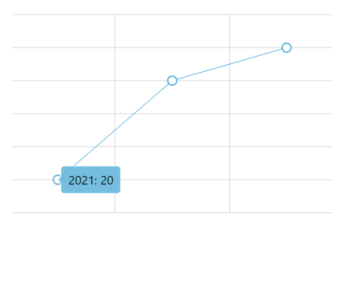 | 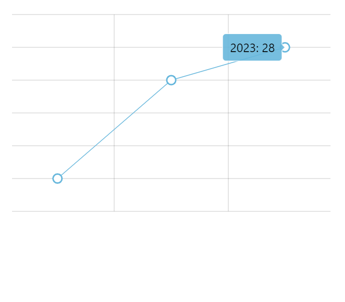 |
"left" | | 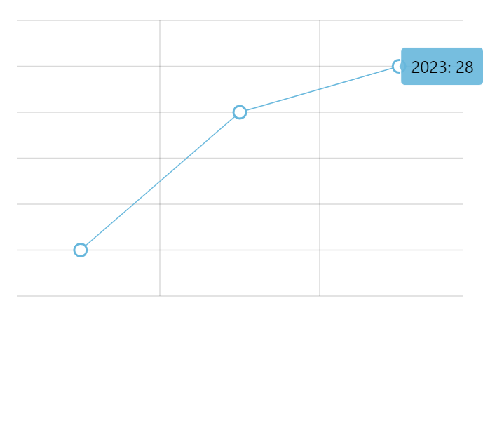 |
"right" | 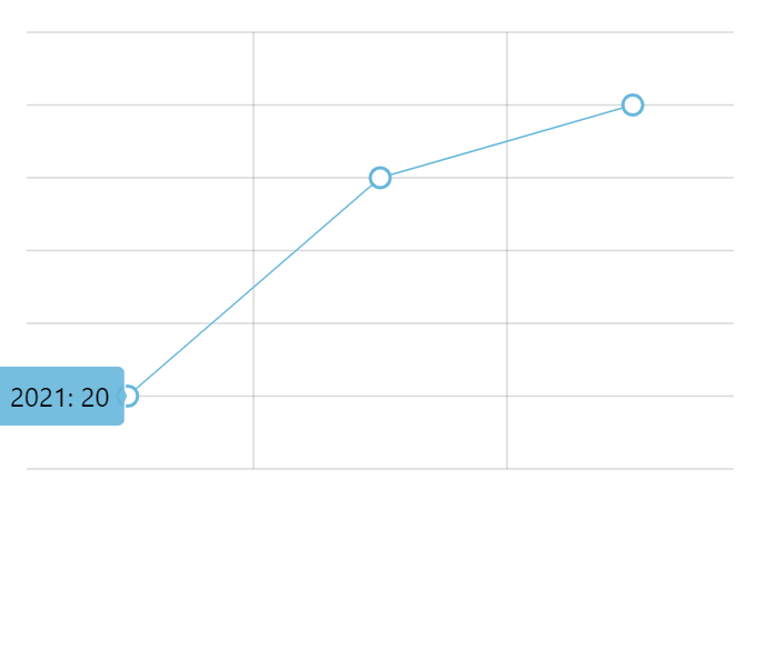 | |
"vertical" | 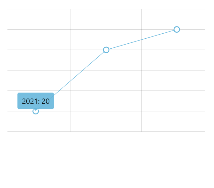 | 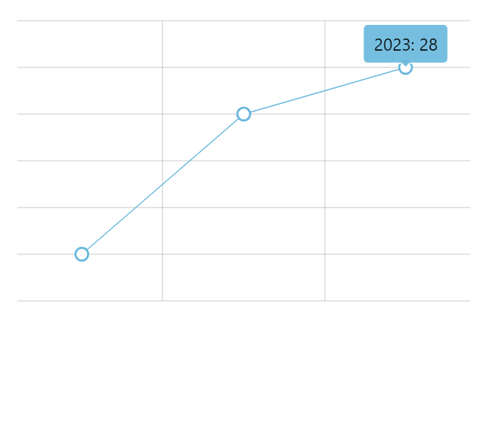 |
"down" | | |
"up" | 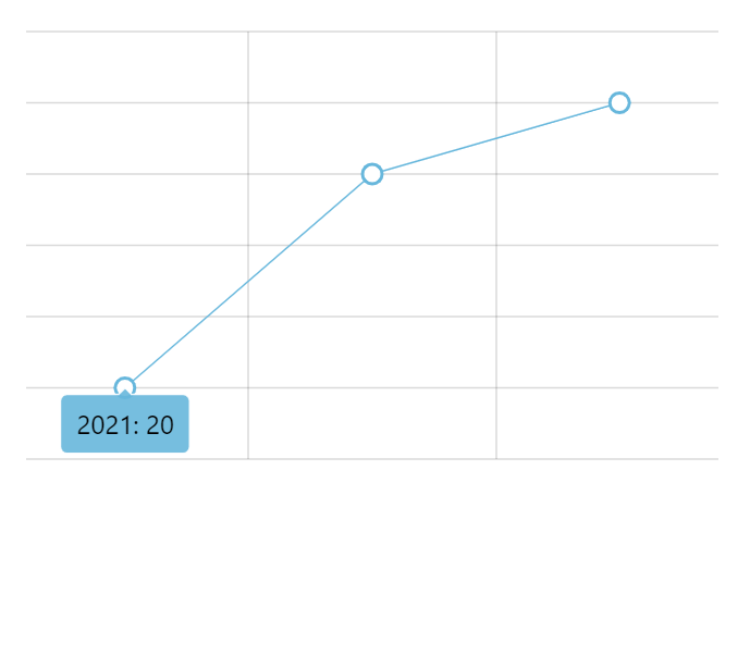 | 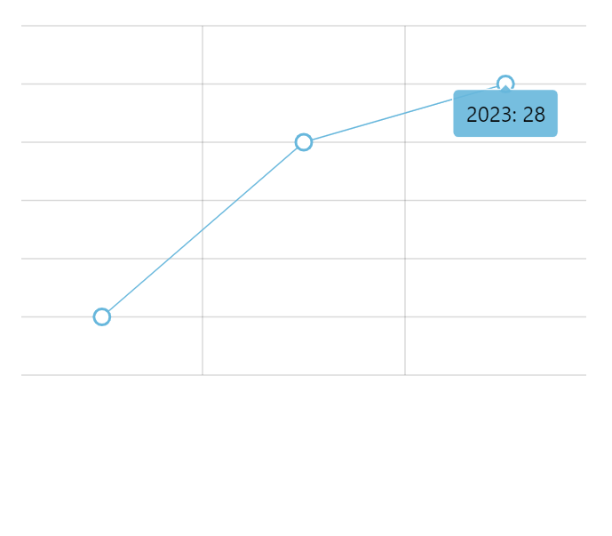 |
See the Pen by amCharts team (@amcharts) on CodePen.
Position
Without cursor
For elements that have width and height (e.g. columns), it's possible to set the point its tooltip will be anchored to.
For that we have tooltipX and tooltipY settings, which can either be absolute pixel value or percent value relative to target element's width or height, respectively.
For example, if we would like to display tooltip anchored to the upper-right corner of a column, we'd do something like this:
columnSeries.columns.template.setAll({
  tooltipX: am5.percent(100),
  tooltipY: am5.percent(0),
  tooltipText: "{categoryX}: {valueY}"
});
columnSeries.columns.template.setAll({
  tooltipX: am5.percent(100),
  tooltipY: am5.percent(0),
  tooltipText: "{categoryX}: {valueY}"
});
See the Pen Tooltip orientation by amCharts team (@amcharts) on CodePen.
With cursor
Controlling tooltip position is not possible when used with chart cursor.
When enabled, cursor is responsible for arranging multiple tooltips and will usually point to exact place of the data item, regardless of the shape of the related series element.
API usage
We can trigger showing of a tooltip on an element programmatically, too.
Every element has a method showTooltip(). All we need to do is to call it:
columnSeries.columns.getIndex(1).showTooltip();
columnSeries.columns.getIndex(1).showTooltip();
The above will trigger tooltip for the second column in a column series.
Sticky tooltips
Normally, tooltips are shown only when the target element is hovered or touched.
We can make them show all the time, without any interactions.
For that, we will need:
- Create a separate instance of a tooltip for the element (because elements share tooltips).
- Set
showTooltipOn: "always"setting for the element.
chart.zoomOutButton.setAll({
  tooltipText: "Click to zoom out",
  showTooltipOn: "always",
  tooltip: am5.Tooltip.new(root, {})
});
chart.zoomOutButton.setAll({
  tooltipText: "Click to zoom out",
  showTooltipOn: "always",
  tooltip: am5.Tooltip.new(root, {})
});
The above will make tooltip appear over XY chart's zoom out button constantly.
On bullets
Creating sticky tooltips for bullets is easy, because we use custom functions that create a bullet:
series.bullets.push(function () {
  return am5.Bullet.new(root, {
    sprite: am5.Circle.new(root, {
      radius: 5,
      fill: series.get("fill"),
      stroke: root.interfaceColors.get("background"),
      strokeWidth: 2,
      tooltipText: "{valueY}",
      showTooltipOn: "always",
      tooltip: am5.Tooltip.new(root, {})
    })
  });
});
See the Pen amCharts 5: Sticky tooltips on bullets by amCharts team (@amcharts) on CodePen.
On series element templates
Adding sticky tooltips to series elements (e.g. columns) via templates is trickier.
We will need to use template's setup handler for that.
series.columns.template.setAll({
  tooltipText: "{name}, {categoryX}:{valueY}",
  width: am5.percent(90),
  tooltipY: 0,
  tooltipText: "{categoryX}: {valueY}",
  showTooltipOn: "always"
});

series.columns.template.setup = function(target) {
  target.set("tooltip", am5.Tooltip.new(root, {}));
}
series.columns.template.setAll({
  tooltipText: "{name}, {categoryX}:{valueY}",
  width: am5.percent(90),
  tooltipY: 0,
  tooltipText: "{categoryX}: {valueY}",
  showTooltipOn: "always"
});

series.columns.template.setup = function(target) {
  target.set("tooltip", am5.Tooltip.new(root, {}));
}
See the Pen amCharts 5: Sticky tooltips on columns by amCharts team (@amcharts) on CodePen.
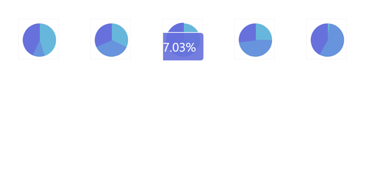
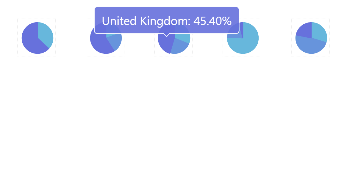
Tooltips on labels
If we need rollover tooltips to be displayed on a label, there is one additional step needed besides setting its tooltipText: make label interactive by adding a background to it. If we don't need an actual background, we can make it full transparent.
The following snippet will add tooltip to the pie chart's slice labels:
series.labels.template.set("tooltipText", "{category}: {value}");

series.labels.template.setup = function(target) {
  target.set("background", am5.Rectangle.new(root, {
    fill: am5.color(0x000000),
    fillOpacity: 0
  }));
}
series.labels.template.set("tooltipText", "{category}: {value}");

series.labels.template.setup = function(target) {
  target.set("background", am5.Rectangle.new(root, {
    fill: am5.color(0x000000),
    fillOpacity: 0
  }));
}
See the Pen Adding tooltips to pie chart slice labels by amCharts team (@amcharts) on CodePen.
MORE INFOFor more information on label interactivity refer to "Labels as interactive elements" tutorial.
HTML in tooltips
Please refer to "HTML content: Tooltips" for more information.
Tooltips outside chart area
Normally, tooltips are constrained to the area of the actual chart.
This may not work for small charts that are unable to fit tooltips.
Using root element's tooltipContainerBounds setting, it's possible to add additional margins around chart area for tooltips.
The setting accepts an object with pixel values for top, right, bottom, and left sides of the chart area:
const root = am5.Root.new("chartdiv", {
  tooltipContainerBounds: {
    top: 50,
    right: 100,
    bottom: 50,
    left: 100
  }
});
var root = am5.Root.new("chartdiv", {
  tooltipContainerBounds: {
    top: 50,
    right: 100,
    bottom: 50,
    left: 100
  }
});
tooltipContainerBoundsSee the Pen Expanded tooltip area by amCharts team (@amcharts) on CodePen.