This tutorial will look at how to configure partition series.
Orientation
Partition will plot itself in vertical mode, i.e. with top-level nodes on the top, second level beneath them, etc.
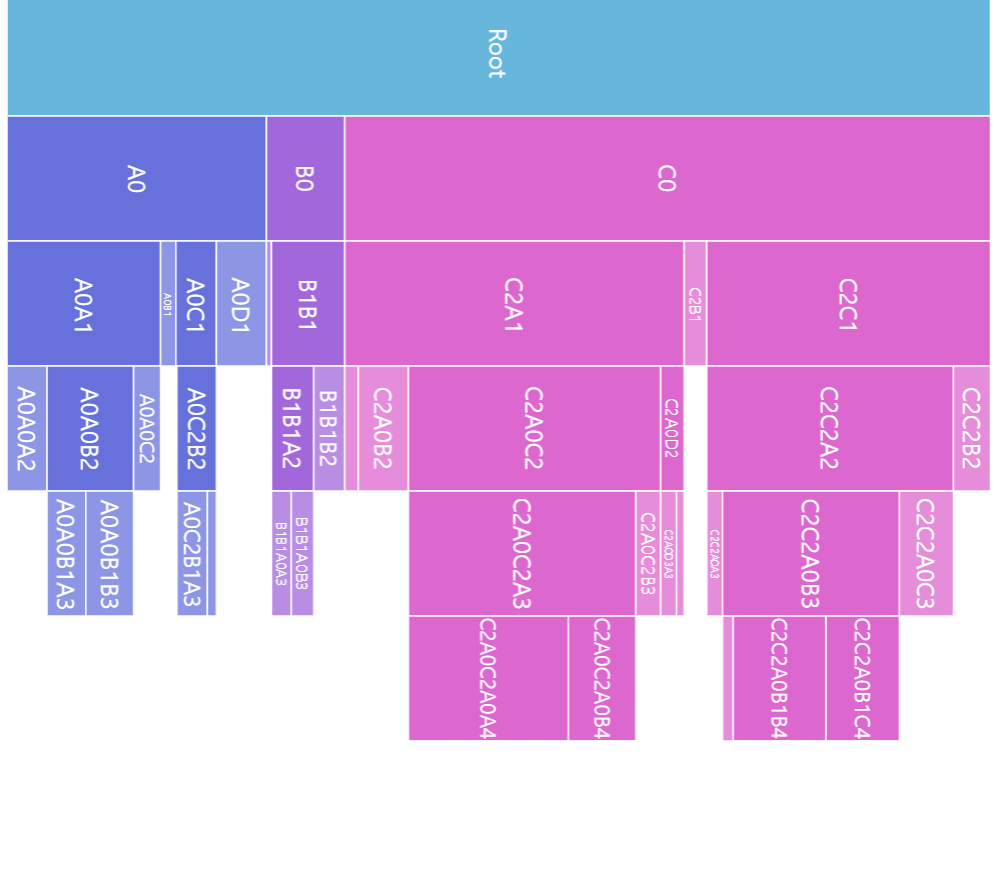
We can change that using series' orientation setting, by setting it to "horizontal". It will put top level on the left, with other levels lining up to the right.
let series = root.container.children.push(
  am5hierarchy.Partition.new(root, {
    valueField: "value",
    categoryField: "name",
    childDataField: "children",
    orientation: "horizontal"
  })
);
var series = root.container.children.push(
  am5hierarchy.Partition.new(root, {
    valueField: "value",
    categoryField: "name",
    childDataField: "children",
    orientation: "horizontal"
  })
);
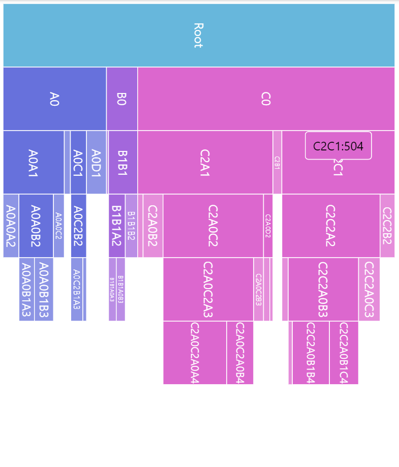
orientation: "vertical" (default)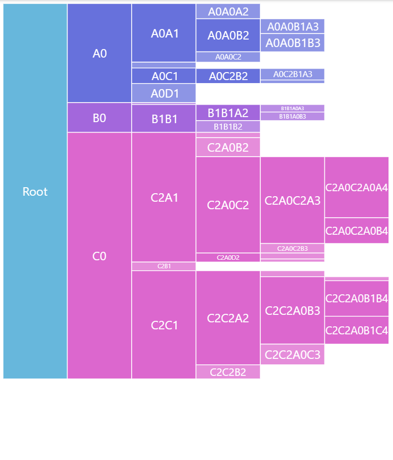
orientation: "horizontal"See the Pen Tree chart by amCharts team (@amcharts) on CodePen.
Nodes
Margins
By default, the squares of the nodes are plotted without any gaps between them.
We can increase that gap using series setting nodePadding. It accepts numeric values in pixels:
let series = root.container.children.push(
  am5hierarchy.Partition.new(root, {
    valueField: "value",
    categoryField: "name",
    childDataField: "children",
    nodePadding: 5
  })
);
var series = root.container.children.push(
  am5hierarchy.Partition.new(root, {
    valueField: "value",
    categoryField: "name",
    childDataField: "children",
    nodePadding: 5
  })
);
nodePadding: 0 (default)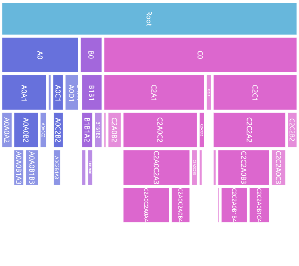
nodePadding: 5Node appearance
The appearance of node rectangles can be configured using their template, accessible on series property: rectangles.template.
The template can have contain any RoundedRectangle setting.
series.rectangles.template.setAll({
  fillOpacity: 0.7,
  cornerRadiusTL: 4,
  cornerRadiusTR: 4,
  cornerRadiusBL: 4,
  cornerRadiusBR: 4
});
series.rectangles.template.setAll({
  fillOpacity: 0.7,
  cornerRadiusTL: 4,
  cornerRadiusTR: 4,
  cornerRadiusBL: 4,
  cornerRadiusBR: 4
});
Hover behavior
We can set setting values to apply to a rectangle when it is hovered by creating a "hover" state for it.
series.rectangles.template.states.create("hover", {
  fill: am5.color(0x677935),
  fillOpacity: 1
});
series.rectangles.template.states.create("hover", {
  fill: am5.color(0x677935),
  fillOpacity: 1
});
Labels
Configuring labels
Series label configuration is done via its template, accessible via series property labels.template.
series.labels.template.setAll({
  fontSize: 20,
  fill: am5.color(0x550000),
  text: "{category}"
});
series.labels.template.setAll({
  fontSize: 20,
  fill: am5.color(0x550000),
  text: "{category}"
});
Partition series uses Label for its labels. Check out its class reference for all the possible settings.
Label content
Node labels are pre-set to display name of the node.
We can modify contents of the tooltips using text setting on a series label template:
series.labels.template.setAll({
  text: "{category}: [bold]{sum}[/]",
  fontSize: 14
});
series.labels.template.setAll({
  text: "{category}: [bold]{sum}[/]",
  fontSize: 14
});
Contents of the tooltip can include data placeholders (codes in curly brackets that will be replaced by actual data) and in-line formatting blocks (formatting instructions enclosed in square brackets).
Refer to IPartitionDataItem for available keys for the data placeholders.
Disabling labels
To disable series labels, we can set forceHidden setting to true in their template:
series.labels.template.set("forceHidden", true);
series.labels.template.set("forceHidden", true);
Tooltips
Rectangles series are pre-set to display a tooltip on hover containing name of the category and its value.
We can modify contents of the tooltips using tooltipText on rectangle's template:
series.rectangles.template.set("tooltipText", "{category}: [bold]{sum}[/]");
series.rectangles.template.set("tooltipText", "{category}: [bold]{sum}[/]");
Contents of the tooltip can include data placeholders (codes in curly brackets that will be replaced by actual data) and in-line formatting blocks (formatting instructions enclosed in square brackets).
Refer to IPartitionDataItem for available keys for the data placeholders.
Example
See the Pen Partition chart by amCharts team (@amcharts) on CodePen.