This tutorial looks into how to get the most of the axes on an XY chart.
Adding axes
Creating axes, assigning them to charts and series, as well as the concept of axis renderer is explained in the the "Adding axes" section of the main "XY Chart" article.
This tutorial will look into various ways we can configure the axes.
Grid
Grid lines
Grid lines are configured using grid template accessible via axis renderer's grid template: grid.template.
It's a Template object, which allows specifying settings, events, and adapters for each new grid line created for the axis.
To specify settings we can use template's set() method (to set single key) or setAll() method (to set a bunch of keys all at once):
let yRenderer = yAxis.get("renderer");
yRenderer.grid.template.setAll({
  stroke: am5.color(0xFF0000),
  strokeWidth: 2
});
var yRenderer = yAxis.get("renderer");
yRenderer.grid.template.setAll({
  stroke: am5.color(0xFF0000),
  strokeWidth: 2
});
The above will make Y axis grid lines 2px wide red.
Or, if we want to modify grid lines for all axes all at once, we can create a quick theme:
const myTheme = am5.Theme.new(root);

myTheme.rule("Grid").setAll({
  stroke: am5.color(0xFF0000),
  strokeWidth: 2
});

root.setThemes([
  myTheme
]);
var myTheme = am5.Theme.new(root);

myTheme.rule("Grid").setAll({
  stroke: am5.color(0xFF0000),
  strokeWidth: 2
});

root.setThemes([
  myTheme
]);
Base grid
There is no template for base grid line - a grid line that is displayed on a zero value.
Should we like to modify it, we'll need to either create a custom theme, or create a quick theme:
const myTheme = am5.Theme.new(root);

myTheme.rule("Grid", ["base"]).setAll({
  strokeOpacity: 1
});

root.setThemes([
  myTheme
]);
var myTheme = am5.Theme.new(root);

myTheme.rule("Grid", ["base"]).setAll({
  strokeOpacity: 1
});

root.setThemes([
  myTheme
]);
Axis line
The actual axis line is represented by the axis renderer itself. That means if we need to configure the appearance of it, we need to use renderers visual settings to do it.
let yAxis = chart.yAxes.push(
  am5xy.ValueAxis.new(root, {
    renderer: am5xy.AxisRendererY.new(root, {
      strokeOpacity: 1,
      strokeWidth: 2
    })
  })
);
var yAxis = chart.yAxes.push(
  am5xy.ValueAxis.new(root, {
    renderer: am5xy.AxisRendererY.new(root, {
      strokeOpacity: 1,
      strokeWidth: 2
    })
  })
);
Grid above series
Normally, grid is drawn behind series.
If we'd like it to be drawn above, we can simply move chart's gridContainer to front:
chart.gridContainer.toFront();
chart.gridContainer.toFront();
Grid density
We can control how densely packed together grid lines (as well as related ticks and labels) are using axis renderer's minGridDistance setting.
Basically, it means "minimum distance in pixels between any two grid lines". The axis will adjust its scale, number of grid lines, and their position to accommodate this setting.
let yAxis = chart.yAxes.push(
  am5xy.ValueAxis.new(root, {
    renderer: am5xy.AxisRendererY.new(root, {
      minGridDistance: 20
    })
  })
);
var yAxis = chart.yAxes.push(
  am5xy.ValueAxis.new(root, {
    renderer: am5xy.AxisRendererY.new(root, {
      minGridDistance: 20
    })
  })
);

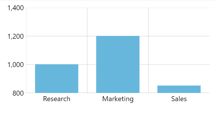
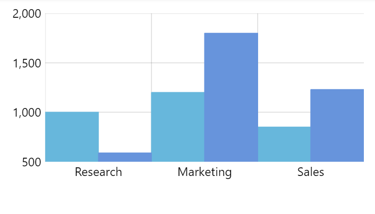
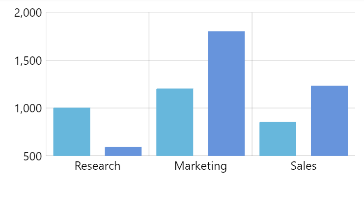
minGridDistance: 50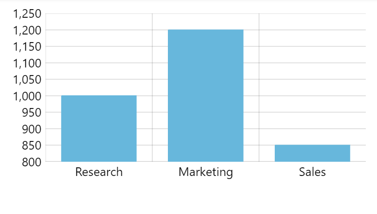
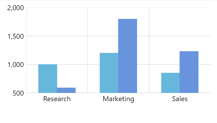
minGridDistance: 20Minor grid
Enabling minor grid
We can re-enable display of grid lines that were skipped due to the lack of space according to minGridDistance setting in an axis renderer.
To do that, we can set renderer's minorGridEnabled: true setting (since 5.6.0).
var xAxis = chart.xAxes.push(
  am5xy.DateAxis.new(root, {
    baseInterval: {
      timeUnit: "day",
      count: 1
    },
    renderer: am5xy.AxisRendererX.new(root, {
      minGridDistance: 100,
      minorGridEnabled: true
    })
  })
);
var xAxis = chart.xAxes.push(
  am5xy.DateAxis.new(root, {
    baseInterval: {
      timeUnit: "day",
      count: 1
    },
    renderer: am5xy.AxisRendererX.new(root, {
      minGridDistance: 100,
      minorGridEnabled: true
    })
  })
);
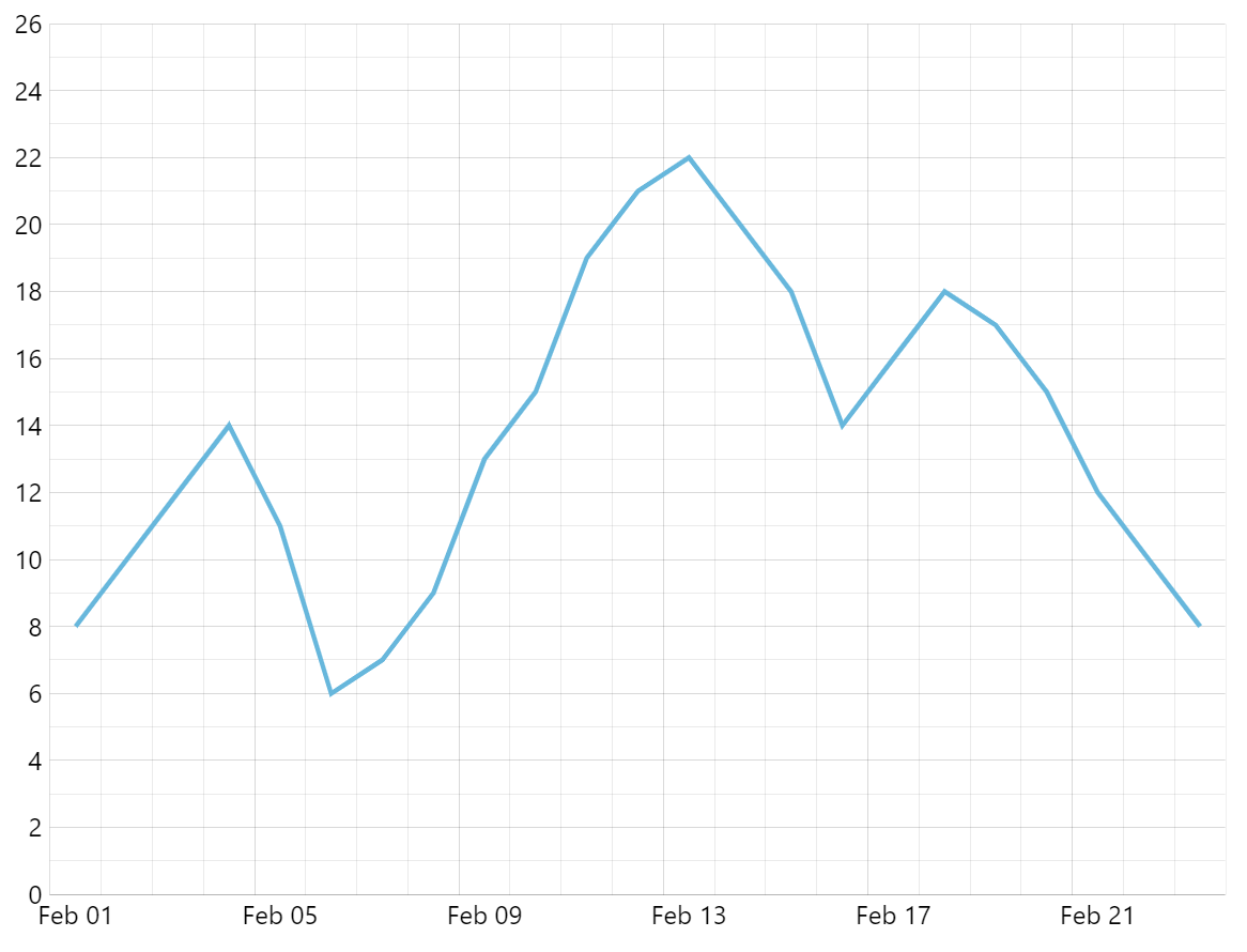
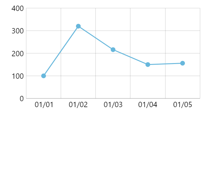
minorGridEnabled: true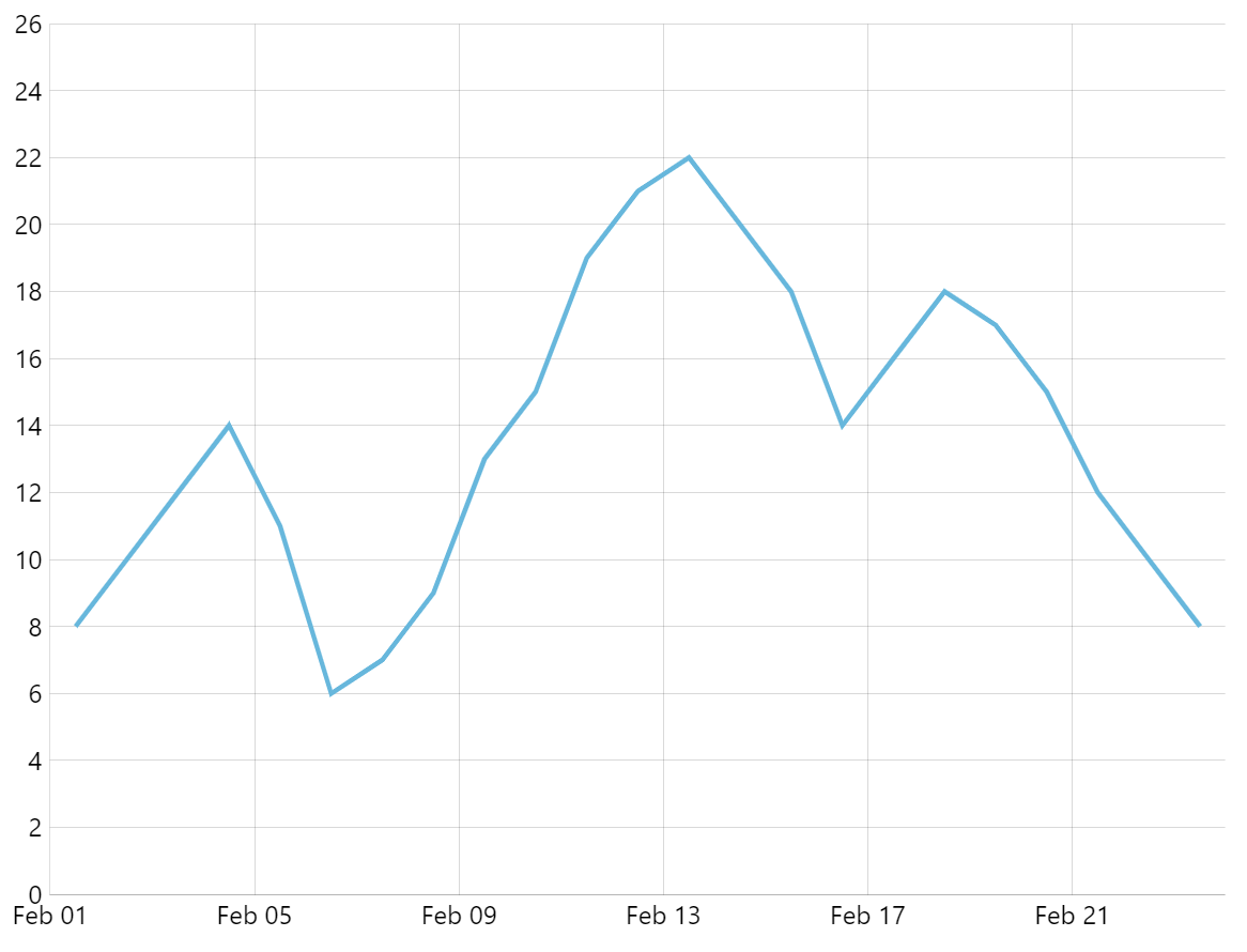
minorGridEnabled: false (default)Enabling minor grid labels
Similarly to minor grid enabling via minorGridEnabled, we can enable its labels via minorLabelsEnabled setting.
NOTEEnabling minor labels will automatically enable minor grid, even if minorGridEnabled is not set.
var xAxis = chart.xAxes.push(
  am5xy.DateAxis.new(root, {
    baseInterval: {
      timeUnit: "day",
      count: 1
    },
    renderer: am5xy.AxisRendererX.new(root, {
      minGridDistance: 100,
      minorGridEnabled: true,
      minorLabelsEnabled: true
    })
  })
);
var xAxis = chart.xAxes.push(
  am5xy.DateAxis.new(root, {
    baseInterval: {
      timeUnit: "day",
      count: 1
    },
    renderer: am5xy.AxisRendererX.new(root, {
      minGridDistance: 100,
      minorGridEnabled: true,
      minorLabelsEnabled: true
    })
  })
);
Styling minor grid and labels
Minor grid is styled using the same settings as the regular grid, which can be applied via templates or themes.
This means that any setting, applied to regular grid will apply to minor grid, too.
The only difference is that minor grid has a slightly strokeOpacity set by default.
If we want to change the default opacity of the minor grid, or we want to use some other settings that would apply only to minor grid, we can use a custom theme:
const myTheme = am5.Theme.new(root);

myTheme.rule("Grid", ["minor"])).setAll({
  stroke: am5.color(0xFF0000),
  strokeWidth: 2,
  strokeOpacity: 0.05
});

root.setThemes([
  myTheme
]);
var myTheme = am5.Theme.new(root);

myTheme.rule("Grid", ["minor"])).setAll({
  stroke: am5.color(0xFF0000),
  strokeWidth: 2,
  strokeOpacity: 0.05
});

root.setThemes([
  myTheme
]);
Similarly, minor grid labels will inherit all the settings for regular labels.
The only difference is that minor labels have a different default value of fontSize (0.6em).
Again, overriding their settings, would require a custom theme:
const myTheme = am5.Theme.new(root);

myTheme.rule("AxisLabel", ["minor"])).setAll({
  fill: am5.color(0xFF0000),
  fontSize: 10
});

root.setThemes([
  myTheme
]);
var myTheme = am5.Theme.new(root);

myTheme.rule("AxisLabel", ["minor"])).setAll({
  fill: am5.color(0xFF0000),
  fontSize: 10
});

root.setThemes([
  myTheme
]);
Ticks
Like many axis elements, ticks are configurable by accessing their template on the renderer: ticks.template.
Please note, that ticks are disabled by default, so we will need to set their visible setting to true in order for them to appear:
let yRenderer = yAxis.get("renderer");
yRenderer.ticks.template.setAll({
  stroke: am5.color(0xFF0000),
  visible: true
});
var yRenderer = yAxis.get("renderer");
yRenderer.ticks.template.setAll({
  stroke: am5.color(0xFF0000),
  visible: true
});
Naturally, we can do that by creating a custom theme as well:
const myTheme = am5.Theme.new(root);

myTheme.rule("AxisTick").setAll({
  stroke: am5.color(0xFF0000),
  visible: true
});

root.setThemes([
  myTheme
]);
var myTheme = am5.Theme.new(root);

myTheme.rule("AxisTick").setAll({
  stroke: am5.color(0xFF0000),
  visible: true
});

root.setThemes([
  myTheme
]);
Labels
Label appearance
Labels too have a template in axis renderer: labels.template. We can use that to set appearance settings, as well as other stuff like adapters, that modify label content.
let yRenderer = yAxis.get("renderer");
yRenderer.labels.template.setAll({
  fill: am5.color(0xFF0000),
  fontSize: "1.5em"
});
let yRenderer = yAxis.get("renderer");
yRenderer.labels.template.setAll({
  fill: am5.color(0xFF0000),
  fontSize: "1.5em"
});
Or, via custom quick theme, to apply settings to all axes at once:
const myTheme = am5.Theme.new(root);

myTheme.rule("AxisLabel").setAll({
  fill: am5.color(0xFF0000),
  fontSize: "1.5em"
});

root.setThemes([
  myTheme
]);
var myTheme = am5.Theme.new(root);

myTheme.rule("AxisLabel").setAll({
  fill: am5.color(0xFF0000),
  fontSize: "1.5em"
});

root.setThemes([
  myTheme
]);
Label background
Setting background on a label template won't work as complex objects are not copied over to template clones.
For that we'll need to use template's setup() method. For more information, refer to "Containers: Background" tutorial.
Label format
Some axis types (e.g. value axis or date axis) will apply formatting to their labels. This is described in greater details in their respective tutorials: "Value axis" and "Date axis".
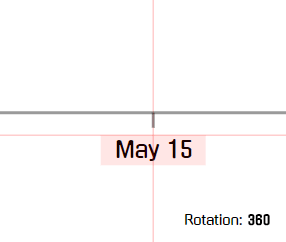
Label rotation
In some cases, when there are more labels to fit them nicely, we can rotate them. An axis can accommodate more labels if they are rotated to vertical or diagonal.
We can use a rotation setting on an axis' label template to set the angle at which to rotate the angle.
Please note, that rotation is applied around "center" of an element, which is defined by its centerX and centerY settings.
In case of axis' labels, their centerY is set to top (0%). If would leave it like that, the rotated labels would appear off-center, so we need to to reset it to 50%, so that they are rotated against label's vertical center:
let xRenderer = xAxis.get("renderer");
xRenderer.labels.template.setAll({
  rotation: -90,
  centerY: am5.p50
});
var xRenderer = xAxis.get("renderer");
xRenderer.labels.template.setAll({
  rotation: -90,
  centerY: am5.p50
});
rotation: 0 (default)
rotation: -90
rotation: -90centerY: am5.p50See the Pen Untitled by amCharts team (@amcharts) on CodePen.
Here's how the rotation works with out default centering options:
centerX: am5.p50 (50% - middle)centerY: am5.p0 (0% - top)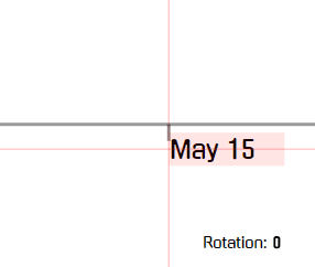
centerX: am5.p0 (0% - left)centerY: am5.p50 (50% - middle)
centerX: am5.p50 (50% - middle)centerY: am5.p50 (50% - middle)Location of axis elements
We can control where axis elements (grid, ticks, labels, bullets) are displayed in relation to the axis cell they represent.
An axis cell is a logical increment, e.g. a day on a date axis, or a category on a category axis.
Basic location
Each axis element has a setting location which is a relative number from 0 (zero) meaning the start of the cell to 1 (one) denoting end of the cell.
So, if we'd like our grid to to be displayed in the middle of the cell, rather than default start position, we would set location to 0.5:
let xRenderer = xAxis.get("renderer");
xRenderer.grid.template.setAll({
  location: 0.5
});
var xRenderer = xAxis.get("renderer");
xRenderer.grid.template.setAll({
  location: 0.5
});
location: 0 (default)
location: 0.5Multi-location
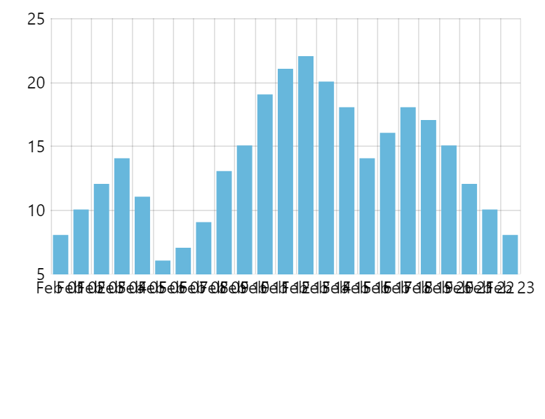
In some cases, in order to prevent chart to become to crammed with grid and labels, the axis will start skipping grid lines, and displaying every second, third, fourth, etc. grid line.
This is called multi-location scenario.
For such scenarios axis labels and ticks have an additional setting: multiLocation.
It basically acts as a location except it is used only in situations where grid lines are being skipped, so that we can apply different positioning of those elements.
let xRenderer = xAxis.get("renderer");
xRenderer.ticks.template.setAll({
  location: 0.5,
  multiLocation: 0,
  visible: true
});
var xRenderer = xAxis.get("renderer");
xRenderer.ticks.template.setAll({
  location: 0.5,
  multiLocation: 0,
  visible: true
});
The above will make axis tick appear in the middle of the cell when all grid lines are visible, but will move it to the start when chart starts skipping grid.
Location on a weekly Date axis
A DateAxis with weekly data granularity (baseInterval set to "week") is a special case. Due to internal reasons, it still uses days for calculation of cell width, so therefore location must be adjusted for that.
For example, if we would like to position the label at the center of the week, we would need to label's location: 3.5 (instead of 0.5).
Related label tutorials
Start/end labels and ticks
Normally, all axis labels and ticks are shown, even those at the very start and end of the axis.
We can set a "no go" zone on either end of the axis using label or ticks template's minPosition and maxPosition settings.
It's a relative numeric value where 0 (zero) means start of the axis, and 1 (end).
let yRenderer = yAxis.get("renderer");
yRenderer.ticks.template.setAll({
  minPosition: 0.1,
  maxPosition: 0.9,
  visible: true
});
yRenderer.labels.template.setAll({
  minPosition: 0.1,
  maxPosition: 0.9
});
let yRenderer = yAxis.get("renderer");
yRenderer.ticks.template.setAll({
  minPosition: 0.1,
  maxPosition: 0.9,
  visible: true
});
yRenderer.labels.template.setAll({
  minPosition: 0.1,
  maxPosition: 0.9
});
The above ensures that no label or tick is shown closer than 10% to either ends of the axis.
minPosition and maxPosition setLabels/ticks inside plot area
We can make the axis display its labels and ticks inside plot area instead of outside by setting inside to true either on respective templates (labels.template and/or ticks.template):
let yRenderer = yAxis.get("renderer");
yRenderer.ticks.template.setAll({
  inside: true,
  visible: true
});
yRenderer.labels.template.setAll({
  inside: true
});
let yRenderer = yAxis.get("renderer");
yRenderer.ticks.template.setAll({
  inside: true,
  visible: true
});
yRenderer.labels.template.setAll({
  inside: true
});
Alternatively, we can set it directly on axis renderer:
let yAxis = chart.yAxes.push(
  am5xy.ValueAxis.new(root, {
    renderer: am5xy.AxisRendererY.new(root, {
      inside: true
    })
  })
);
var yAxis = chart.yAxes.push(
  am5xy.ValueAxis.new(root, {
    renderer: am5xy.AxisRendererY.new(root, {
      inside: true
    })
  })
);
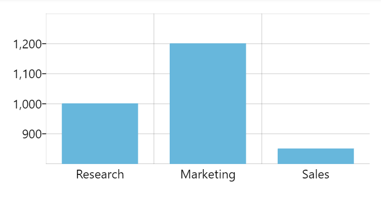
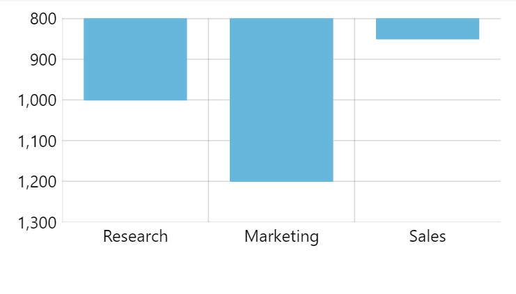
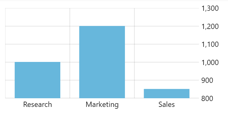
Inversed axes
Normally, the axes start from lower-left corner of the XY chart.
Setting axis renderer's inversed setting to true will flip the scale of the axis, and all associated series accordingly:
let yAxis = chart.yAxes.push(
  am5xy.ValueAxis.new(root, {
    renderer: am5xy.AxisRendererY.new(root, {
      inversed: true
    })
  })
);
var yAxis = chart.yAxes.push(
  am5xy.ValueAxis.new(root, {
    renderer: am5xy.AxisRendererY.new(root, {
      inversed: true
    })
  })
);
Axis position
By default, vertical axes are displayed to the left of the plot area, whereas horizontal ones are displayed below.
We can move the axis to the other side of the plot area by setting opposite to true on in the settings of their renderer:
let yAxis = chart.yAxes.push(
  am5xy.ValueAxis.new(root, {
    renderer: am5xy.AxisRendererY.new(root, {
      opposite: true
    })
  })
);
var yAxis = chart.yAxes.push(
  am5xy.ValueAxis.new(root, {
    renderer: am5xy.AxisRendererY.new(root, {
      opposite: true
    })
  })
);
opposite: trueCell start/end locations
Axis makes all the width/height of its cells available for series to use. This means that if we have column series with columns set to width at 100%, they will take up the whole width of each cell.
We can control this available space using axis renderer's cellStartLocation and cellEndLocation settings.
Both are relative numbers with 0 (zero) indicating start of the actual visible cell, and 1 (one) - the end.
let xAxis = chart.xAxes.push(
  am5xy.CategoryAxis.new(root, {
    renderer: am5xy.AxisRendererX.new(root, {
      cellStartLocation: 0.2,
      cellEndLocation: 0.8
    }),
    categoryField: "category"
  })
);
var xAxis = chart.xAxes.push(
  am5xy.CategoryAxis.new(root, {
    renderer: am5xy.AxisRendererX.new(root, {
      cellStartLocation: 0.2,
      cellEndLocation: 0.8
    }),
    categoryField: "category"
  })
);
The above will restrict the space available for actual series to 60% of the actual cell.
Axis start/end locations
Normally axis starts at the beginning of its first cell and ends at the end of the last one.
We can use axis' startLocation and endLocation to change it.
For example, if we'd like axis to start and end in the middle of the first and last cells, we'd set those settings to 0.5:
let xAxis = chart.xAxes.push(
  am5xy.DateAxis.new(root, {
    renderer: am5xy.AxisRendererX.new(root, {}),
    startLocation: 0.5,
    endLocation: 0.5
  })
);
var xAxis = chart.xAxes.push(
  am5xy.DateAxis.new(root, {
    renderer: am5xy.AxisRendererX.new(root, {}),
    startLocation: 0.5,
    endLocation: 0.5
  })
);
startLocation: 0endLocation: 1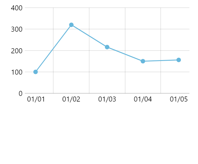
startLocation: 0.2endLocation: 0.8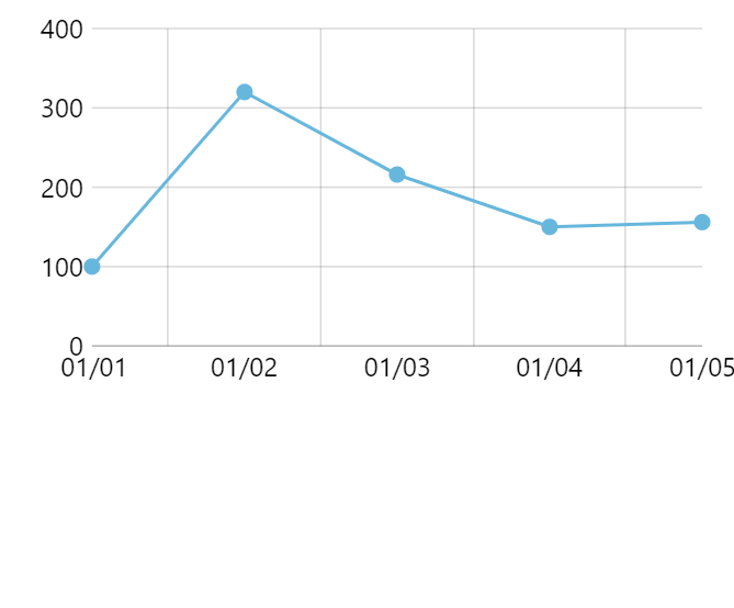
startLocation: 0.5endLocation: 0.5See the Pen Axis start and end locations by amCharts team (@amcharts) on CodePen.
Axis bullets
Adding axis bullets
Along with grid, ticks, and labels an axis can also create bullets.
To set that up, we can use axis' bullet setting, which accepts function that returns an AxisBullet object.
The function will be called each time, an axis needs to create a bullet, that is for every grid location.
The function will receive 3 parameters:
- A reference to root element.
- A reference to the axis itself.
- Axis data item bullet is being created for.
let xAxis = chart.xAxes.push(am5xy.CategoryAxis.new(root, {
  categoryField: "category",
  renderer: am5xy.AxisRendererX.new(root, {}),
  bullet: function (root, axis, dataItem) {
    return am5xy.AxisBullet.new(root, {
      location: 0.5,
      sprite: am5.Circle.new(root, {
        radius: 5,
        fill: am5.color(0xff0000)
      })
    });
  }
}));
var xAxis = chart.xAxes.push(am5xy.CategoryAxis.new(root, {
  categoryField: "category",
  renderer: am5xy.AxisRendererX.new(root, {}),
  bullet: function (root, axis, dataItem) {
    return am5xy.AxisBullet.new(root, {
      location: 0.5,
      sprite: am5.Circle.new(root, {
        radius: 5,
        fill: am5.color(0xff0000)
      })
    });
  }
}));
The above will add a red circle for each category in a category axis.
We can also use the third parameter - data item - to dynamically modify content, i.e. sprite parameter of the bullet:
let xAxis = chart.xAxes.push(am5xy.CategoryAxis.new(root, {
  categoryField: "category",
  renderer: am5xy.AxisRendererX.new(root, {}),
  bullet: function (root, axis, dataItem) {
    return am5xy.AxisBullet.new(root, {
      location: 0.5,
      sprite: am5.Picture.new(root, {
        dy: 10,
        width: 24,
        height: 24,
        src: dataItem.dataContext.icon
      })
    });
  }
}));
var xAxis = chart.xAxes.push(am5xy.CategoryAxis.new(root, {
  categoryField: "category",
  renderer: am5xy.AxisRendererX.new(root, {}),
  bullet: function (root, axis, dataItem) {
    return am5xy.AxisBullet.new(root, {
      location: 0.5,
      sprite: am5.Picture.new(root, {
        dy: 10,
        width: 24,
        height: 24,
        src: dataItem.dataContext.icon
      })
    });
  }
}));
The above code will add an image to each category using information form actual data.
See the Pen amCharts 5: Bullet chart by amCharts team (@amcharts) on CodePen.
Axis bullets will be placed directly on the axis. If we would like to move those somewhere else, like for instance on top of plot container, we will need to adjust their y setting using an adapter:
let xAxis = chart.xAxes.push(am5xy.CategoryAxis.new(root, {
  categoryField: "category",
  renderer: am5xy.AxisRendererX.new(root, {
}),
  bullet: function (root, axis, dataItem) {
    let bullet = am5.Picture.new(root, {
      width: 24,
      height: 24,
      centerY: am5.p50,
      centerX: am5.p50,
      src: dataItem.dataContext.icon
    });

    bullet.adapters.add("y", function(y, target) {
      return -1 * chart.plotContainer.getPrivate("height");
    });

    return am5xy.AxisBullet.new(root, {
      location: 0.5,
      sprite: bullet
    });
  }
}));
var xAxis = chart.xAxes.push(am5xy.CategoryAxis.new(root, {
  categoryField: "category",
  renderer: am5xy.AxisRendererX.new(root, {
}),
  bullet: function (root, axis, dataItem) {
    var bullet = am5.Picture.new(root, {
      width: 24,
      height: 24,
      centerY: am5.p50,
      centerX: am5.p50,
      src: dataItem.dataContext.icon
    });

    bullet.adapters.add("y", function(y, target) {
      return -1 * chart.plotContainer.getPrivate("height");
    });

    return am5xy.AxisBullet.new(root, {
      location: 0.5,
      sprite: bullet
    });
  }
}));
See the Pen amCharts 5: Strip count plot by amCharts team (@amcharts) on CodePen.
Stacked axis bullets
It's possible to make axis bullets stack on each other if they fall on the same base interval or category.
For that, we need to set stacked: true in axis bullet's settings:
let xAxis = chart.xAxes.push(am5xy.CategoryAxis.new(root, {
  categoryField: "category",
  renderer: am5xy.AxisRendererX.new(root, {}),
  bullet: function (root, axis, dataItem) {
    return am5xy.AxisBullet.new(root, {
      stacked: true,
      sprite: am5.Circle.new(root, {
        radius: 5,
        fill: am5.color(0xff0000)
      })
    });
  }
}));
var xAxis = chart.xAxes.push(am5xy.CategoryAxis.new(root, {
  categoryField: "category",
  renderer: am5xy.AxisRendererX.new(root, {}),
  bullet: function (root, axis, dataItem) {
    return am5xy.AxisBullet.new(root, {
      stacked: true,
      sprite: am5.Circle.new(root, {
        radius: 5,
        fill: am5.color(0xff0000)
      })
    });
  }
}));
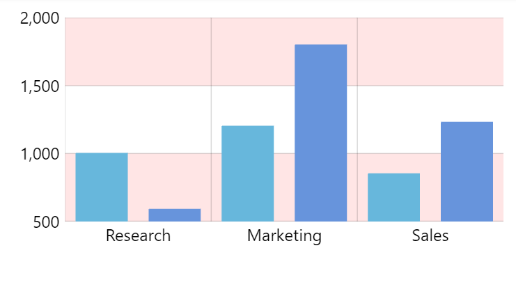
Axis fills
Gaps between each grid line can be made to be filled with a color. Those are called "axis fills" and can be configured using axis renderer's axis fill template: axisFills.template.
Enabling fills
Similarly to ticks, fills are disabled by default, so we will need to enable by setting their visible to true.
let yRenderer = yAxis.get("renderer");
yRenderer.axisFills.template.setAll({
  fill: am5.color(0xFF0000),
  fillOpacity: 0.1,
  visible: true
});
var yRenderer = yAxis.get("renderer");
yRenderer.axisFills.template.setAll({
  fill: am5.color(0xFF0000),
  fillOpacity: 0.1,
  visible: true
});
They can be modified/enabled by creating a quick theme, too:
const myTheme = am5.Theme.new(root);

myTheme.rule("Graphics", ["axis", "fill"]).setAll({
  stroke: am5.color(0xFF0000),
  fillOpacity: 0.1,
  visible: true
});

root.setThemes([
  myTheme
]);
var myTheme = am5.Theme.new(root);

myTheme.rule("Graphics", ["axis", "fill"]).setAll({
  stroke: am5.color(0xFF0000),
  fillOpacity: 0.1,
  visible: true
});

root.setThemes([
  myTheme
]);
Fill rules
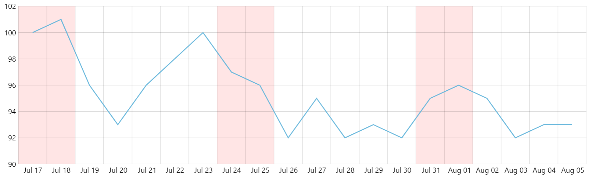
By default, axis will enable fills for every second gab between grid lines.
We can change that by using axis' fillRule setting.
It is a function, which dynamically can modify fills visible setting (and possible other settings) based on some criteria.
The function receives axis data item as well as index, which can help it decide what to do with particular fill.
As an example, fillRule can be set to a function, that highlights weekends:
let xAxis = chart.xAxes.push(am5xy.DateAxis.new(root, {
  baseInterval: {
    timeUnit: "day",
    count: 1
  },
  fillRule: function(dataItem) {
    const axisFill = dataItem.get("axisFill");
    const date = new Date(dataItem.get("value"));
    axisFill.setPrivate("visible", (date.getDay() == 6 || date.getDay() == 0));
  },
  renderer: am5xy.AxisRendererX.new(root, {
    minGridDistance: 20
  })
}));
var xAxis = chart.xAxes.push(am5xy.DateAxis.new(root, {
  baseInterval: {
    timeUnit: "day",
    count: 1
  },
  fillRule: function(dataItem) {
    var axisFill = dataItem.get("axisFill");
    var date = new Date(dataItem.get("value"));
    axisFill.setPrivate("visible", (date.getDay() == 6 || date.getDay() == 0));
  },
  renderer: am5xy.AxisRendererX.new(root, {
    minGridDistance: 20
  })
}));
Stacked axes
Turning on stacking
If a chart has multiple axes on the same side, they are put into the same container and arranged so they are next to each other.
For example all Y-axes are put into chart's leftAxesContainer which has a layout of type "horizontal". That's why axes are put next to each other.
If we would like to stack axes vertically, all we need to do is to change the layout setting of the leftAxesContainer:
chart.leftAxesContainer.set("layout", root.verticalLayout);
chart.leftAxesContainer.set("layout", root.verticalLayout);
The axes, including all the grid and related series will now occupy separate parts of the the plot area.
For more information about XY chart's containers, refer "Layout and containers of the XY chart" tutorial. For more about container layouts, please take a look at "Containers: Layout".
Variable axis heights
Stacked axis will divide the available space equally between them.
If we need them to be different, we can use axis' height setting with percent values, e.g.:
let yAxis1 = chart.yAxes.push(
  am5xy.ValueAxis.new(root, {
    height: am5.percent(70),
    renderer: am5xy.AxisRendererY.new(root, {})
  })
);

let yAxis2 = chart.yAxes.push(
  am5xy.ValueAxis.new(root, {
    height: am5.percent(30),
    renderer: am5xy.AxisRendererY.new(root, {})
  })
);
var yAxis1 = chart.yAxes.push(
  am5xy.ValueAxis.new(root, {
    height: am5.percent(70),
    renderer: am5xy.AxisRendererY.new(root, {})
  })
);

var yAxis2 = chart.yAxes.push(
  am5xy.ValueAxis.new(root, {
    height: am5.percent(30),
    renderer: am5xy.AxisRendererY.new(root, {})
  })
);
Gaps between stacked axes
There normally is no gap between, two stacked axes.
The best way to put such gap between them, is to use axis headers with some or no information in them:
yAxis1.axisHeader.children.push(am5.Label.new(root, {
  text: "Value",
  fontWeight: "500"
}));

yAxis2.axisHeader.set("paddingTop", 10);
yAxis2.axisHeader.children.push(am5.Label.new(root, {
  text: "Volume",
  fontWeight: "500"
}));
yAxis1.axisHeader.children.push(am5.Label.new(root, {
  text: "Value",
  fontWeight: "500"
}));

yAxis2.axisHeader.set("paddingTop", 10);
yAxis2.axisHeader.children.push(am5.Label.new(root, {
  text: "Volume",
  fontWeight: "500"
}));
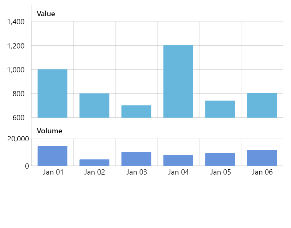
See the Pen Stacked axes by amCharts team (@amcharts) on CodePen.
Aligning stacked axes
Stacked are left-aligned by default.
If number scale are different across different axes, that might not look good on a left-side Y axis.
The solution is to right-align all axes, by using their x and centerX settings:
let yAxis1 = chart.yAxes.push(
  am5xy.ValueAxis.new(root, {
    height: am5.percent(70),
    x: am5.percent(100),
    centerX: am5.percent(100),
    renderer: am5xy.AxisRendererY.new(root, {})
  })
);

let yAxis2 = chart.yAxes.push(
  am5xy.ValueAxis.new(root, {
    height: am5.percent(30),
    x: am5.percent(100),
    centerX: am5.percent(100),
    renderer: am5xy.AxisRendererY.new(root, {})
  })
);
var yAxis1 = chart.yAxes.push(
  am5xy.ValueAxis.new(root, {
    height: am5.percent(70),
    x: am5.percent(100),
    centerX: am5.percent(100),
    renderer: am5xy.AxisRendererY.new(root, {})
  })
);

var yAxis2 = chart.yAxes.push(
  am5xy.ValueAxis.new(root, {
    height: am5.percent(30),
    x: am5.percent(100),
    centerX: am5.percent(100),
    renderer: am5xy.AxisRendererY.new(root, {})
  })
);
Right-side axes do not need any modification because they are already left-aligned.
Horizontally-stacked axes
It works the same way for horizontal axes, too.
The exception is that we will need to use bottomAxesContainer (or topAxesContainer if we have our axes on top) and we will need to set its layout to root.horizontalLayout.
Axis title
Adding an axis title consists of creating a Label element, as well as pushing it into axis' children list.
xAxis.children.push(
  am5.Label.new(root, {
    text: "GDP per Capita, USD",
    x: am5.p50,
    centerX:am5.p50
  })
);

yAxis.children.unshift(
  am5.Label.new(root, {
    rotation: -90,
    text: "Life expectancy, years",
    y: am5.p50,
    centerX: am5.p50
  })
);
xAxis.children.push(
  am5.Label.new(root, {
    text: "GDP per Capita, USD",
    x: am5.p50,
    centerX:am5.p50
  })
);

yAxis.children.unshift(
  am5.Label.new(root, {
    rotation: -90,
    text: "Life expectancy, years",
    y: am5.p50,
    centerX: am5.p50
  })
);
A few comments about the code above.
Notice how we do push() on an X axis, but unshift() on Y axis. There are other elements in the axis (lines, labels, etc.), and we need our title to be the last on bottom axis (hence push()) and for the left axis, we need it to be the first child, so it's left-most of the other elements (hence unshift()).
We also need to apply rotation of the label for the vertical axis, as well as properly position it using relative values for x or y and centerX.
See the Pen XY scatter chart with heat rules on bullets by amCharts team (@amcharts) on CodePen.
Axis tooltips
Axis can display tooltips indicating position of a chart cursor if its available. For more information visit "Cursor: Axis tooltips" tutorial.
If you would like to add labels to axis labels, check out "Labels: Interactive axis labels".
Zoomable axes
We can also enable drag-zooming of axes by adding pan: "zoom" to settings of their renderer:
let yAxis = chart.yAxes.push(
  am5xy.ValueAxis.new(root, {
    renderer: am5xy.AxisRendererY.new(root, {
      pan: "zoom"
    })
  })
);
var yAxis = chart.yAxes.push(
  am5xy.ValueAxis.new(root, {
    renderer: am5xy.AxisRendererY.new(root, {
      pan: "zoom"
    })
  })
);
See the Pen Zoomable value axes by amCharts team (@amcharts) on CodePen.
Removing axes
Effect to related series
To remove an axis from a chart, we need to remove its instance from chart.xAxes (or chart.yAxes) list.
It's important to know, that there might still be series that are using the axis we're about to remove. Since series cannot function without X and Y axis, just removing the axis might result in an error.
So, before removing an axis, we need to do one of these things:
- Assign related series a different axis, or...
- Remove those series as well.
The following function will take care of the latter:
function removeAxis(axis) {
  am5.array.each(axis.series, function(series) {
    chart.series.removeValue(series);
  });
  chart.yAxes.removeValue(axis);
}
function removeAxis(axis) {
  am5.array.each(axis.series, function(series) {
    chart.series.removeValue(series);
  });
  chart.yAxes.removeValue(axis);
}
See the Pen Removing axes by amCharts team (@amcharts) on CodePen.
Auto-disposing
chart.xAxes and chart.yAxes are auto-disposable lists, meaning that removing an item (an axis in this case) from it, will automatically dispose that item.
If we want to remove the axis only temporarily, and do not want it to be disposed, we need to disable auto-disposing:
chart.yAxes.autoDispose = false;
chart.yAxes.autoDispose = false;