This tutorial focuses on the configuration of a tree diagram.
Orientation
Tree series will plot itself in vertical mode, i.e. with top-level nodes on the top, second level beneath them, etc.
We can change that using series' orientation setting, by setting it to "horizontal". It will put top level on the left, with other levels lining up to the right.
let series = root.container.children.push(
  am5hierarchy.Tree.new(root, {
    valueField: "value",
    categoryField: "name",
    childDataField: "children",
    orientation: "horizontal"
  })
);
var series = root.container.children.push(
  am5hierarchy.Tree.new(root, {
    valueField: "value",
    categoryField: "name",
    childDataField: "children",
    orientation: "horizontal"
  })
);
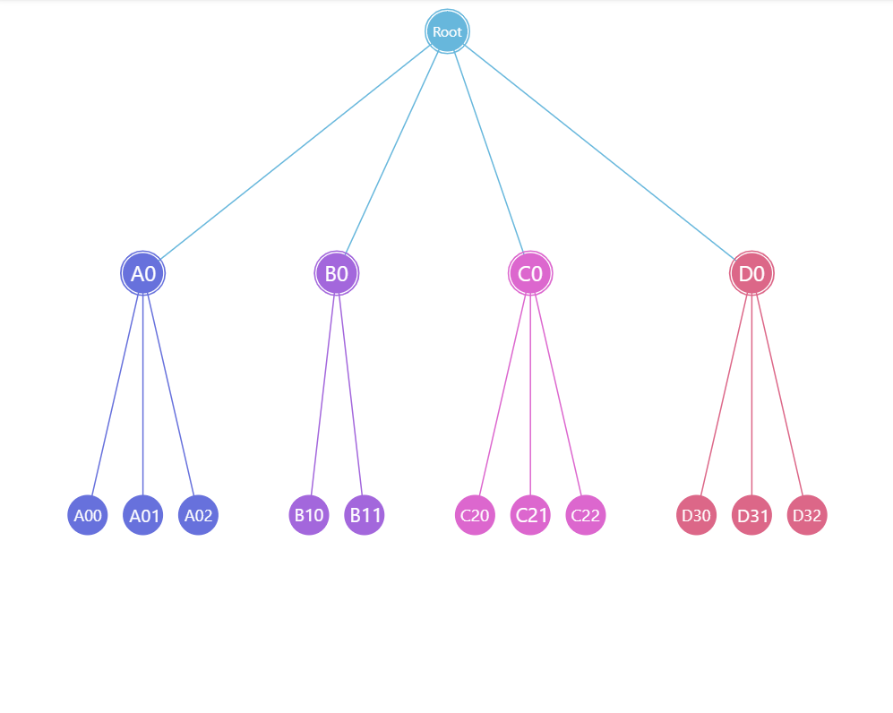
orientation: "vertical" (default)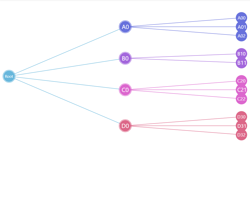
orientation: "horizontal"See the Pen Tree chart: configuring node radii by amCharts team (@amcharts) on CodePen.
Nodes
There are two lists of elements that we can use to configure nodes: circles and outerCircles.
Circles
circles.template can be used to configure node circles. All nodes have them.
The template accepts all Circle settings.
series.circles.template.setAll({
  fillOpacity: 0.7,
  strokeWidth: 1,
  strokeOpacity: 1
});
series.circles.template.setAll({
  fillOpacity: 0.7,
  strokeWidth: 1,
  strokeOpacity: 1
});
Outer circles
outerCircles.template configures additional node circle outline. Only nodes with children have them.
series.outerCircles.template.setAll({
  strokeWidth: 2
});
series.outerCircles.template.setAll({
  strokeWidth: 2
});
Outer circles play special role in linked hierarchies: they indicate if node has children.
The outer circle also has different looks based on whether it is expanded or collapsed.
Those looks are controlled via application of certain states.
An outer circle can have four built-in states:
| State | Example | Comment |
|---|---|---|
"disabled" |  | Applied when node is collapsed. |
"hover" |  | Applied when node is hovered. |
"hoverDisabled" |  | Applied when collapsed node is hovered. |
"hidden" |  | Applied to nodes that do not have children. |
The following code modifies how outer circle looks like:
series.outerCircles.template.states.create("disabled", {
  fillOpacity: 0.5,
  strokeOpacity: 0,
  strokeDasharray: 0
});

series.outerCircles.template.states.create("hoverDisabled", {
  fillOpacity: 0.5,
  strokeOpacity: 0,
  strokeDasharray: 0
});
series.outerCircles.template.states.create("disabled", {
  fillOpacity: 0.5,
  strokeOpacity: 0,
  strokeDasharray: 0
});

series.outerCircles.template.states.create("hoverDisabled", {
  fillOpacity: 0.5,
  strokeOpacity: 0,
  strokeDasharray: 0
});
See the Pen Tree chart: configuring node outer circles by amCharts team (@amcharts) on CodePen.
Sizing nodes
The main circle of a node in a tree series has a radius of 15 pixels.
We can change that using radius setting of both circles.template and outerCircles.template.
The smallest and biggest possible node circle is controlled by series minRadius and maxRadius settings.
Both accept numeric values in pixels or percent values relative to the size of the chart itself.
series.circles.template.setAll({
  radius: 20
});

series.outerCircles.template.setAll({
  radius: 20
});
series.circles.template.setAll({
  radius: 20
});

series.outerCircles.template.setAll({
  radius: 20
});
radius: 15 (default)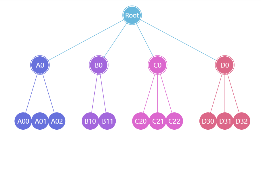
radius: 20See the Pen Tree chart: configuring node outer circles by amCharts team (@amcharts) on CodePen.
Fitting visible nodes
By default, Tree will reserve space for all nodes, even if they are invisible.
If we'd like to free up the space of the nodes that are hidden, we can set fitNodes to true:
let series = root.container.children.push(
  am5hierarchy.Tree.new(root, {
    valueField: "value",
    categoryField: "name",
    childDataField: "children",
    orientation: "horizontal",
    fitNodes: true
  })
);

var series = root.container.children.push(
  am5hierarchy.Tree.new(root, {
    valueField: "value",
    categoryField: "name",
    childDataField: "children",
    orientation: "horizontal",
    fitNodes: true
  })
);
fitNodes: false (default)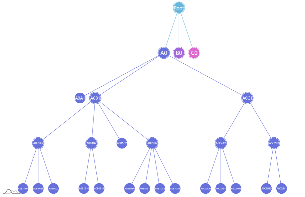
fitNodes: trueDisabling dragging
Nodes in the tree are draggable. We can disable it by setting draggable to false:
series.nodes.template.setAll({
  draggable: false
});
series.nodes.template.setAll({
  draggable: false
});
Disabling toggling
To disable toggle behavior on a node, all we need to do is to reset toggle key for node template, as well as resetting pointer cursor:
series.nodes.template.setAll({
  toggleKey: "none",
  cursorOverStyle: "default"
});
series.nodes.template.setAll({
  toggleKey: "none",
  cursorOverStyle: "default"
});
Using images
We can replace standard circles with custom images.
For that we'll need to go through some steps:
- Disable inner and outer circles.
- Create images in node using
setup()method of its template. - Disable or reposition labels.
// Hide circles
series.circles.template.set("forceHidden", true);
series.outerCircles.template.set("forceHidden", true);

// Add an icon to node
series.nodes.template.setup = function(target) {
  let icon = target.children.push(am5.Picture.new(root, {
    width: 70,
    height: 70,
    centerX: am5.percent(50),
    centerY: am5.percent(50),
    src: "https://assets.codepen.io/t-160/star.svg"
  }));
}
// Hide circles
series.circles.template.set("forceHidden", true);
series.outerCircles.template.set("forceHidden", true);

// Add an icon to node
series.nodes.template.setup = function(target) {
  var icon = target.children.push(am5.Picture.new(root, {
    width: 50,
    height: 50,
    centerX: am5.percent(50),
    centerY: am5.percent(50),
    src: "https://assets.codepen.io/t-160/star.svg"
  }));
}
See the Pen Tree chart: configuring node radii by amCharts team (@amcharts) on CodePen.
The above will replace regular circles for all nodes with an icon of a star.
If we'd like to display different images for each node, we'll need to enhance our code a bit:
- Add image information to data.
- Enhance
setupcode to grab imageurlfrom the data.
We'll also reposition the labels while we're at it.
// Disable circles
series.circles.template.setAll({
  radius: 40,
  forceHidden: true
});

series.outerCircles.template.setAll({
  radius: 40,
  forceHidden: true
});

// ... except for central node
series.circles.template.adapters.add("forceHidden", function(forceHidden, target) {
  return target.dataItem.get("depth") == 0 ? false : forceHidden;
});

// Set up labels
series.labels.template.setAll({
  fill: am5.color(0x000000),
  y: 30,
  oversizedBehavior: "none"
});

// Use adapter to leave central node label centered
series.labels.template.adapters.add("y", function(y, target) {
  return target.dataItem.get("depth") == 0 ? 0 : y;
});

// Use template.setup function to prep up node with an image
series.nodes.template.setup = function(target) {
  target.events.on("dataitemchanged", function(ev) {
    let icon = target.children.push(am5.Picture.new(root, {
      width: 40,
      height: 40,
      centerX: am5.percent(50),
      centerY: am5.percent(50),
      src: ev.target.dataItem.dataContext.image
    }));
  });
}
// Disable circles
series.circles.template.setAll({
  radius: 40,
  forceHidden: true
});

series.outerCircles.template.setAll({
  radius: 40,
  forceHidden: true
});

// ... except for central node
series.circles.template.adapters.add("forceHidden", function(forceHidden, target) {
  return target.dataItem.get("depth") == 0 ? false : forceHidden;
});

// Set up labels
series.labels.template.setAll({
  fill: am5.color(0x000000),
  y: 30,
  oversizedBehavior: "none"
});

// Use adapter to leave central node label centered
series.labels.template.adapters.add("y", function(y, target) {
  return target.dataItem.get("depth") == 0 ? 0 : y;
});

// Use template.setup function to prep up node with an image
series.nodes.template.setup = function(target) {
  target.events.on("dataitemchanged", function(ev) {
    var icon = target.children.push(am5.Picture.new(root, {
      width: 40,
      height: 40,
      centerX: am5.percent(50),
      centerY: am5.percent(50),
      src: ev.target.dataItem.dataContext.image
    }));
  });
}
See the Pen Tree chart: configuring node radii by amCharts team (@amcharts) on CodePen.
IMPORTANT The template.setup needs to be set before any data is set on the the series. More info here.
Layout
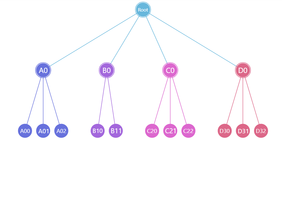
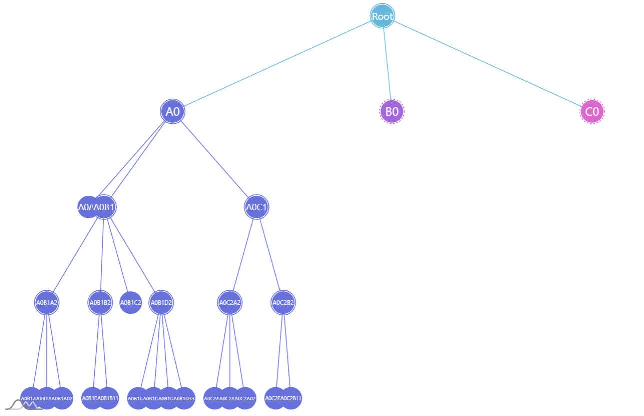
By default, Tree will divide the space and arrange the nodes in perfect columns.
While that works for smaller structures, having more complicated ones might not use the available space efficiently.
Here's when clustered mode comes in play. To enable it, simply set clustered: false in your Tree settings:
var series = zoomableContainer.contents.children.push(am5hierarchy.Tree.new(root, {
  singleBranchOnly: false,
  downDepth: 1,
  initialDepth: 10,
  valueField: "value",
  categoryField: "name",
  childDataField: "children",
  clustered: true
}));
let series = zoomableContainer.contents.children.push(am5hierarchy.Tree.new(root, {
  singleBranchOnly: false,
  downDepth: 1,
  initialDepth: 10,
  valueField: "value",
  categoryField: "name",
  childDataField: "children",
  clustered: true
}));
clustered: false (default)
clustered: trueSee the Pen Tree Chart by amCharts team (@amcharts) on CodePen.
Links
Link appearance
Links can be configured using series' links.template. It accepts all HierarchyLink settings.
series.links.template.setAll({
  strokeWidth: 5,
  strokeOpacity: 0.5
});
series.links.template.setAll({
  strokeWidth: 5,
  strokeOpacity: 0.5
});
Cross-linking nodes
It's possible to link nodes not directly related with a parent-child relation.
That will require:
- Adding an array of nodes to link to in data.
- Specifying
linkWithFieldandidFieldsetting for series.
Sample data:
[{
  "name": "First",
  "value": 1,
  "link": ["Second"]
}, {
  "name": "Second",
  "value": 1,
  "link": ["Third"]
}, {
  "name": "Third",
  "value": 1,
  "link": ["First"]
}]
And code:
var series = container.children.push(
  am5hierarchy.ForceDirected.new(root, {
    valueField: "value",
    categoryField: "name",
    idField: "name",
    childDataField: "children",
    linkWithField: "link"
  })
);
var series = container.children.push(
  am5hierarchy.ForceDirected.new(root, {
    valueField: "value",
    categoryField: "name",
    idField: "name",
    childDataField: "children",
    linkWithField: "link"
  })
);
IMPORTANT Since categories (via categoryField) do not have the requirement to be unique, we need to use a separate idField to bind nodes to their unique IDs, which are used in the linkWithField values. If we know our nodes have unique names, we can use the same field for both categoryField and idField.
See the Pen Force-directed chart with cross-linked nodes by amCharts team (@amcharts) on CodePen.
Link bullets
Refer to "Hierarchy link bullets".
Labels
Configuring labels
Series label configuration is done via its template, accessible via series property labels.template.
series.labels.template.setAll({
  fontSize: 20,
  fill: am5.color(0x550000),
  text: "{category}"
});
series.labels.template.setAll({
  fontSize: 20,
  fill: am5.color(0x550000),
  text: "{category}"
});
Tree series uses Label for its labels. Check out its class reference for all the possible settings.
Label content
Node labels are pre-set to display name of the node.
We can modify contents of the tooltips using text setting on a series label template:
series.labels.template.setAll({
  text: "{category}: [bold]{sum}[/]",
  fontSize: 14
});
series.labels.template.setAll({
  text: "{category}: [bold]{sum}[/]",
  fontSize: 14
});
Contents of the tooltip can include data placeholders (codes in curly brackets that will be replaced by actual data) and in-line formatting blocks (formatting instructions enclosed in square brackets).
Refer to ITreeDataItem for available keys for the data placeholders.
Disabling labels
To disable series labels, we can set forceHidden setting to true in their template:
series.labels.template.set("forceHidden", false);
series.labels.template.set("forceHidden", false);
Tooltips
Nodes are pre-set to display a tooltip on hover containing name of the category and its value.
We can modify contents of the tooltips using tooltipText on rectangle's template:
series.nodes.template.set("tooltipText", "{category}: [bold]{sum}[/]");
series.nodes.template.set("tooltipText", "{category}: [bold]{sum}[/]");
Contents of the tooltip can include data placeholders (codes in curly brackets that will be replaced by actual data) and in-line formatting blocks (formatting instructions enclosed in square brackets).
Refer to ITreeDataItem for available keys for the data placeholders.