This tutorial looks at general concepts behind series - a centerpiece of an XY chart.
Adding series
let series = chart.series.push(
  am5xy.ColumnSeries.new(root, {
    name: "Series",
    xAxis: xAxis,
    yAxis: yAxis,
    valueYField: "value",
    valueXField: "date"
  })
);
var series = chart.series.push(
  am5xy.ColumnSeries.new(root, {
    name: "Series",
    xAxis: xAxis,
    yAxis: yAxis,
    valueYField: "value",
    valueXField: "date"
  })
);
For more info, refer to "Adding series" section of the main "XY Chart" tutorial.
Setting data
series.data.setAll([{
  category: "Research",
  value: 1000
}, {
  category: "Marketing",
  value: 1200
}, {
  category: "Sales",
  value: 850
}]);
series.data.setAll([{
  category: "Research",
  value: 1000
}, {
  category: "Marketing",
  value: 1200
}, {
  category: "Sales",
  value: 850
}]);
For more info, refer to "Setting data" section of the main "XY Chart" tutorial.
IMPORTANT It's a good practice to make sure that setting data happens as late into code as possible. Once you set data, all related objects are created, so any configuration settings applied afterwards might not carry over.
Data fields
Data fields specify how series relates to data and how it uses that data to plot itself.
There are two types of data fields: input data fields and display data fields.
Data input fields
XY chart is a two-dimensional chart, so its series will require at least two values in order to be plotted: one for X and one for Y.
Series data field settings will specify which key in data holds values for each data field.
The actual name of the data field depends on the type of data we are plotting.
For example, a series that is plotted on a category axis (X) and a value axis (Y) will need to define at least two data fields: categoryXField and valueYField.
let series = chart.series.push(
  am5xy.ColumnSeries.new(root, {
    name: "Series",
    xAxis: xAxis,
    yAxis: yAxis,
    valueYField: "budget",
    categoryXField: "department"
  })
);
var series = chart.series.push(
  am5xy.ColumnSeries.new(root, {
    name: "Series",
    xAxis: xAxis,
    yAxis: yAxis,
    valueYField: "budget",
    categoryXField: "department"
  })
);
Date axis operates in tiemstamps, that are numeric values, that's why we need to use value*Field for it, just like for value axis:
let series = chart.series.push(
  am5xy.ColumnSeries.new(root, {
    name: "Series",
    xAxis: xAxis,
    yAxis: yAxis,
    valueYField: "budget",
    valueXField: "date"
  })
);
var series = chart.series.push(
  am5xy.ColumnSeries.new(root, {
    name: "Series",
    xAxis: xAxis,
    yAxis: yAxis,
    valueYField: "budget",
    valueXField: "date"
  })
);
Some series types, like candlestick or OHLC, need more than two values. They will need more data fields defined. For more info refer to "Candlestick and OHLC series" tutorial.
IMPORTANTIn order to work properly data fields need to be set when series object is created (via its .new() method). Setting them later on will not work as expected.
Open data input fields
Besides valueXField and valueYField data fields, series can also have "open" data fields, named openValueXField and openValueYField.
If set, series will not use axis base value (zero) as a start for each data item, but rather the actual "open" value.
For example, for line series that will mean the fill will extend to that value, rather than axis. For column series, it will mean that actual columns will start at some value, rather than axis.
For more information and examples, check "Line series: Open data fields" and "Column series: floating columns" sections.
Display fields
If we need our series to be plotted using raw input values, we're all set. However, if we need to plot it using some sort of other derived value, like change, percent, or similar derived/calculated value, we will need to set display fields as well.
Basically, display field tells series to "use this calculated value instead of input value when plotting yourself".
Display fields are named similarly as input fields, except they end with an "*Show", indicating that this is a value for a show.
The value that needs to be used for display fields is a pre-set list of available calculated values:
| Value | Comment |
|---|---|
valueXChangevalueYChange | Change from the first value in a data set. |
valueXChangePercentvalueYChangePercent | Change from the first value in data set in percent. |
valueXChangeSelectionvalueYChangeSelection | Change from the first value in current visible scope. |
valueXChangeSelectionPercentvalueYChangeSelectionPercent | Change from the first value in current visible scope in percent. |
valueXChangePreviousvalueYChangePrevious | Change from the previous value. |
valueXChangePreviousPercentvalueYChangePreviousPercent | Change from the previous value in percent. |
valueXTotalvalueYTotal | Sum of all absolute values (cast to positive) from all series on the same value axis in same category/interval. |
valueXTotalPercentvalueYTotalPercent | Percent value of the value from the sum of all absolute values (cast to positive) from all series on the same value axis in same category/interval. |
valueXSumvalueYSum | Sum of all previous values from the same series on the same value axis. |
Let's say we need to display a 100% stacked chart with 3 column series. We would need to use valueYTotalPercent for valueYShow to make it work:
let series = chart.series.push(
  am5xy.ColumnSeries.new(root, {
    name: name,
    xAxis: xAxis,
    yAxis: yAxis,
    valueYField: "value",
    valueYShow: "valueYTotalPercent",
    categoryXField: "year",
    stacked: true
  })
);
var series = chart.series.push(
  am5xy.ColumnSeries.new(root, {
    name: name,
    xAxis: xAxis,
    yAxis: yAxis,
    valueYField: "value",
    valueYShow: "valueYTotalPercent",
    categoryXField: "year",
    stacked: true
  })
);
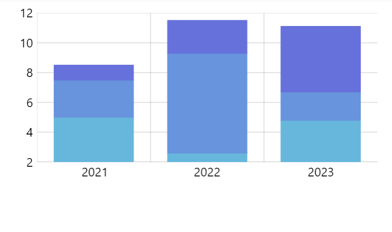
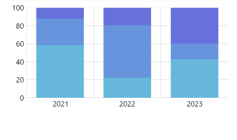
valueYShow: "valueYTotalPercent"See the Pen Stacked column chart 100% by amCharts team (@amcharts) on CodePen.
Changing data fields
All data fields that need to be used by series need to absolutely be set when series is created using .new() method.
Setting data fields later via set() or setAll() methods will not work.
let series = chart.series.push(
  am5xy.ColumnSeries.new(root, {
    name: name,
    xAxis: xAxis,
    yAxis: yAxis,
    valueYField: "value"
  })
);

// ERROR: This will not work as expected!
series.set("categoryXField", "year");
series = chart.series.push(
  am5xy.ColumnSeries.new(root, {
    name: name,
    xAxis: xAxis,
    yAxis: yAxis,
    valueYField: "value"
  })
);

// ERROR: This will not work as expected!
series.set("categoryXField", "year");
Changing of the data field is only possible if it was first set when creating the series:
let series = chart.series.push(
  am5xy.ColumnSeries.new(root, {
    name: name,
    xAxis: xAxis,
    yAxis: yAxis,
    valueYField: "value",
    categoryXField: "category"
  })
);

// This will now work!
series.set("categoryXField", "year");
var series = chart.series.push(
  am5xy.ColumnSeries.new(root, {
    name: name,
    xAxis: xAxis,
    yAxis: yAxis,
    valueYField: "value",
    categoryXField: "category"
  })
);

// This will now work!
series.set("categoryXField", "year");
Please note that changing data fields dynamically will not automatically reparse data.
This means that data always needs to be set after all data fields are set or changed:
let series = chart.series.push(
  am5xy.ColumnSeries.new(root, {
    name: name,
    xAxis: xAxis,
    yAxis: yAxis,
    valueYField: "value",
    categoryXField: "category"
  })
);

// This will now work!
series.set("categoryXField", "year");

// Data needs to be set after data fields are set
series.data.setAll([ ... ]);
var series = chart.series.push(
  am5xy.ColumnSeries.new(root, {
    name: name,
    xAxis: xAxis,
    yAxis: yAxis,
    valueYField: "value",
    categoryXField: "category"
  })
);

// This will now work!
series.set("categoryXField", "year");

// Data needs to be set after data fields are set
series.data.setAll([ ... ]);
Series colors
A color for series plays an important role in its identification. It is used in a number of places, like drawing actual plots (lines, columns, etc.) as well as identifying series in chart's legend.
Auto-assigned colors
If we do not specify any color settings (fill and stroke) when creating series, an XY chart will assign those automatically, from its own color set.
Should we want to, we can override the whole list of colors by either setting it directly on series color set, creating a quick theme, or a reusable full theme, e.g.:
chart.get("colors").set("colors", [
  am5.color(0x095256),
  am5.color(0x087f8c),
  am5.color(0x5aaa95),
  am5.color(0x86a873),
  am5.color(0xbb9f06)
]);
chart.get("colors").set("colors", [
  am5.color(0x095256),
  am5.color(0x087f8c),
  am5.color(0x5aaa95),
  am5.color(0x86a873),
  am5.color(0xbb9f06)
]);
MORE INFO A "Color sets" section of our color tutorial has more details and code samples.
Manual colors
We can set colors to newly-created series manually, too. For that we will need to set series' fill and stroke settings:
let series = chart.series.push(
  am5xy.ColumnSeries.new(root, {
    name: "Series",
    xAxis: xAxis,
    yAxis: yAxis,
    valueYField: "value",
    valueXField: "date",
    fill: am5.color(0x095256),
    stroke: am5.color(0x095256)
  })
);
var series = chart.series.push(
  am5xy.ColumnSeries.new(root, {
    name: "Series",
    xAxis: xAxis,
    yAxis: yAxis,
    valueYField: "value",
    valueXField: "date",
    fill: am5.color(0x095256),
    stroke: am5.color(0x095256)
  })
);
Configuring appearance
Each series consists of certain visual elements, depending on its type.
For example, line series will consist of line segments we can set stroke settings on. Column series will have columns, and we can control how they are filled, etc.
To set those up, series have properties holding template object we can modify settings for, that will be applied to the actual elements when series is plotted.
As an example, let's take column series. It has a property columns.template which is a Template accepting settings for a RoundedRectangle objects. If we need to make columns rounded on top, all we need to do is to modify the template:
series.columns.template.setAll({
  cornerRadiusTL: 5,
  cornerRadiusTR: 5
});
series.columns.template.setAll({
  cornerRadiusTL: 5,
  cornerRadiusTR: 5
});
Please refer to dedicated series type tutorials for further info:
Binding settings to data
It's possible to bind settings of a series element templates to values in data.
For more information on how to do it, refer to "Template fields" tutorial.
Stacked series
Data requirements
IMPORTANTStacking requires that all stacked series have equal number of data items with the same timestamps / categories. Mismatched datasets will have visually odd results when series are plotted. For a workaround, please visit tutorial "Stacking series with mismatched categories/dates".
Enabling stacking
To make series stack to each other, it's enough to set their stacked setting to true. The chart will automatically arrange everything else accordingly.
let series = chart.series.push(
  am5xy.ColumnSeries.new(root, {
    name: name,
    xAxis: xAxis,
    yAxis: yAxis,
    valueYField: field,
    categoryXField: "year",
    stacked: true
  })
);
var series = chart.series.push(
  am5xy.ColumnSeries.new(root, {
    name: name,
    xAxis: xAxis,
    yAxis: yAxis,
    valueYField: field,
    categoryXField: "year",
    stacked: true
  })
);
Negative value stacking
In situations where there are both negative and positive values in stacks, we might also consider another setting: stackToNegative.
If it's set to true (default for column series) columns with positive values will stack from zero line upwards, whereas columns with negative value will start their stacking from zero line downwards.
IMPORTANTThere is no way to make series stack correctly if it contains both positive and negative values in its data, regardless of the value set on stackToNegative setting.
100% stacks
Enabling 100% stacks require few manipulation to chart setup:
- Specifying display data fields for series to use calculated percent values instead of absolute values.
- Setting
calculateTotals: trueon a value axis so that percent values are calculated and available for use in display data fields. - Capping value axis scale at
0and100values. - Optionally, adding "%" sign to axis values using adapter or value axis'
numberFormatsetting.
let yAxis = chart.yAxes.push(
  am5xy.ValueAxis.new(root, {
    min: 0,
    max: 100,
    calculateTotals: true,
    numberFormat: "#'%'",
    renderer: am5xy.AxisRendererY.new(root, {})
  })
);

let series = chart.series.push(
  am5xy.ColumnSeries.new(root, {
    name: name,
    xAxis: xAxis,
    yAxis: yAxis,
    valueYField: "value",
    valueYShow: "valueYTotalPercent",
    categoryXField: "year",
    stacked: true
  })
);
var yAxis = chart.yAxes.push(
  am5xy.ValueAxis.new(root, {
    min: 0,
    max: 100,
    calculateTotals: true,
    numberFormat: "#'%'",
    renderer: am5xy.AxisRendererY.new(root, {})
  })
);

var series = chart.series.push(
  am5xy.ColumnSeries.new(root, {
    name: name,
    xAxis: xAxis,
    yAxis: yAxis,
    valueYField: "value",
    valueYShow: "valueYTotalPercent",
    categoryXField: "year",
    stacked: true
  })
);
See the Pen Stacked column chart 100% by amCharts team (@amcharts) on CodePen.
Stack totals
Refer to "Totals on column stacks" tutorial for information on how to display labels with totals over the stacks.
Relation to axes
Assigning to axes
Each series needs to know its X and Y axes. Settings xAxis and yAxis must be set to instances of the axes.
As per data fields section above, assigning certain types of axis, will dictate what names data fields will have to use when setting up the series.
Base axis
A base axis is an axis which indicates linear progress of the series, e.g. a date axis or category axis.
If series uses fills, the fill will be towards that axis. Columns will also will be drawn perpendicularly to base axis.
If base axis is not set, it is assigned automatically per the following logic:
- If Y axis is either category axis or date axis, it will become base axis.
- All other setups will use X axis as a base axis.
To explicitly set a base axis for a series, us its baseAxis setting:
var series = chart.series.push(am5xy.ColumnSeries.new(root, {
  xAxis: xAxis,
  yAxis: yAxis,
  baseAxis: xAxis,
  openValueYField: "start",
  valueYField:"end",
  categoryXField: "category"
}));
var series = chart.series.push(am5xy.ColumnSeries.new(root, {
  xAxis: xAxis,
  yAxis: yAxis,
  baseAxis: xAxis,
  openValueYField: "start",
  valueYField:"end",
  categoryXField: "category"
}));
Bullets
NOTE Bullets are not exclusive to XY chart. We are going to touch the topic briefly here, but for more information make sure to visit our dedicated "Bullets" tutorial.
Adding bullets
Bullets in series are added by pushing custom functions into series' bullets list.
The functions must return a new Bullet object with its sprite property pre-populated with actual visual elements.
Those can be literally any visual element: from a simple Circle or Label to a whole other chart.
series.bullets.push(function() {
  return new am5.Bullet.new(root, {
    sprite: am5.Circle.new(root, {
      radius: 4,
      fill: series.get("fill")
    })
  });
});
series.bullets.push(function() {
  return am5.Bullet.new(root, {
    sprite: am5.Circle.new(root, {
      radius: 4,
      fill: series.get("fill")
    })
  });
});
See the Pen Smoothed line series by amCharts team (@amcharts) on CodePen.
Relation to data
Among other things, series will also pass relevant data item to the bullet.
That's why bullets can use data placeholders to populate text, as well as heat rules.
Positioning bullets
A Bullet object has two properties that help position them within the parent element/data item: locationX and locationY.
Those accept numeric values from 0 (zero) to 1 (one) indicating relative position within target element, with zero indicating beginning and one the end.
Some series (e.g. line series) do not have any dimension, so location settings will be ignored.
However in those series that do have elements with actual shapes (e.g. column series), location settings are super useful as it gives us flexibility over positioning of a bullet.
Let's put a Label bullet in the middle of a column in a column series:
series.bullets.push(function() {
  return am5.Bullet.new(root, {
    sprite: am5.Label.new(root, {
      text: "{valueY}",
      centerX: am5.percent(50),
      centerY: am5.percent(50),
      populateText: true
    })
  });
});
series.bullets.push(function() {
  return am5.Bullet.new(root, {
    sprite: am5.Label.new(root, {
      text: "{valueY}",
      centerX: am5.percent(50),
      centerY: am5.percent(50),
      populateText: true
    })
  });
});
NOTE Please note the populateText use above. This is needed to force Label to populate data placeholders with actual data.
See the Pen Line series with bullets by amCharts team (@amcharts) on CodePen.
Auto-hiding bullets
We can set up series to automatically hide its bullets if there are a lot of data points and bullets would just overcrowd the chart.
For that purpose, XY chart series has a setting minBulletDistance.
It's a numeric value which means this: if the distance between data items in series is less than X pixels, hide all bullets.
This setting is dynamic, and will react to changing conditions. I.e. when chart is zoomed in and distances between data items increase, hidden bullets may reappear.
Tooltips
Series-wide tooltips
If our chart setup has a cursor, we can assign a Tooltip object to series' tooltip setting, so that tooltip relevant to closest data item will be shown when cursor is hovering over the plot area.
let series = chart.series.push(
  am5xy.LineSeries.new(root, {
    name: name,
    xAxis: xAxis,
    yAxis: yAxis,
    valueYField: field,
    valueXField: "date",
    tooltip: am5.Tooltip.new(root, {
      labelText: "[bold]{name}[/]\n{valueX.formatDate()}: {valueY}"
    })
  })
);

series.data.setAll(data);
var series = chart.series.push(
  am5xy.LineSeries.new(root, {
    name: name,
    xAxis: xAxis,
    yAxis: yAxis,
    valueYField: field,
    valueXField: "date",
    tooltip: am5.Tooltip.new(root, {
      labelText: "[bold]{name}[/]\n{valueX.formatDate()}: {valueY}"
    })
  })
);

series.data.setAll(data);
See the Pen Chart with cursor by amCharts team (@amcharts) on CodePen.
Tooltips on series elements
We can also make tooltips appear when hovered on individual series elements directly, e.g. on a column.
To make that happen, all we need to do is to set tooltipText on that elements template:
series.columns.template.set("tooltipText", "{valueY}");
series.columns.template.set("tooltipText", "{valueY}");
Animation
Normally, created series will appear on chart right away. Should we want to make it play out initial animation, we can call it's appear() method right after creating its object:
let series = chart.series.push(
  am5xy.ColumnSeries.new(root, {
    name: "Series",
    xAxis: xAxis,
    yAxis: yAxis,
    valueYField: "value",
    valueXField: "date"
  })
);
series.appear();
var series = chart.series.push(
  am5xy.ColumnSeries.new(root, {
    name: "Series",
    xAxis: xAxis,
    yAxis: yAxis,
    valueYField: "value",
    valueXField: "date"
  })
);
series.appear();
Pre-hiding series
The correct way to pre-hide series is to set its visible setting to false.
let series = chart.series.push(
  am5xy.ColumnSeries.new(root, {
    name: "Series",
    xAxis: xAxis,
    yAxis: yAxis,
    valueYField: "value",
    valueXField: "date",
    visible: false
  })
);
var series = chart.series.push(
  am5xy.ColumnSeries.new(root, {
    name: "Series",
    xAxis: xAxis,
    yAxis: yAxis,
    valueYField: "value",
    valueXField: "date",
    visible: false
  })
);
NOTECalling series appear() method will knock off visible setting value, and will make it visible again. To keep series pre-hidden, do not call this method.
If you are also using a legend, for best results use series hide() method instead, called after the legend data is set.
let series = chart.series.push(
  am5xy.ColumnSeries.new(root, {
    name: "Series",
    xAxis: xAxis,
    yAxis: yAxis,
    valueYField: "value",
    valueXField: "date"
  })
);

legend.data.push(series);

series.hide();
var series = chart.series.push(
  am5xy.ColumnSeries.new(root, {
    name: "Series",
    xAxis: xAxis,
    yAxis: yAxis,
    valueYField: "value",
    valueXField: "date"
  })
);

legend.data.push(series);

series.hide();
See the Pen amCharts 5: Pre-hiding series by amCharts team (@amcharts) on CodePen.
Data item location
Some series (e.g. line series) have control over where their data item can be placed when plotting them. We do have series settings locationX and locationY for that.
The concept is explained in detail in "Line series" tutorial.