Responsive features in amCharts 5 are activated via Responsive theme.
Loading
Responsive is loaded just like any other theme:
import am5themes_Responsive from "@amcharts/amcharts5/themes/Responsive";
<script src="//cdn.amcharts.com/lib/5/themes/Responsive.js"></script>
Applying
If we do not wish to modify anything in the responsive rules, we can just instantiate the Responsive theme using its static new() method, passing in the root element.
root.setThemes([
  am5themes_Responsive.new(root)
]);
root.setThemes([
  am5themes_Responsive.new(root)
]);
This will instantiate the responsive theme with all default rules available.
However, if we are going to be adding our own rules, we may want to start off without default rules. In such case we'd use newEmpty() method instead:
root.setThemes([
  am5themes_Responsive.newEmpty(root)
]);
root.setThemes([
  am5themes_Responsive.newEmpty(root)
]);
Adding custom rules
Basically responsive works like this:
- If condition is met (e.g. chart width is smaller than X), apply certain setting value.
- If condition is no longer applicable (e.g. chart grows larger), reset setting to original value (or no value at all of it wasn't set before).
A responsive rule defines all those elements: condition and setting values to override.
To create a rule, we use responsive theme's addRule() method. Since we need to call the method on theme object, we will need to pre-create the object:
const responsive = am5themes_Responsive.new(root);

responsive.addRule({
  name: "AxisRendererY",
  relevant: function(width, height) {
    return width < 1000;
  },
  settings: {
    inside: true
  }
});

root.setThemes([
  AnimatedTheme.new(root),
  responsive
]);
const responsive = am5themes_Responsive.new(root);

responsive.addRule({
  name: "AxisRendererY",
  relevant: function(width, height) {
    return width < 1000;
  },
  settings: {
    inside: true
  }
});

root.setThemes([
  AnimatedTheme.new(root),
  responsive
]);
Let's examine what's going on in the above snippet.
Rule target
Target element class name
name parameter indicates what elements to target by this rule. Each element has at least one class name, but possibly more.
The class name of the element is represented by its class' className and classNames properties.
Take a look at class reference of the AxisRendererY from the example above:
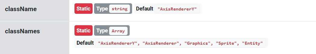
We can target elements by any of the class names. E.g. using AxisRenderer would target all axis renderers, not just ones for the Y axis.
Theme tags
It's possible to refine targeting by using theme tags of the element:
responsive.addRule({
  name: "AxisRendererY",
  tags: ["opposite"],
  relevant: function(width, height) {
    return width < 1000;
  },
  settings: {
    inside: true
  }
});
responsive.addRule({
  name: "AxisRendererY",
  tags: ["opposite"],
  relevant: function(width, height) {
    return width < 1000;
  },
  settings: {
    inside: true
  }
});
The above will target vertical axis renderer, but only if it's placed on the right-side of the chart (opposite: true).
For more information about targeting elements using class names, theme tags and a list of hard-coded tags, refer to "Creating themes: Targeting elements" tutorial.
Rule condition
Condition is represented by rule's relevant property, which must be a function that takes two parameters: width and height of the chart, and returns true if rule condition is met or false if it's not.
Bundled conditions and breakpoints
Responsive theme comes with some helpful condition functions as well as breakpoints we can use to avoid replicating the code.
Breakpoints
| Accessible via | Value |
|---|---|
am5themes_Responsive.XXS | 100 |
am5themes_Responsive.XS | 200 |
am5themes_Responsive.S | 300 |
am5themes_Responsive.M | 400 |
am5themes_Responsive.L | 600 |
am5themes_Responsive.XL | 800 |
am5themes_Responsive.XXL | 1000 |
Using breakpoints we can rewrite our example above:
responsive.addRule({
  name: "AxisRendererY",
  relevant: function(width, height) {
    return width < am5themes_Responsive.XXL;
  },
  settings: {
    inside: true
  }
});
responsive.addRule({
  name: "AxisRendererY",
  relevant: function(width, height) {
    return width < am5themes_Responsive.XXL;
  },
  settings: {
    inside: true
  }
});
Conditional functions
| Accessible via | Check |
|---|---|
am5themes_Responsive.widthXXS | width <= 100 |
am5themes_Responsive.widthXS | width <= 200 |
am5themes_Responsive.widthS | width <= 300 |
am5themes_Responsive.widthM | width <= 400 |
am5themes_Responsive.widthL | width <= 600 |
am5themes_Responsive.widthXL | width <= 800 |
am5themes_Responsive.widthXXL | width <= 1000 |
am5themes_Responsive.heightXXS | height <= 100 |
am5themes_Responsive.heightXS | height <= 200 |
am5themes_Responsive.heightS | height <= 300 |
am5themes_Responsive.heightM | height <= 400 |
am5themes_Responsive.heightL | height <= 600 |
am5themes_Responsive.heightXL | height <= 800 |
am5themes_Responsive.heightXXL | height <= 1000 |
am5themes_Responsive.maybeXXS | width <= 100 || height <= 100 |
am5themes_Responsive.maybeXS | width <= 200 || height <= 200 |
am5themes_Responsive.maybeS | width <= 300 || height <= 300 |
am5themes_Responsive.maybeM | width <= 400 || height <= 400 |
am5themes_Responsive.maybeL | width <= 600 || height <= 600 |
am5themes_Responsive.maybeXL | width <= 800 || height <= 800 |
am5themes_Responsive.maybeXXL | width <= 1000 || height <= 1000 |
am5themes_Responsive.isXXS | width <= 100 && height <= 100 |
am5themes_Responsive.isXS | width <= 200 && height <= 200 |
am5themes_Responsive.isS | width <= 300 && height <= 300 |
am5themes_Responsive.isM | width <= 400 && height <= 400 |
am5themes_Responsive.isL | width <= 600 && height <= 600 |
am5themes_Responsive.isXL | width <= 800 && height <= 800 |
am5themes_Responsive.isXXL | width <= 1000 && height <= 1000 |
Let's simplify our example even further:
responsive.addRule({
  name: "AxisRendererY",
  relevant: am5themes_Responsive.widthXXL,
  settings: {
    inside: true
  }
});
responsive.addRule({
  name: "AxisRendererY",
  relevant: am5themes_Responsive.widthXXL,
  settings: {
    inside: true
  }
});
Setting overrides
Final property of the rule is settings which supplies key - value pairs to override for the element if the condition is met.
NOTE Settings are not regular properties of the element, which cannot be set by the responsive rule. For more complex overrides, please refer to the "Custom apply/remove functions" section of this tutorial. Also, read about "Settings".
Note about user-set settings
IMPORTANTSettings set in a responsive rule will not override settings, that are set directly on an element.
As an example, let's take an XYChart which has layout set directly on it:
let chart = root.container.children.push(am5xy.XYChart.new(root, {
  layout: root.verticalLayout
}));
var chart = root.container.children.push(am5xy.XYChart.new(root, {
  layout: root.verticalLayout
}));
Let's say we want to change layout to vertical, if chart is less than 1000px width.
The assumption would be that the following responsive rule should do it:
// THIS WILL NOT WORK AS EXPECTED!
responsive.addRule({
  name: "XYChart",
  relevant: function(width, height) {
    return width < 1000;
  },
  settings: {
    layout: root.horizontalLayout
  }
});
// THIS WILL NOT WORK AS EXPECTED!
responsive.addRule({
  name: "XYChart",
  relevant: function(width, height) {
    return width < 1000;
  },
  settings: {
    layout: root.horizontalLayout
  }
});
However, this will not work, because layout set directly on chart's object will take precedence over the rule's template.
The solution is to remove layout setting from the XYChart and create two responsive rules instead to handle situations when the chart is below and above 1000px in width:
responsive.addRule({
  name: "XYChart",
  relevant: function(width, height) {
    return width >= 1000;
  },
  settings: {
    layout: root.verticalLayout
  }
});

responsive.addRule({
  name: "XYChart",
  relevant: function(width, height) {
    return width < 1000;
  },
  settings: {
    layout: root.horizontalLayout
  }
});

// ...

let chart = root.container.children.push(am5xy.XYChart.new(root, {
  //layout: root.verticalLayout
}));
responsive.addRule({
  name: "XYChart",
  relevant: function(width, height) {
    return width >= 1000;
  },
  settings: {
    layout: root.verticalLayout
  }
});

responsive.addRule({
  name: "XYChart",
  relevant: function(width, height) {
    return width < 1000;
  },
  settings: {
    layout: root.horizontalLayout
  }
});

// ...

var chart = root.container.children.push(am5xy.XYChart.new(root, {
  //layout: root.verticalLayout
}));
Custom apply/remove functions
If we need to do some more complex chart setup changes than changing a value for a setting, we can use custom functions that are called when rule is applied and removed.
They are supplied via rule's applying and removing properties, respectively.
As an example, let's move the chart's legend to bottom of the chart when its width gets smaller than 400 pixels.
responsive.addRule({
  relevant: am5themes_Responsive.widthM,
  applying: function() {
    chart.set("layout", root.verticalLayout);
    legend.setAll({
      y: null,
      centerY: null,
      x: am5.p0,
      centerX: am5.p0
    });
  },
  removing: function() {
    chart.set("layout", root.horizontalLayout);
    legend.setAll({
      y: am5.p50,
      centerY: am5.p50,
      x: null,
      centerX: null
    });
  }
});
See the Pen Testing responsive by amCharts team (@amcharts) on CodePen.