Custom themes is a really powerful way to create a functional reusable sets of settings, events, and adapters to apply to specific elements of the chart.
Creating a theme
To create a theme, we need to create an object that extends built-in Theme class.
The basic structure of the theme class looks like this:
class MyTheme extends am5.Theme {
  setupDefaultRules() {
    // Set theme rules here
    // ...
  }
}
class MyTheme extends am5.Theme {
  setupDefaultRules() {
    // Set theme rules here
    // ...
  }
}
As per above, a a custom theme class needs to only define single method: setupDefaultRules().
Rules
A theme works via collection of objects - rules - that target specific elements to automatically set their settings, events, and adapters.
Creating rules
To create a rule we use theme's rule() method.
It accepts one or two parameters that define a range of elements this rule is applicable for, and returns a template object which we can use to set setting values, define events, and adapters. E.g.:
class MyTheme extends am5.Theme {
  setupDefaultRules() {

    this.rule("Label").setAll({
      fontSize: 12,
      fill: am5.color(0x777777)
    });

  }
}
class MyTheme extends am5.Theme {
  setupDefaultRules() {

    this.rule("Label").setAll({
      fontSize: 12,
      fill: am5.color(0x777777)
    });

  }
}
The above will create a theme which, when applied, would make all Label elements on chart use 12-size font and grey color.
Using templates
rule() method returns a template object. We can use it to:
- Settings
- Events
- Adapters
- States
- Object setup function
We can use its set() or setAll() methods to set single or several settings.
this.rule("AxisRenderer").setAll({
  minGridDistance: 30
});
this.rule("AxisRenderer").setAll({
  minGridDistance: 30
});
Use rule's events object to add event handlers:
this.rule("Bullet").events.on("pointerover", function(event) {
  console.log("Pointer over bullet!", event.target);
});
this.rule("Bullet").events.on("pointerover", function(event) {
  console.log("Pointer over bullet!", event.target);
});
Or, use rules adapters to add an adapter to targeted elements:
this.rule("LineSeries").adapters.add("stroke", function(stroke, target) {
  return am5.color(0x881133);
});
this.rule("LineSeries").adapters.add("stroke", function(stroke, target) {
  return am5.color(0x881133);
});
And we can also use states to create element states:
this.rule("AxisLabel").states.create("hover", {
  fontWeight: "bold"
});
this.rule("AxisLabel").states.create("hover", {
  fontWeight: "bold"
});
Finally, we can add a setup function that will be run when new element is created:
this.rule("AxisLabel").setup = function(target) {
  target.set("background", am5.Rectangle.new(this._root, {
    fill: am5.color(0xffffff),
    fillOpacity: 0.5
  });
};
this.rule("AxisLabel").setup = function(target) {
  target.set("background", am5.Rectangle.new(this._root, {
    fill: am5.color(0xffffff),
    fillOpacity: 0.5
  });
};
MORE INFO For more information on how templates work, refer to "Templates" tutorial.
Targeting elements
Class names
The most basic way to target an element by a theme rule is by its class name or by a class name of one of its ascendants.
Each element will come with a pre-defined list of its class names that we can use to target it. In most cases, the list will contain its own class name, as well as a list of all its ancestors, so that we can broaden our targeting as needed.
The class name of the element is represented by its class' className and classNames static properties.
Let's take a look at reference for the AxisRendererY:
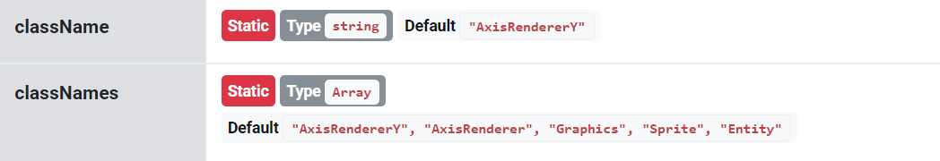
As per above, we can target renderers for vertical axes using AxisRendererY name, or all renderers using AxisRenderer.
NOTE Class name must always be specified as a first parameter when creating a theme rule.
Theme tags
Theme tags is a way to narrow down elements targeted by a class name.
The above example targeted all of the labels across the chart. If we would like to target labels just for an axis, we could use second parameter to the rule() method to specify it:
class MyTheme extends am5.Theme {
  setupDefaultRules() {

    this.rule("Label", ["axis"]).setAll({
      fontSize: 12,
      fill: am5.color(0x777777)
    });

  }
}
class MyTheme extends am5.Theme {
  setupDefaultRules() {

    this.rule("Label", ["axis"]).setAll({
      fontSize: 12,
      fill: am5.color(0x777777)
    });

  }
}
Furthermore, we could narrow it down even further by setting axis orientation as a second theme tag:
class MyTheme extends am5.Theme {
  setupDefaultRules() {

    this.rule("Label", ["axis", "x"]).setAll({
      fontSize: 12,
      fill: am5.color(0x777777)
    });

  }
}
class MyTheme extends am5.Theme {
  setupDefaultRules() {

    this.rule("Label", ["axis", "x"]).setAll({
      fontSize: 12,
      fill: am5.color(0x777777)
    });

  }
}
Now the rule will target labels on a horizontal axis only.
When multiple theme tags are specified in the rule, only those elements will be targeted that have all of the listed tags.
NOTE Theme tags are inheritable. This means that element will inherit theme tags set on any of their ascendants. As per above example, axis does have "axis" theme tag set. Since axis labels are descendants of the axis, they will have "axis" tag set as well, enabling us to target just axis labels.
Below is another example that targets line segments of the line series, as well as sets up bullets via theme:
See the Pen Custom theme by amCharts team (@amcharts) on CodePen.
Custom tags
We can add our own custom tags to any element via its themeTags setting, then target those via our custom theme.
It accepts an array of string names:
class MyTheme extends am5.Theme {
  setupDefaultRules() {

    this.rule("AxisLabel", ["my-axis-label"]).setAll({
      fontSize: 12,
      fill: am5.color(0x777777)
    });

  }
}

xAxis.get("renderer").labels.template.setAll({
  themeTags: ["my-axis-label"]
});
class MyTheme extends am5.Theme {
  setupDefaultRules() {

    this.rule("AxisLabel", ["my-axis-label"]).setAll({
      fontSize: 12,
      fill: am5.color(0x777777)
    });

  }
}

xAxis.get("renderer").labels.template.setAll({
  themeTags: ["my-axis-label"]
});
Non-inheritable tags
While generally tags are inheritable from parents, some elements will have special non-inheritable tags set on them.
For example, item containers in legend have "itemcontainer" non-inheritable tag set on them. If we create a rule targeting a Container (which is an item container class in legend) and refine it with an "itemcontainer" tag, it wil be applied to the item container, and not any of its children that might happen to be Container classes, too.
If we would like to set a non-inheritable custom theme tag on an element, instead of themeTags, we can use themeTagsSelf:
am5.Container.new(root, {
  themeTagsSelf: ["non-inheritable-tag"]
});
am5.Container.new(root, {
  themeTagsSelf: ["non-inheritable-tag"]
});
Built-in tags
A quick reminder: theme tags are inheritable.
For example, if axis renderer does have "x" tag, it will apply to all its descendants, i.e. labels, grid, ticks, etc.
this.rule("AxisTick", ["x"]).setAll({
  visible: true,
  length: 5
});
this.rule("AxisTick", ["x"]).setAll({
  visible: true,
  length: 5
});
XY and radar charts
XY chart
| Class | Theme tags | Targets |
|---|---|---|
Axes | ||
AxisRenderer+ children (e.g. AxisTick)+ extending classes (e.g. AxisRendererX) | "x" | Horizontal axis elements. |
"y" | Vertical axis elements. | |
Container | "axis", "header" | Axis header container. |
Rectangle | "axis", "header", "background" | Axis header background. |
Series | ||
Graphics | "xy", "line", "series", "stroke" | Line segments of a LineSeries, StepLineSeries, Smoothed*LineSeries. |
Graphics | "xy","line", "series", "fill" | Fill elements of a LineSeries , StepLineSeries, Smoothed*LineSeries . |
RoundedRectangle | "xy", "series", "column" | Columns in a ColumnSeries. |
Candlestick | "xy", "candlestick", "series", "column" | Candles in a CandlestickSeries. |
OHLC | "xy", "ohlc", "series", "column" | An OHLC column in an OHLCSeries. |
Radar chart
| Class | Theme tags | Targets |
|---|---|---|
Axes | ||
AxisRenderer+ children (e.g. AxisTick)+ extending classes (e.g. AxisRendererRadial) | "radial" | Radial axis elements on a radar chart. |
"circular" | Circular axis elements on a radar chart. | |
Series | ||
Graphics | "radar", "line", "series", "stroke" | Line segments of a RadarLineSeries, and SmoothedStepLineSeries. |
Graphics | "radar", "line", "series", "fill" | Fill elements of a RadarLineSeries, and SmoothedStepLineSeries. |
Slice | "radar", "series", "column" | Columns in a RadarColumnSeries. |
Pie and sliced charts
Pie
| Class | Theme tags | Targets |
|---|---|---|
PieChart | "pie" | Pie chart. |
PieSeries | "pie", "series" | Pie series. |
Slice | "pie", "series" | Slice elements. |
RadialLabel | "pie", "series" | Slice labels. |
Tick | "pie", "series" | Slice ticks. |
Funnel
| Class | Theme tags | Targets |
|---|---|---|
FunnelSeries+ children (e.g. FunnelSlice) | "vertical", "funnel" | Vertical funnel series (orientation: "vertical"). |
"horizontal", "funnel" | Horizontal funnel series (orientation: "horizontal"). | |
FunnelSlice | "funnel", "series", "slice"+ "vertical" or "horizontal" | Funnel series slices. |
Label | "funnel", "series", "label"+ "vertical" or "horizontal" | Funnel series labels. |
Tick | "funnel", "series", "tick"+ "vertical" or "horizontal" | Funnel series ticks. |
Tick | "pyramid", "series", "tick"+ "vertical" or "horizontal" | Pyramid series ticks. |
Pyramid
| Class | Theme tags | Targets |
|---|---|---|
PyramidSeries+ children (e.g. FunnelSlice) | "vertical", "pyramid" | Vertical pyramid series (orientation: "vertical"). |
"horizontal", "pyramid" | Horizontal pyramid series (orientation: "horizontal"). | |
FunnelSlice | "pyramid", "series", "slice"+ "vertical" or "horizontal" | Pyramid series slices. |
Label | "pyramid", "series", "label"+ "vertical" or "horizontal" | Pyramid series labels. |
Tick | "pyramid", "series", "tick"+ "vertical" or "horizontal" | Pyramid series ticks. |
Pictorial stacked
| Class | Theme tags | Targets |
|---|---|---|
PictorialStackedSeries+ children (e.g. FunnelSlice) | "vertical", "pictorial" | Vertical pictorial series (orientation: "vertical"). |
"horizontal", "pictorial" | Horizontal pictorial series (orientation: "horizontal"). | |
FunnelSlice | "pictorial", "series", "slice"+ "vertical" or "horizontal" | Pictorial series slices. |
Label | "pictorial", "series", "label"+ "vertical" or "horizontal" | Pictorial series labels. |
Tick | "pictorial", "series", "tick"+ "vertical" or "horizontal" | Pictorial series ticks. |
Flow charts
Sankey
| Class | Theme tags | Targets |
|---|---|---|
Sankey+ children (e.g. SankeyLink) | "vertical", "sankey" | Vertical Sankey series (orientation: "vertical"). |
"horizontal", "sankey" | Horizontal Sankey series (orientation: "horizontal"). | |
SankeyLink | "sankey", "link", "shape" + "vertical" or "horizontal" | Sankey link. |
RoundedRectangle | "sankey", "shape" + "vertical" or "horizontal" | Sankey node rectangle. |
Chord
| Class | Theme tags | Targets |
|---|---|---|
Chord+ children (e.g. ChordLink) | "chord" | Chord series. |
ChordLink | "chord", "link", "shape" | Link. |
Slice | "chord", "shape" | Node. |
Chord directed
| Class | Theme tags | Targets |
|---|---|---|
ChordDirected+ children (e.g. ChordDirectedLink) | "directed" | Chord directed series. |
ChordDirectedLink | "chord", "directed", "link", "shape" | Link. |
Slice | "chord", "directed", "shape" | Node. |
Chord directed
| Class | Theme tags | Targets |
|---|---|---|
ChordNonRibbon+ children (e.g. ChordNonRibbonLink) | "chord", "simple" | Chord non-ribbon series. |
ChordNonRibbonLink | "chord", "simple", "link", "shape" | Link. |
Slice | "chord", "simple", "shape" | Node. |
Hierarchy charts
Force-directed
| Class | Theme tags | Targets |
|---|---|---|
ForceDirected | "forcedirected" | Force-directed series. |
LinkedHierarchyNode | "forcedirected", "linkedhierarchy", "hierarchy", "node" | Node. |
Circle | "forcedirected", "linkedhierarchy", "hierarchy", "node", "shape" | Inner node circle. |
Circle | "forcedirected", "linkedhierarchy", "hierarchy", "node", "shape", "outer" | Outer node circle. |
HierarchyLink | "forcedirected", "linkedhierarchy", "hierarchy", "link" | Link. |
Label | "forcedirected", "linkedhierarchy", "hierarchy", "node" | Node label. |
Pack
| Class | Theme tags | Targets |
|---|---|---|
Pack | "pack" | Chord series. |
HierarchyNode | "pack", "hierarchy", "node" | Node. |
Circle | "pack", "hierarchy", "node", "shape" | Node circle. |
Label | "pack", "hierarchy", "node" | Node label. |
Partition
| Class | Theme tags | Targets |
|---|---|---|
Partition | "vertical", "partition" | Vertical partition series. |
"horizontal", "partition" | Horizontal partition series. | |
HierarchyNode | "partition", "hierarchy", "node" + "vertical" or "horizontal" | Node. |
RoundedRectangle | "partition", "hierarchy", "node", "shape" + "vertical" or "horizontal" | Node rectangle. |
Label | "partition", "hierarchy", "node" + "vertical" or "horizontal" | Node label. |
Sunburst
| Class | Theme tags | Targets |
|---|---|---|
Sunburst | "sunburst" | Sunburst series. |
HierarchyNode | "sunburst", "hierarchy", "node" | Node. |
Slice | "sunburst", "hierarchy", "node", "shape" | Node slice. |
RadialLabel | "sunburst", "hierarchy", "node" | Node label. |
Tree
| Class | Theme tags | Targets |
|---|---|---|
Tree | "vertical", "tree" | Vertical tree. |
"horizontal", "tree" | Horizontal tree. | |
LinkedHierarchyNode | "tree", "linkedhierarchy", "hierarchy", "node" + "vertical" or "horizontal" | Node. |
Circle | "tree", "linkedhierarchy", "hierarchy", "node", "shape" + "vertical" or "horizontal" | Inner node circle. |
Circle | "tree", "linkedhierarchy", "hierarchy", "node", "shape", "outer" + "vertical" or "horizontal" | Outer node circle. |
HierarchyLink | "tree", "linkedhierarchy", "hierarchy", "link" + "vertical" or "horizontal" | Link. |
Label | "tree", "linkedhierarchy", "hierarchy", "node" + "vertical" or "horizontal" | Node label. |
Treemap
| Class | Theme tags | Targets |
|---|---|---|
Treemap | "treemap" | Treemap series. |
HierarchyNode | "treemap", "hierarchy", "node" | Node. |
RoundedRectangle | "treemap", "hierarchy", "node", "shape" | Node rectangle. |
Label | "treemap", "hierarchy", "node" | Node label. |
Map chart
| Class | Theme tags | Targets |
|---|---|---|
MapChart+ all child elements | "map" | Map chart. |
Rectangle | "map", "background" | Map chart background. |
Button | "plus" | "Plus" button of a zoom control. |
Button | "minus" | "Minus" button of a zoom control. |
Common elements
Scrollbar
| Class | Theme tags | Targets |
|---|---|---|
Scrollbar+ all child elements | "scrollbar", "vertical" | Vertical scrollbar (orientation: "vertical"). |
"scrollbar", "horizontal" | Horizontal scrollbar (orientation: "horizontal"). | |
Rectangle | "scrollbar", "background" | Scrollbar background. |
Button | "scrollbar", "resize", "button" + "vertical" or "horizontal" | Scrollbar grip buttons. |
Graphics | "scrollbar", "resize", "button", "icon" + "vertical" or "horizontal" | A grip button icon. |
RoundedRectangle | | Scrollbar thumb element. |
Legend
| Class | Theme tags | Targets |
|---|---|---|
Legend+ all child elements | "legend" | Legend. |
Container | "legend", "item" + "itemcontainer" (non-inheritable) | Item containers (contain marker and labels). |
Rectangle | "legend", "item", "background" + "itemcontainer" (non-inheritable) | Item container background. |
Label | "legend", "label" | Legend labels. |
Label | "legend", "label", "value" | Legend value labels. |
RoundedRectangle | "marker", "rectangle" | Default legend marker. |
Graphics | "line", "series", "marker", "stroke" | Line part of the legend marker for LineSeries. |
Graphics | "line", "series", "marker", "fill" | Fill part of the legend marker for LineSeries. |
Tooltip
| Class | Theme tags | Targets |
|---|---|---|
Tooltip+ all child elements | "tooltip" | Tooltip. |
PointedRectangle | "tooltip", "background" | Tooltip background (balloon graphics). |
Colors in themes
There are two classes that control two aspects of coloring chart elements:
ColorSet- which controls a list of colors that are used to assign to elements, e.g. slices on a Pie chart, or series on an XY chart.InterfaceColors- Which defines colors for UI elements like buttons, grid, etc.
Color lists
We can specify list of auto-assignable colors via ColorSet's colors setting:
class MyTheme extends am5.Theme {
  setupDefaultRules() {

    this.rule("ColorSet").setAll({
      colors: [
        am5.color(0x095256),
        am5.color(0x087f8c),
        am5.color(0x5aaa95),
        am5.color(0x86a873),
        am5.color(0xbb9f06)
      ],
      reuse: true
    });

  }
}
class MyTheme extends am5.Theme {
  setupDefaultRules() {

    this.rule("ColorSet").setAll({
      colors: [
        am5.color(0x095256),
        am5.color(0x087f8c),
        am5.color(0x5aaa95),
        am5.color(0x86a873),
        am5.color(0xbb9f06)
      ],
      reuse: true
    });

  }
}
See the Pen Color set via theme by amCharts team (@amcharts) on CodePen.
UI colors
Colors for common user interface colors are set via various InterfaceColors settings, like primaryButton, secondaryButton, etc.
For a complete list of available UI settings, refer to "Colors, gradients, and patterns: Interface colors".
class MyTheme extends am5.Theme {
  setupDefaultRules() {

    this.rule("InterfaceColors").setAll({
      stroke: Color.fromHex(0xffffff),
      fill: Color.fromHex(0x2b2b2b),
      primaryButton: Color.lighten(Color.fromHex(0xc3cdbd), -0.2),
      primaryButtonHover: Color.lighten(Color.fromHex(0x6771dc), -0.2),
      primaryButtonDown: Color.lighten(Color.fromHex(0x68dc75), -0.2),
      primaryButtonActive: Color.lighten(Color.fromHex(0x68dc76), -0.2),
      primaryButtonText: Color.fromHex(0x11120F),
      primaryButtonStroke: Color.lighten(Color.fromHex(0xc3cdbd), -0.2),

      secondaryButton: Color.fromHex(0xd8ded4),
      secondaryButtonHover: Color.lighten(Color.fromHex(0xd8ded4), 0.1),
      secondaryButtonDown: Color.lighten(Color.fromHex(0xd8ded4), 0.15),
      secondaryButtonActive: Color.lighten(Color.fromHex(0xd8ded4), 0.2),
      secondaryButtonText: Color.fromHex(0x161814),
      secondaryButtonStroke: Color.lighten(Color.fromHex(0xd8ded4), -0.2),

      grid: Color.fromHex(0x161814),
      background: Color.fromHex(0xffffff),
      alternativeBackground: Color.fromHex(0x000000),
      text: Color.fromHex(0x000000),
      alternativeText: Color.fromHex(0xffffff),
      disabled: Color.fromHex(0xadadad),
      positive: Color.fromHex(0x50b300),
      negative: Color.fromHex(0xb30000)
    });

  }
}