This combined tutorial examines at possible positioning of axis elements like grid, labels, and ticks as well as series data items in an XY chart scenario with a date axis and date-based data.
Intro
Location of axis elements (grid, labels, ticks) is determined by location and multiLocation settings. For a simplified explanation about those, visit "Axes: Location of axis elements".
Location of data items from series with date-based data can be controlled using locationX (or locationY for vertical charts) setting of the series. For a brief intro into that, check out "Line series: Data item location" tutorial.
While the above applies to all types of axes and series, this tutorial will focus on a very common scenario, where an XY chart has a date axis on X, value axis on Y, and a line series with date-based data.
Layout scenarios
With a date axis, there can be various scenarios how it positions its labels and grid and where series data points are placed. It might depend on data granularity, series type, the time when the actual change of the data happens, etc.
Default behavior
The defaults were chosen very careful, as they - we feel - provide the most intuitive experience for date-based data.
Grid
Regardless of data granularity, zoom, or other situations, a date axis will show its grid at the beginning of its increment / period: e.g. a minute, 30 minutes, an hour, a day, 2 days, a month, a year, etc.
Labels
Placement of labels follow different logic. Basically it's this: if the increment (distance between two grid lines) is a single interval (1 minute, 1 hour, 1 month, etc.), label will be centered within it.
Otherwise label will be placed directly under the grid line, i.e. on the beginning of the period it represents.
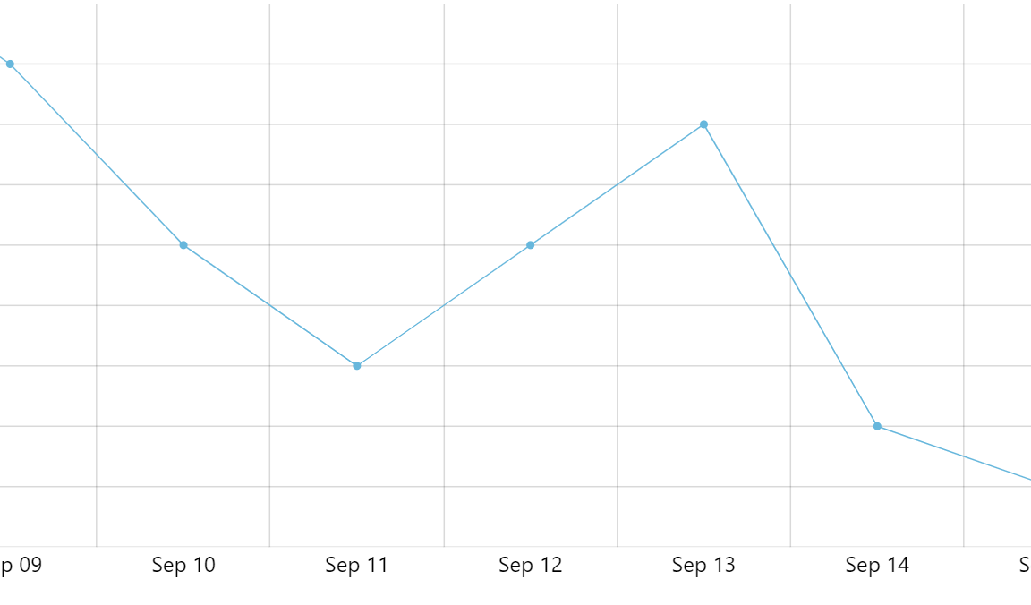
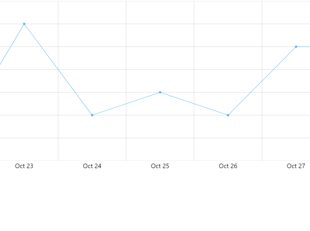
For example, if we have daily data and grid shown every day, the labels will be shown centered within the axis increments as they represent full period - a day:
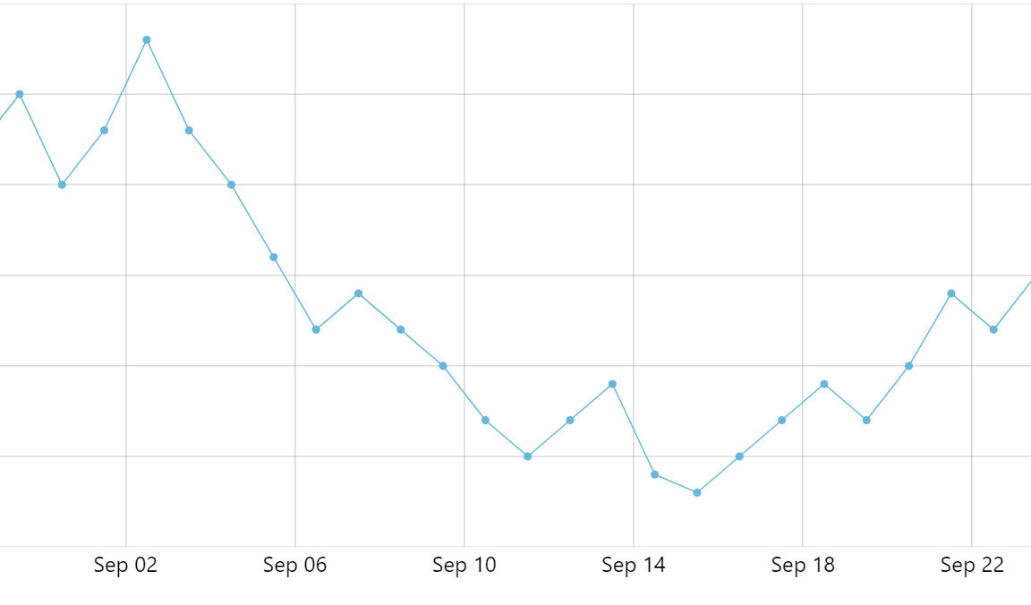
If the axis displays more days into single increment (perhaps if we are zooming out the chart), the daily labels no longer represent full period and thus are moved to the beginning of the period - under the grid, which is always in the beginning:
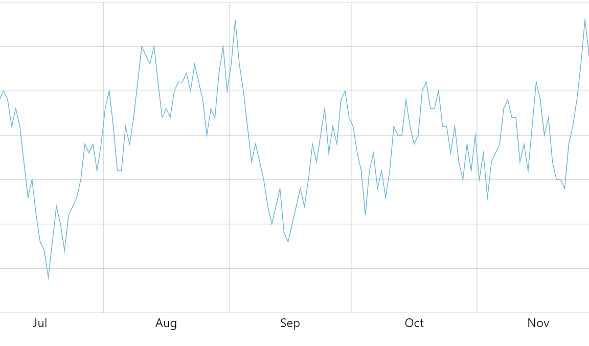
Zooming out even further, we might get into a situation, where axis switches to monthly view and monthly labels.
Now we have grid line every month, and monthly labels, that represent full month, thus they are centered within the period again:
Series data item
Series data item is shown in the middle of the increment.
In case there's one data item per date axis increment - say our grid is placed every day, and our series is using daily data - the series point will be shown centered within the period:
If axis period has several data items (e.g. days in it), available space will be divided to base intervals (days in this case) and each point from series centered within it.
In the below example each increment consists of 4 days, so it is virtually divided into four equal spaces, and each series data item is centered within it:
Custom locations
We the default behavior out of the way, let's look at the alternative logic of the layout of a date axis and related series:
- Axis labels are always centered below related grid lines.
To achieve that we have two options:
- Option #1: Moving grid and multi-location labels to the middle.
- Option #2: Moving single-period label to the left.
Axis elements
We can override the location of the axis elements - grid, labels, ticks - using their location and multiLocation settings.
Both are numeric values that represent relative position within the increment, with 0 (zero) meaning beginning, 0.5 - the middle, and 1 (one) the end.
location is used when axis displays whole increment, say a day, a month, etc.
multiLocation is used when each increment has multiple periods in it, e.g. 4 days.
If we need to change location of the axis element, we need to set required setting on its template.
Option #1: Moving grid
Our first option is to move the grid and multi-location labels to the middle, which is achieved setting a location: 0.5 and multiLocation: 0.5 settings respectively:
let xRenderer = xAxis.get("renderer");

xRenderer.grid.template.setAll({
  location: 0.5
});

xRenderer.labels.template.setAll({
  multiLocation: 0.5
});
var xRenderer = xAxis.get("renderer");

xRenderer.grid.template.setAll({
  location: 0.5
});

xRenderer.labels.template.setAll({
  multiLocation: 0.5
});

location: 0 (default)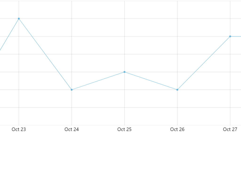
location: 0.5As we can see above, the label remains in the middle (because it represents full period - day), but the grid moves to the middle, too.
However, when our axis goes into multi-period increment (e.g. showing grid every 4 days), the multiLocation setting kicks in. That's why we need to also set multiLocation: 0.5 so that multi-period labels are displayed in the middle, too.
Here's a working example:
See the Pen Moving axis labels, tooltip location, bullets, and data items by amCharts team (@amcharts) on CodePen.
Option #2: Moving labels
Grid and multi-period labels are already located at the beginning of the cell, so we don't have to do anything about them.
We just need to move single-period label to the beginning:
let xRenderer = xAxis.get("renderer");
xRenderer.labels.template.setAll({
  location: 0
});
var xRenderer = xAxis.get("renderer");
xRenderer.labels.template.setAll({
  location: 0
});
location: 0.5 (default)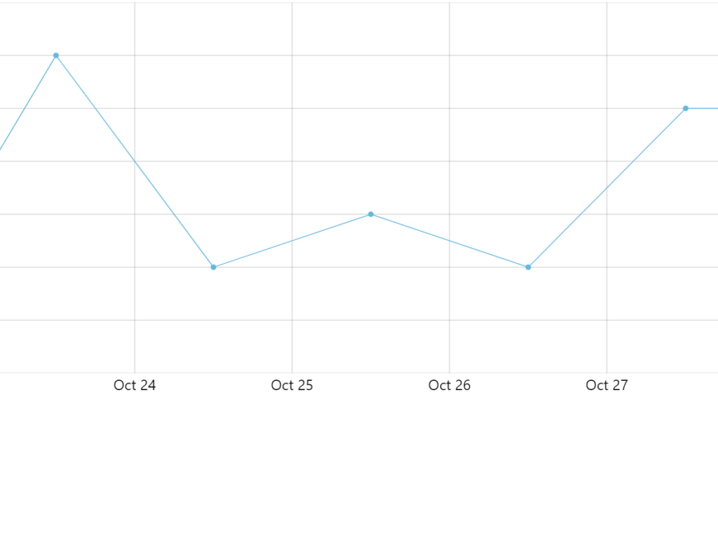
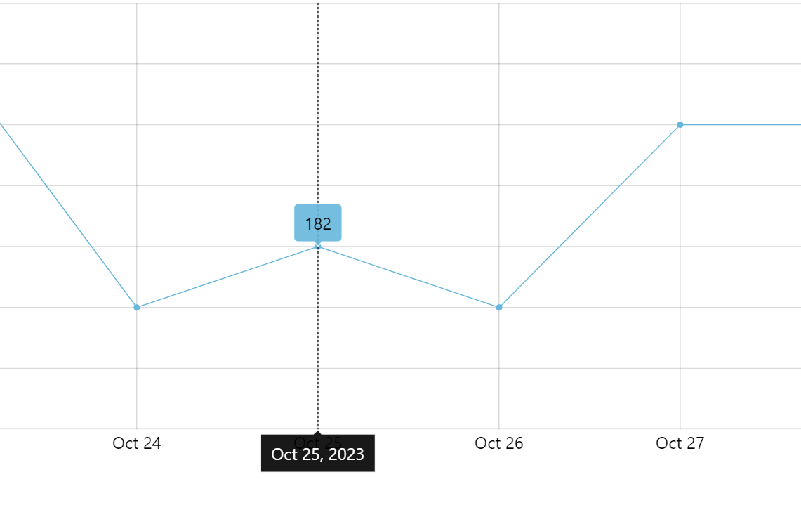
location: 0Note that while labels are now under the grid line - where we want them - the actual data point is still in the middle, which looks a bit awkward if not misleading.
To drive it home, let's also:
- change
locationXof the series to0(zero). - If we have bullets, change
locationXof the bullets to0(zero), too. - If we have use a chart cursor and an axis tooltip, set
tooltipLocationof the axis to0(zero).
let xAxis = chart.xAxes.push(am5xy.DateAxis.new(root, {
  maxDeviation: 0.2,
  baseInterval: {
    timeUnit: "day",
    count: 1
  },
  tooltipLocation: 0, // <-- moves axis tooltip to the start
  renderer: xRenderer,
  tooltip: am5.Tooltip.new(root, {})
}));

let series = chart.series.push(am5xy.LineSeries.new(root, {
  xAxis: xAxis,
  yAxis: yAxis,
  valueYField: "value",
  valueXField: "date",
  locationX: 0, // <-- moves data items to the start
  tooltip: am5.Tooltip.new(root, {
    labelText: "{valueY}"
  })
}));

series.bullets.push(function() {
  return am5.Bullet.new(root, {
    locationX: 0, // <-- moves bullets to the start
    sprite: am5.Circle.new(root, {
      radius: 3,
      fill: series.get("fill")
    })
  });
});
var xAxis = chart.xAxes.push(am5xy.DateAxis.new(root, {
  maxDeviation: 0.2,
  baseInterval: {
    timeUnit: "day",
    count: 1
  },
  tooltipLocation: 0, // <-- moves axis tooltip to the start
  renderer: xRenderer,
  tooltip: am5.Tooltip.new(root, {})
}));

varseries = chart.series.push(am5xy.LineSeries.new(root, {
  xAxis: xAxis,
  yAxis: yAxis,
  valueYField: "value",
  valueXField: "date",
  locationX: 0, // <-- moves data items to the start
  tooltip: am5.Tooltip.new(root, {
    labelText: "{valueY}"
  })
}));

series.bullets.push(function() {
  return am5.Bullet.new(root, {
    locationX: 0, // <-- moves bullets to the start
    sprite: am5.Circle.new(root, {
      radius: 3,
      fill: series.get("fill")
    })
  });
});
There's still one last thing to improve: if we are using a chart cursor, we might want to make it "snap" to our series:
let cursor = chart.set("cursor", am5xy.XYCursor.new(root, {
  xAxis: xAxis,
  snapToSeries: [series],
  snapToSeriesBy: "x"
}));
var cursor = chart.set("cursor", am5xy.XYCursor.new(root, {
  xAxis: xAxis,
  snapToSeries: [series],
  snapToSeriesBy: "x"
}));
The above ensures that cursor snaps to the nearest series' data item horizontally.
Here's a working example of the above implementation:
See the Pen Line Graph by amCharts team (@amcharts) on CodePen.