Donut Chart
Donut Chart (also known as Doughnut chart) is a variation on a Pie chart except it has a round hole in the center which makes it look like a donut, hence the name. This empty space can be used to display additional data.
Configurable inner radius
To make a donut chart out of a regular pie chart, we simply need to set innerRadius setting of the chart.
It can either take relative percent value, or fixed pixel radius.
Related tutorials
Build this chart with AI
The prompt below can be used to build this chart with AI. For best coding results, use the most advanced AI models, like Claude Opus 4.6 and GPT-5.3-Codex. For more info and tips, check out amCharts AI docs.
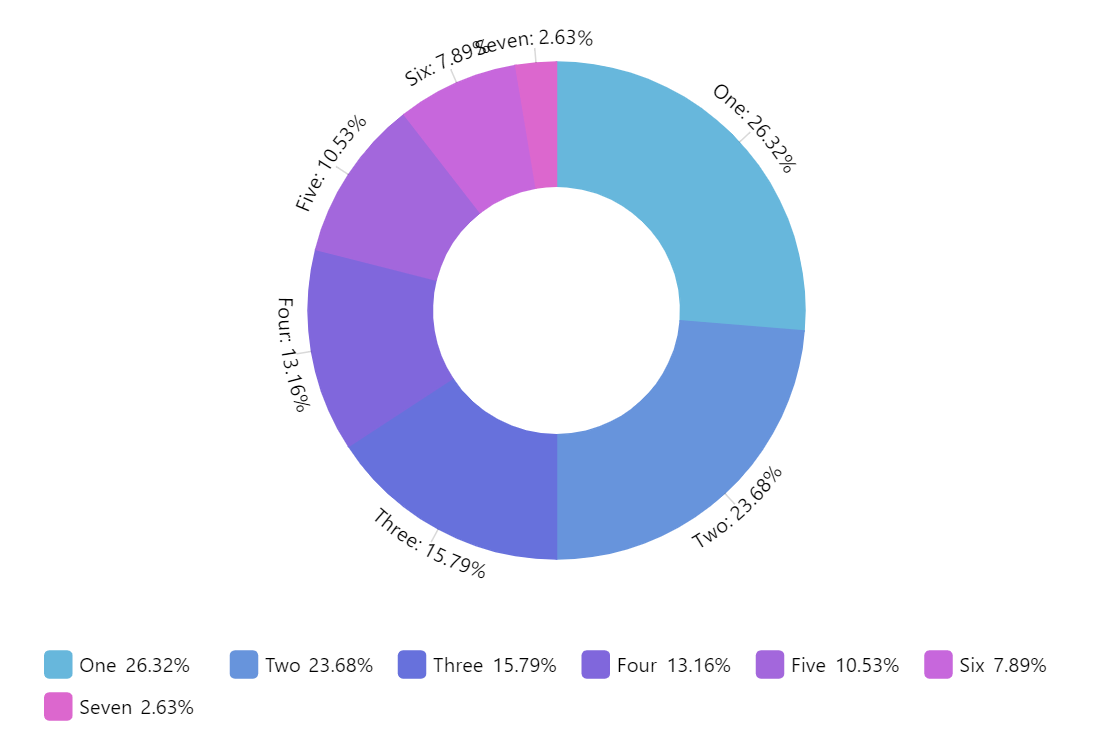
Create a donut chart displaying seven categories ('One' through 'Seven', values 10 down to 1). Include a horizontally centered legend below the chart. Display text labels positioned around the donut slices. Provide three interactive slider controls: inner hole size, slice transparency, and corner roundness. Apply a smooth animated entrance on load. The chart should be 100% width at 500px height. Use amCharts 5 library.
Demo source