Gauge with Bands
Gauge charts are great for representing where the value falls in a range. They are especially useful in a live data scenarios like in this demo. We can also add bands on the gauge to make the value even more readable at a glance.
Key implementation details
We add bands to a gauge chart using the axis range feature of amCharts. Setting up these ranges on the axis is all you need to do to enable the bands. The chart engine takes care of the rest.
Related tutorials
Build this chart with AI
The prompt below can be used to build this chart with AI. For best coding results, use the most advanced AI models, like Claude Opus 4.6 and GPT-5.3-Codex. For more info and tips, check out amCharts AI docs.
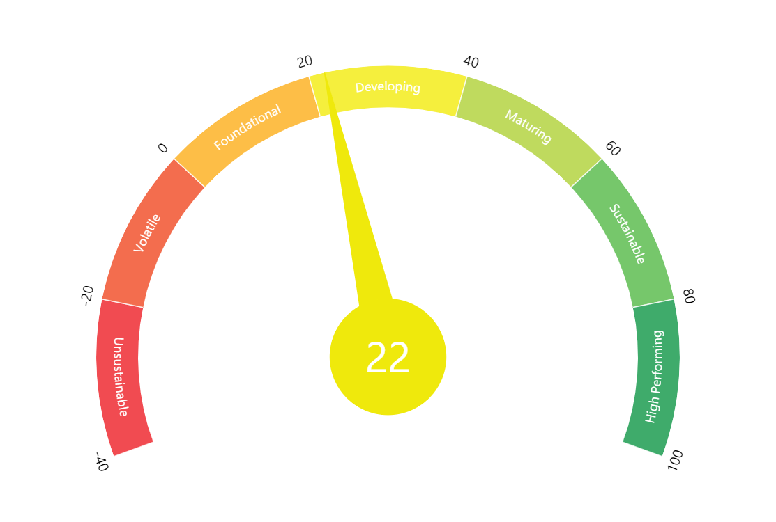
Create a semicircular gauge chart with a value range of -40 to 100. Display seven colored bands, each with an internal label: 'Unsustainable' (red, -40 to -20), 'Volatile' (orange-red, -20 to 0), 'Foundational' (gold, 0 to 20), 'Developing' (yellow, 20 to 40), 'Maturing' (light green, 40 to 60), 'Sustainable' (green, 60 to 80), and 'High Performing' (dark green, 80 to 100). Add a needle that rotates to indicate the current value, with the needle's color dynamically animating to match whichever band it enters. Display a large centered numeric label showing the current rounded value. Auto-update with random values between -40 and 140 every 2 seconds, with smooth animations. Use amCharts 5 library.
Demo source