Line Chart with Range Slider
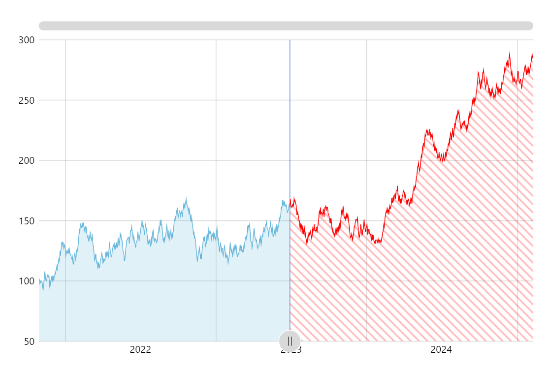
Displaying parts of the chart differently is a powerful visual aid helping users comprehend the data better. Add an interactive element adjusting the point dividing the parts and you get a powerful analytical tool.
Key implementation details
To change the look of parts of the chart we use the axis range feature of amCharts 5. Except instead of being just an independent axis range (as the name suggests) we create it on the series series.createAxisRange() so that the range settings affect the part of the series falling into it. We fill the area in the range with a patterned fill.
We also add a button as an axis bullet for the range which enables interactivity to allow viewers control the range.
Related tutorials
Build this chart with AI
The prompt below can be used to build this chart with AI. For best coding results, use the most advanced AI models, like Claude Opus 4.6 and GPT-5.3-Codex. For more info and tips, check out amCharts AI docs.
Create a line chart with 1,200 daily data points featuring a draggable vertical slider on the plot area. The region after the slider should display a diagonal red-and-white striped pattern overlay. Show a colored vertical reference line at the slider position. Include a semi-transparent area fill, XY cursor, tooltips, horizontal scrollbar, and pan/zoom. Animate on load. Use amCharts 5 library.
Demo source