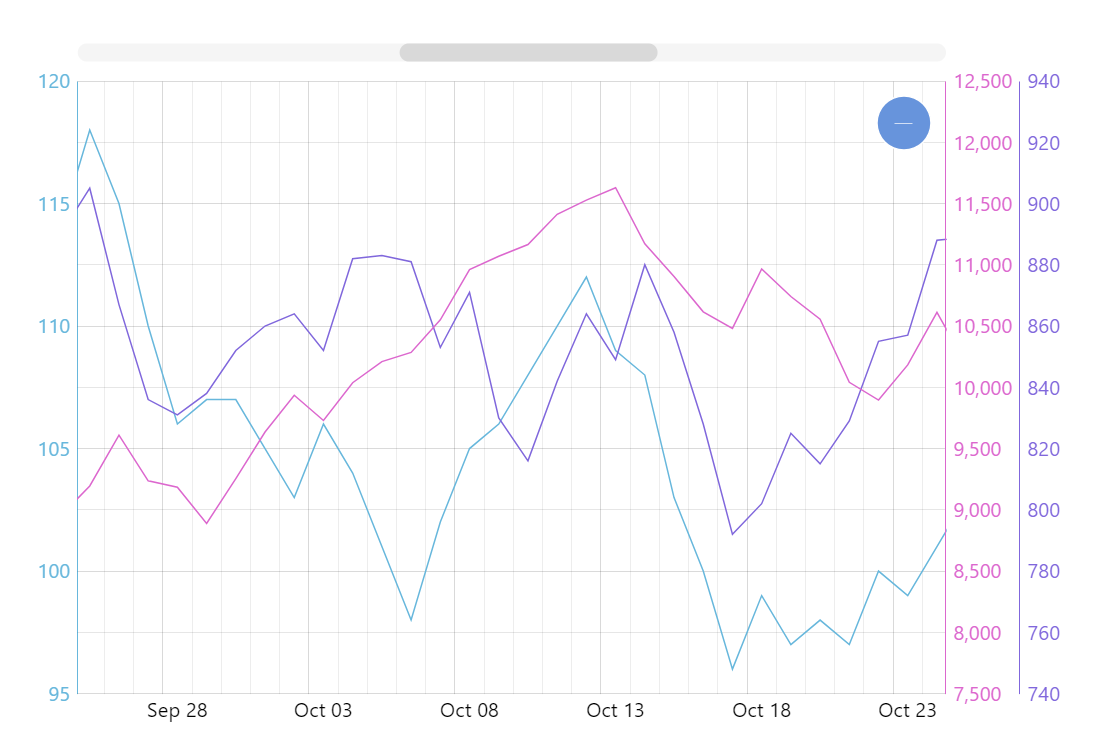
Multiple Value Axes
It’s very common to have multiple vastly different values yet want to be able to visually compare trends and relations between them. When you chart those values on the same scale you get mostly unusable results. But if you could map different graphs along different value axes you’d get a much better visualization. And amCharts has all the tools for you to achieve this. This demo shows you how.
Key implementation details
We can add as many axes as we need to the XY chart’s yAxes. Then when we add our line series we can specify which yAxis to assign it to. We can also specify that we want the axis to appear on the opposite side (opposite: true) of the plot area (the default being left side).
Related tutorials
Build this chart with AI
The prompt below can be used to build this chart with AI. For best coding results, use the most advanced AI models, like Claude Opus 4.6 and GPT-5.3-Codex. For more info and tips, check out amCharts AI docs.
Create a line chart with three series, each on its own independent Y-axis for handling different value ranges. Place one axis on the left and two on the right. Color axis labels to match their series. Display 100 daily data points per series on a shared date X-axis. Include pan/zoom, horizontal tooltips, XY cursor, horizontal scrollbar, and entrance animation. Use amCharts 5 library.
Demo source