Radar Heat Map
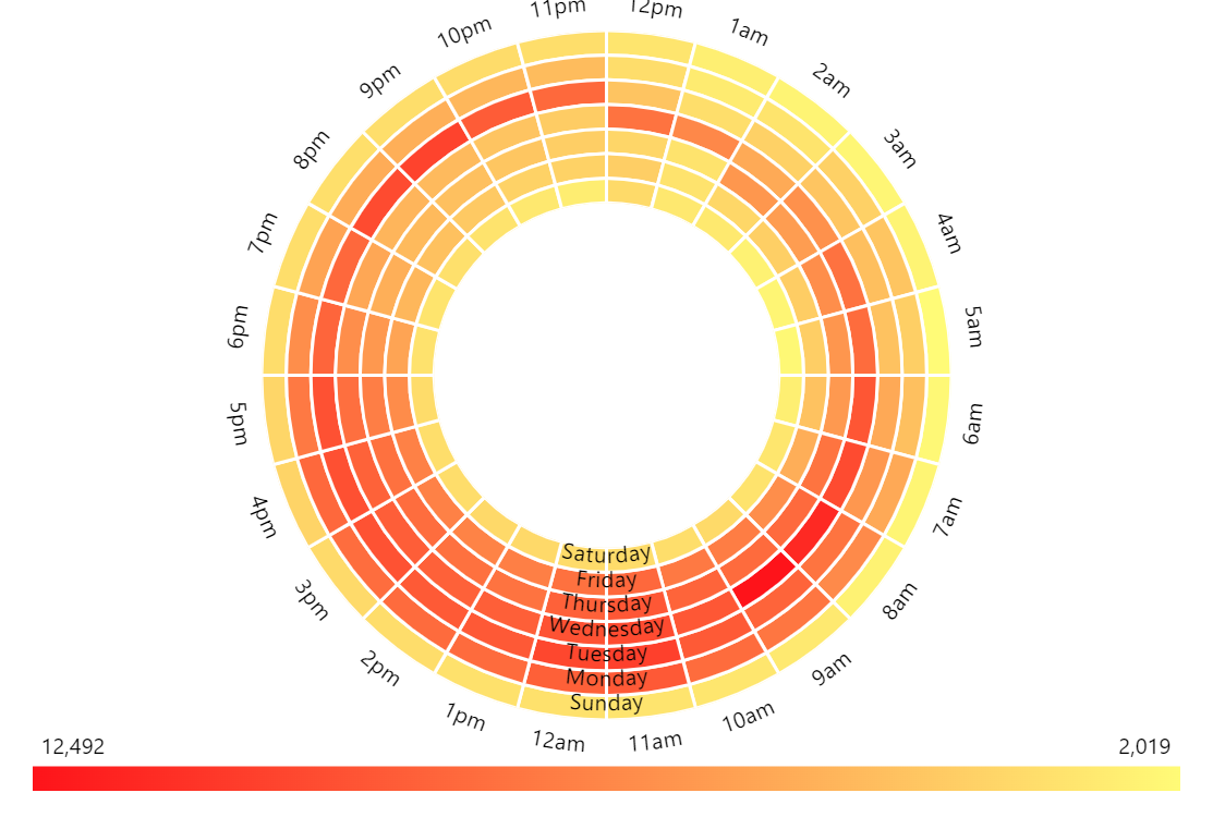
Generally, Heat maps represent data in rectangular matrices where individual values are differentiated by color. In this case, we apply this concept to a radial shape which could be useful for visualizing repeating activities, for example.
Key implementation details
Heat map is basically a bar chart with two category axes instead of one category and one value axis seen in the most most common XY charts. We then create our RadarColumnSeries and set both categoryXField (hour) and categoryYField (weekday). The one thing left is to define a “heat rule” on the series based on the value field.
To complete the picture we add a heat legend at the bottom.
Related tutorials
Build this chart with AI
The prompt below can be used to build this chart with AI. For best coding results, use the most advanced AI models, like Claude Opus 4.6 and GPT-5.3-Codex. For more info and tips, check out amCharts AI docs.
Create a radar heat map with a donut hole in the center. Display 168 data points (24 hours x 7 days) representing hourly activity levels throughout the week. Use a circular axis for hourly time labels and a radial axis for weekday labels, both with hidden grid lines. Color each hour-weekday cell based on its value, ranging from light yellow for low activity to bright red for high activity, with values ranging from roughly 2,000 to 12,500. Show tooltips on hover displaying the specific value, and add a heat legend that updates to highlight the current data point's position within the range. Animate chart appearance on load. Use amCharts 5 library.
Demo source