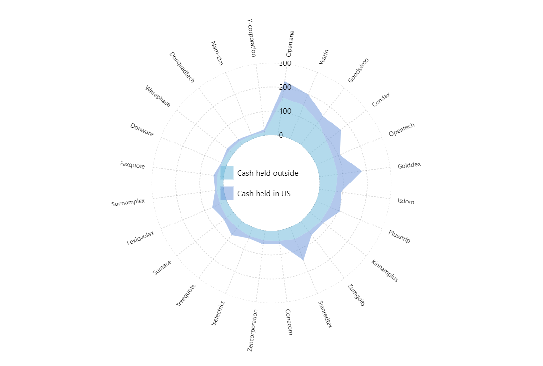
Stacked Area Radar
Like with XY Charts, it is possible to create stacked area charts in the scope of the Radar chart as well.
Key implementation details
All we need to do to make stacking happen, is set stacked: true on our second RadarLineSeries. To make an area series out of line series you just enable fill on the series template.
Related tutorials
Build this chart with AI
The prompt below can be used to build this chart with AI. For best coding results, use the most advanced AI models, like Claude Opus 4.6 and GPT-5.3-Codex. For more info and tips, check out amCharts AI docs.
Create a stacked area radar chart with a donut shape. Display 24 companies on a circular category axis with two line series: 'Cash held outside' and 'Cash held in US' (stacked). Fill areas with partial transparency instead of showing line strokes, creating overlapping zones. Values range from roughly 14-160 for the first metric and 2.8-102.2 for the second. Use dashed grid lines on both axes. Position a legend at the chart's center identifying both series. Show tooltips formatted as 'Outside: {value1}nInside: {value2}'. Add a cursor with zoom and disable panning. Animate entrance on load. Use amCharts 5 library.
Demo source