Stacked and Clustered Column Chart
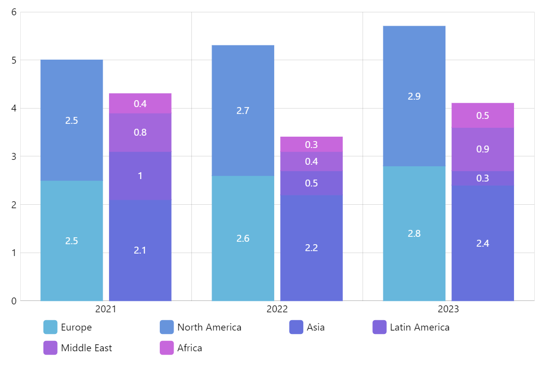
Stacked column charts are great for displaying the contributions of parts of a whole (eg. how much each product line contributed to the total revenue). Clustered column charts excel at being the most comprehensible while comparing the absolute values visually. With amCharts 5 you can combine both techniques to get the best of both worlds.
An example would be displaying revenues by region (clustered chart) while at the same time including the composition of products that contributed to that revenue (stacked chart).
Key implementation details
The key to creating a chart like this is alternating between non-stacked (stacked: false) and stacked (stacked: true) series. In this demo we create non-stacked series for Europe then create stacked series for North America and that goes on top of the previous series (Europe). Then Asia is non-stacked again, creating a new cluster. All of the following series are stacked again and stack on top of Asia.
Related tutorials
Demo source