Zoomable Bubble Chart
A great thing about interactive charts is that you can put a lot of information into one chart and let users zoom in and out to see the data with varying level of detail. This demo shows a bubble chart with all the zooming features enabled.
Key implementation details
The key here is to enable all of the zooming and panning features on the XYChart itself: panX, panY, pinchZoomX, pinchZoomY are all set to true. And mouse-wheel behavior is set to zoom on both X and Y axes with wheelY: "zoomXY". Finally, we add both horizontal and vertical scrollbars to enable manual zooming and panning on each axis.
Related tutorials
Build this chart with AI
The prompt below can be used to build this chart with AI. For best coding results, use the most advanced AI models, like Claude Opus 4.6 and GPT-5.3-Codex. For more info and tips, check out amCharts AI docs.
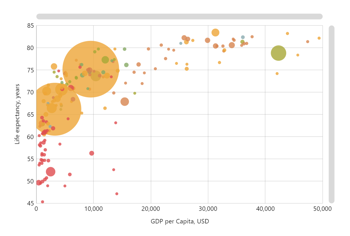
Create a zoomable bubble chart visualizing global socioeconomic data for 195+ countries. The X-axis shows GDP per Capita in USD, the Y-axis shows life expectancy in years. Each country is a colored circle sized based on population so that more populous countries have larger bubbles. Color-code by continent: Africa, Asia, Europe, North America, South America, and Australia/Oceania each have a distinct color. Enable mouse wheel zoom, drag panning on both axes, and pinch zoom for touch. Add horizontal and vertical scrollbars. Tooltips should show country name, life expectancy, GDP, and population. Animate series on load. Use amCharts 5 library.
Demo source