Animated XY Bubble Timeline chart
Animating changes in data is a great way to convey trends over time that would require series of charts or overcrowding one static chart. amCharts has all the tools you need to create animated timelines.
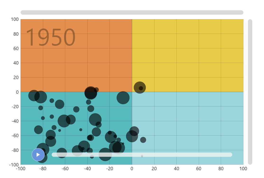
Key implementation details
There’s a lot going on in this chart, so lets focus on the essence related to the title of this demo. The key here is the slider at the bottom. Whenever the location of the slider thumb changes the rangechanged event is fired and we adjust the data slice our series are bound to. The play button just animates the start position of the slider range.
Related tutorials
Build this chart with AI
The prompt below can be used to build this chart with AI. For best coding results, use the most advanced AI models, like Claude Opus 4.6 and GPT-5.3-Codex. For more info and tips, check out amCharts AI docs.
Create an animated XY bubble chart that evolves over time from 1950 to 2022 with 50 data points. Display four colored quadrant backgrounds (orange, teal, light blue, yellow) dividing the plot space. Render bubbles as black circles, slightly transparent, sized dynamically based on a value field. Show a large semi-transparent year label in the chart background. Add a play button that auto-animates the timeline over about 15 seconds and an interactive slider for manual year selection. Data values follow a random walk pattern. Enable mouse wheel zoom, click-drag pan, pinch zoom, and scrollbars. Show tooltips with x, y, and value for each bubble. Smoothly transition bubble positions and sizes on data changes. Use amCharts 5 library.
Demo source