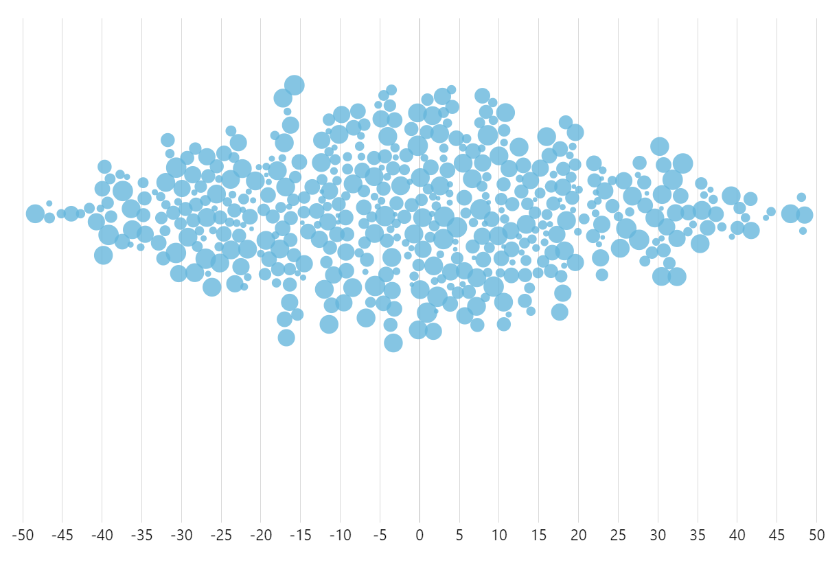
Beeswarm
A beeswarm chart, also known as a “dot plot,” is a data visualization technique used to display the distribution of a dataset along a single axis. In a beeswarm chart, individual data points are represented as dots or circles, and they are arranged in a way that avoids overlap while maintaining their alignment along the axis.
This arrangement allows for easy visualization of the density and distribution of data points, making it useful for understanding patterns, outliers, and overall trends within a dataset. Beeswarm charts are particularly effective for visualizing small to moderate-sized datasets and are commonly used in statistics, data analysis, and scientific research.
This demo uses a regular XYChart together with D3 “Force” library, to apply collision prevention of the bullets.
For a vertical version of this chart on CodePen click here.
Related tutorials
Build this chart with AI
The prompt below can be used to build this chart with AI. For best coding results, use the most advanced AI models, like Claude Opus 4.6 and GPT-5.3-Codex. For more info and tips, check out amCharts AI docs.
Create a beeswarm dot plot visualization with 500 randomly generated data points distributed along a horizontal axis (range -50 to 50). Each point is a circle with varying size based on a value field. Use force-based collision detection to prevent dot overlap, with a small padding between dots. Dots should smoothly reposition when chart bounds change. On hover, change the dot color to a highlight color from the palette. Enable pan on both axes and mouse wheel zoom with pinch support. Show tooltips displaying x-axis values. Animate the entrance smoothly. Use amCharts 5 library.
Demo source