Candlestick Chart
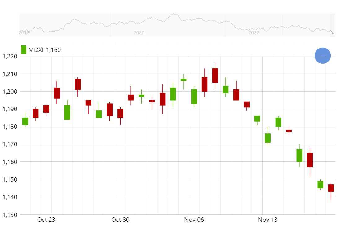
Candlestick chart is one of the most common ways to display financial data such as stock trading prices over time. Creating candlestick charts with amCharts is really easy and you get a lot of advanced features such as grouping right out of the box (try zooming in and out).
Key implementation details
To create a candlestick chart we add CandlestickSeries to an XYChart. We configure all the value fields for open/close/low/high values and also for grouping (lowValueYGrouped, etc.). We enable grouping by setting groupData to true on the DateAxis (X axis in this demo). And the engine takes care of the rest.
Related tutorials
Build this chart with AI
The prompt below can be used to build this chart with AI. For best coding results, use the most advanced AI models, like Claude Opus 4.6 and GPT-5.3-Codex. For more info and tips, check out amCharts AI docs.
Create a candlestick chart displaying 2000 days of simulated OHLC (Open, High, Low, Close) financial data starting at price 1200. X-axis uses a date-based axis with dynamic grouping that automatically aggregates candlesticks when zooming out. Y-axis shows price values. Enable X-axis panning and mouse wheel zoom. Add an XY cursor tracking horizontal position. Include a horizontal scrollbar below the chart showing a miniature weekly-grouped preview. Position a legend in the Y-axis header showing current candle values. Tooltips display open, low, high, and close values. Animate smoothly on load. Use amCharts 5 library.
Demo source