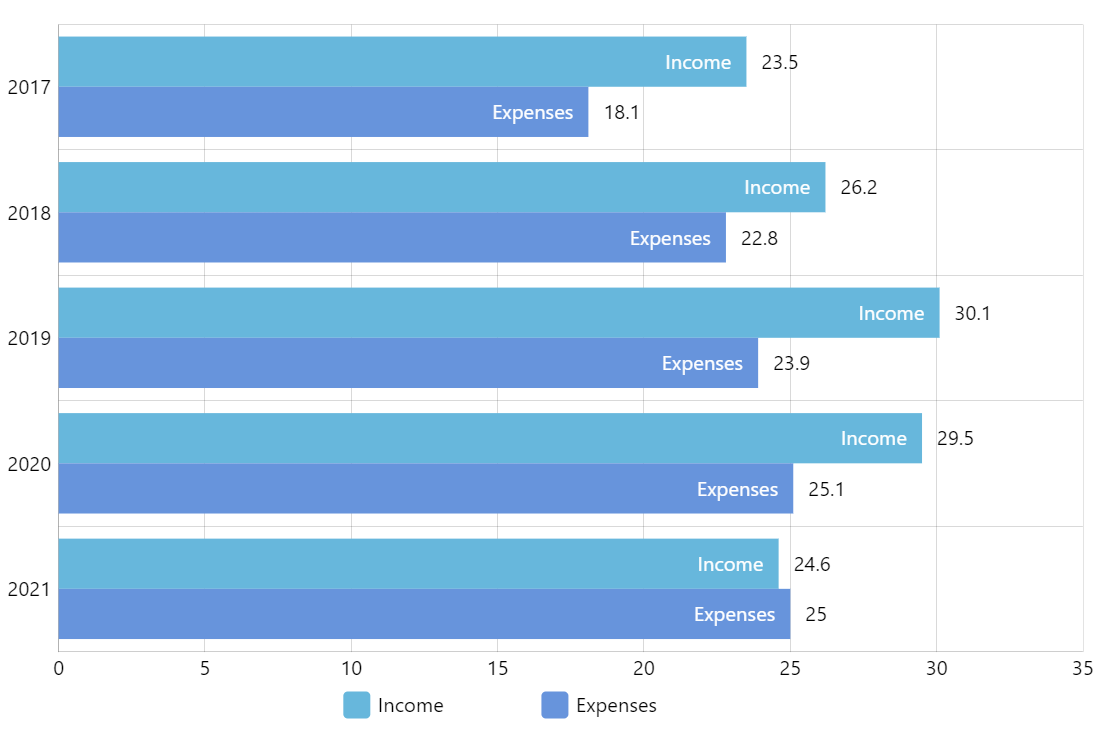
Clustered Bar Chart
Clustered Bar Chart (also known as Grouped bar chart, Multi-series bar chart) is great for displaying and comparing multiple sets of data over the same categories (like sales revenue of various departments of the company over several years).
Key implementation details
Clustered is the default behavior for the column/bar chart, so you don’t have to do anything extra to achieve the “clustering”.
To make a horizontal Bar chart (as opposed to a vertical Column chart) we set yAxis to be a CategoryAxis and xAxis to a ValueAxis. Accordingly, we set valueXField and categoryYField properties on the series, so they know that categories go along the Y axis and values along the X.
Normally, axes start at the 0 point (bottom-left) but in this case we wanted years to go from top to bottom. To achieve this, we’ve set inversed: true on the category axis renderer.
Finally, to make bars appear in a sequenced animation (one-by-one and not all at once) we enable sequencedInterpolation on the series.
Related tutorials
Demo source