Comparing Different Date Values Google Analytics Style
Google popularized this type of chart where data from one period is compared to the same data in the previous period in it’s Analytics product. In this demo we implement this concept with amCharts.
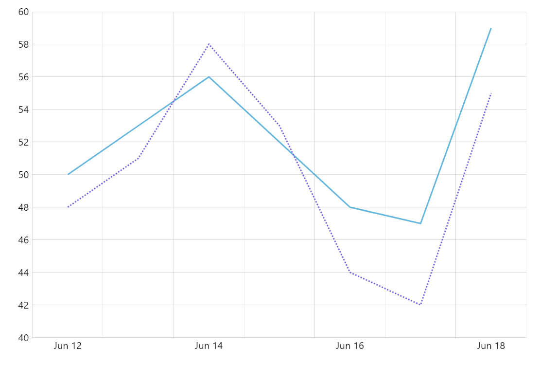
Key implementation details
We combine data for the current and previous period in one dataset. We use the current values for the first (solid) line series and the older values for the second (dotted) graph. One trick here is that we use both current and previous period dates and values for the tooltip on the first series to show both values in one place for easy comparison.
Related tutorials
Build this chart with AI
The prompt below can be used to build this chart with AI. For best coding results, use the most advanced AI models, like Claude Opus 4.6 and GPT-5.3-Codex. For more info and tips, check out amCharts AI docs.
Create a Google Analytics-style comparison line chart with 7 daily data points showing two overlaid series: a solid line for the current period and a dashed line for the previous period. Tooltips should show both current and previous period dates and values side by side. Include pan/zoom on both axes, XY cursor, and staggered entrance animation. Use amCharts 5 library.
Demo source