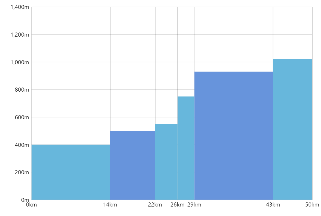
Irregular Interval XY
The most popular XY charts, such as Column Chart or Line Chart, are often distributed over a category axis with equal intervals on the X-axis (or Y-axis for Bar Charts). In most cases, this is logical and fits the goals of the visualization just right. In other cases, you want to distribute the graph differently to reflect some particular dataset in the most sensible way.
Key implementation details
In this demo we emulate an irregular interval column chart by using ValueAxis for both axes and then using StepLineSeries for the graph. We alternate fills for the steps to get the column chart appearance.
Related tutorials
Build this chart with AI
The prompt below can be used to build this chart with AI. For best coding results, use the most advanced AI models, like Claude Opus 4.6 and GPT-5.3-Codex. For more info and tips, check out amCharts AI docs.
Create an XY chart displaying irregularly spaced data as filled step-style columns. Plot seven altitude measurements at non-uniform kilometer positions (0, 14, 22, 26, 29, 43, 50 km) with values between 400 and 1200 meters. Use numeric axes on both X and Y, with the X-axis labeled in km and the Y-axis starting at 0. Alternate between two colors for adjacent columns. Show fills without borders. Enable tooltips showing the km position and altitude. Add a crosshair cursor, mouse wheel zoom, and panning. Animate on load. Use amCharts 5 library.
Demo source