Layered Column Chart
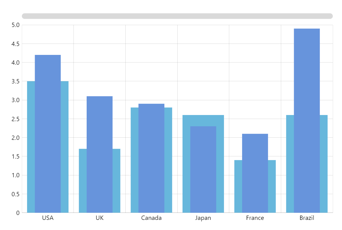
In some scenarios, showing multiple column series side-by-side (clustered) is the best and most “standard” way to display multiple column series. However, when each series has equal and fairly limited number of items, layering series on top of each other presents a much more impactful visualization.
To achieve that with amCharts 5, you just disable clustering on each series and then make columns in one of them wider (or narrower) than the other.
Related tutorials
Demo source