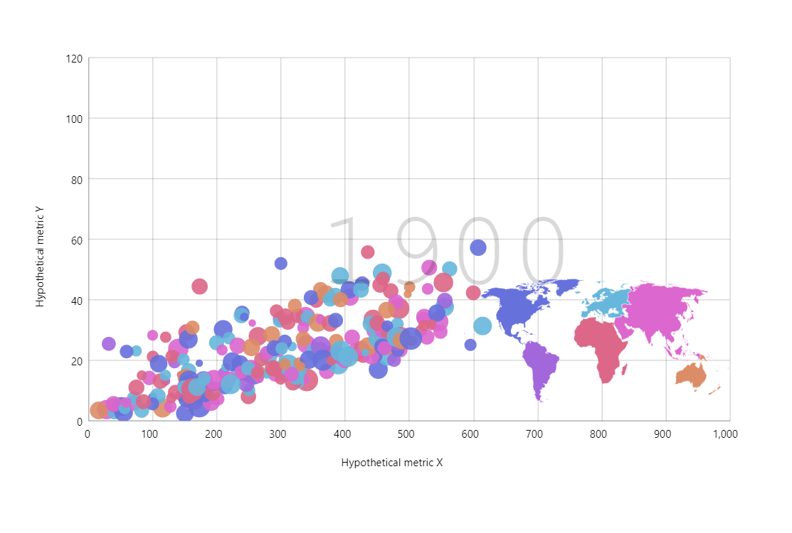
Motion Chart
Motion chart type was popularized by the great GapMinder.org. It’s great at showcasing the changes in some dataset on multiple dimensions (x, y, bubble size, color, etc.)
Key implementation details
There’s a lot going on in this chart including a map and more. Let’s focus on the core here. Our bubbles are actually bullets on a regular LineSeries with stroke set to invisible. Then we add a Slider and the bubble series data is updated in response to the slider’s rangechanged event. The play Button just starts the animation on the slider’s range.
Related tutorials
Build this chart with AI
The prompt below can be used to build this chart with AI. For best coding results, use the most advanced AI models, like Claude Opus 4.6 and GPT-5.3-Codex. For more info and tips, check out amCharts AI docs.
Create a GapMinder-style motion chart displaying approximately 195 countries as bubbles on an XY plot. X-axis: 'Hypothetical metric X' (0-1000), Y-axis: 'Hypothetical metric Y' (0-120). Bubble size scales by population, color-coded by continent (Europe, North America, South America, Asia, Africa, Oceania with distinct colors). Display a large semi-transparent year label in the background. Add a horizontal slider with play button that animates progression from 1900-2022 over 15 seconds. Hovering a bubble fades all other bubbles to be very faint. Clicking a bubble shows its historical trajectory as a line; clicking again deselects. Include a small embedded world map in the bottom-right corner with colored continent polygons; clicking a continent filters bubbles. Enable mouse wheel zoom, pinch zoom, pan, cursor, and scrollbars. Tooltips show country name and all metrics. Use amCharts 5 library.
Demo source