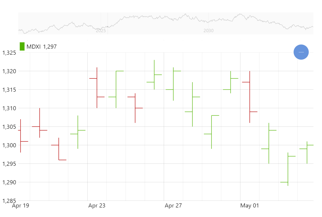
OHLC Chart
The OHLC chart is a very popular way to display financial (and other) data over time with open, high, low, and close values for periods.
Key implementation details
To create an OHLC chart we add OHLCSeries to our XY Chart and setup its open, high, low, and close fields.
Related tutorials
Build this chart with AI
The prompt below can be used to build this chart with AI. For best coding results, use the most advanced AI models, like Claude Opus 4.6 and GPT-5.3-Codex. For more info and tips, check out amCharts AI docs.
Create an OHLC (Open, High, Low, Close) chart displaying 2000 days of simulated financial data. Each data point shows open and close as horizontal ticks on a vertical high-low line. X-axis is date-based with automatic data aggregation when zooming out. Enable horizontal panning and mouse wheel zoom. Add a horizontal cursor with tooltips showing open, low, high, and close values. Include a scrollbar showing weekly-grouped data preview. Position a legend in the Y-axis header with series name and values. Show minor grid lines in the main chart. Animate over 1 second on load. Use amCharts 5 library.
Demo source