Box Plot Chart
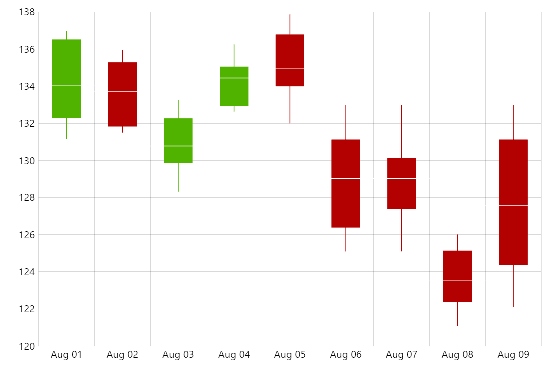
Box plot chart (also know as boxplot, box-and-whisker plot, box-and-whisker diagram) is a way of displaying statistical data based on five numbers: minimum, first quartile (25th percent), median, third quartile (75th percent) and maximum.
Related tutorials
Build this chart with AI
The prompt below can be used to build this chart with AI. For best coding results, use the most advanced AI models, like Claude Opus 4.6 and GPT-5.3-Codex. For more info and tips, check out amCharts AI docs.
Create a box plot (box-and-whisker) chart using candlestick-style bars to represent statistical distribution data. Display 9 data points spanning August 1-9, 2019, each with open, high, low, close values plus a calculated median. Overlay a step line connecting median values across all data points. Enable pan on both axes and mouse wheel horizontal zoom. Add an XY cursor following the X-axis with only a horizontal line shown. Show tooltips with open, low, high, close, and median values. Animate on load. Use amCharts 5 library.
Demo source