Polar Scatter
Polar scatter plots are great for visualizing discreet data that has periodic nature.
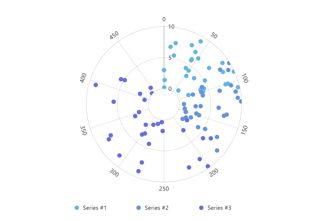
Key implementation details
The points in this demo are in fact bullets on a line series (RadarLineSeries). We just set forceHidden: true on the series strokes template to remove the lines and just keep the bullets.
Related tutorials
Build this chart with AI
The prompt below can be used to build this chart with AI. For best coding results, use the most advanced AI models, like Claude Opus 4.6 and GPT-5.3-Codex. For more info and tips, check out amCharts AI docs.
Create a polar scatter plot with a small donut hole at center. Display three data series, each with 30 data points plotted using angular and radial positions: Series 1, Series 2, and Series 3, each covering different angular and radial ranges. Show only circular bullet point markers at each data point without any connecting lines. Use a circular value axis for the angular position and a radial value axis for the distance from center. Add a centered legend below the chart identifying all three series. Include a cursor with zoom and mouse wheel functionality. Show tooltips on hover. Animate chart and series on load. Use amCharts 5 library.
Demo source